This notebook takes over from part I, where we explored the iris dataset. This time, we’ll give a visual tour of some of the primary machine learning algorithms used in supervised learning, along with a high-level explanation of the algorithms.
Table of Contents
- Data
- Algorithms
import matplotlib.pyplot as plt
import numpy as np
import pandas as pd
import seaborn as sns
from mlxtend.plotting import plot_decision_regions
from sklearn import metrics, model_selection
from sklearn.discriminant_analysis import LinearDiscriminantAnalysis, QuadraticDiscriminantAnalysis
from sklearn.linear_model import LogisticRegression, Perceptron
from sklearn.model_selection import GridSearchCV, train_test_split
from sklearn.naive_bayes import GaussianNB
from sklearn.neighbors import KNeighborsClassifier
from sklearn.neural_network import MLPClassifier
from sklearn.preprocessing import StandardScaler
from sklearn.svm import SVC
from sklearn.tree import DecisionTreeClassifier
import warnings

warnings.filterwarnings("ignore")
sns.set(font_scale=1.5)
Data
df = sns.load_dataset("iris")
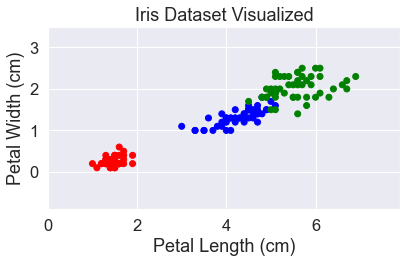
The dataset has four different features which makes it harder to visualize. But from our previous analysis, we could see that the most important features for distinguishing between the different species are petal length and petal width. To make it easier to visualize, we’re going to focus on just those two.
X = df[['petal_length', 'petal_width']]
y = df['species']
# change the labels to numbers
y = pd.factorize(y, sort=True)[0]
We know from the previous analysis that the labels are balanced, so we don’t need to stratify the data. We’ll just randomly divide up the dataset into testing and training sets using Scikit-learn.
X_train, X_test, y_train, y_test = train_test_split(
    X, y, test_size=0.25, random_state=0, shuffle=True
)
# Convert the pandas dataframes to numpy arrays
X_array = np.asarray(X)
X_train_array = np.asarray(X_train)
X_test_array = np.asarray(X_test)
Let’s take a look at our dataset. Since we’re going to visualize a lot of algorithms, we’ll use the mlxtend library and build a simple function to label the graphs.
def add_labels(standardized=False):
    plt.title('Iris Dataset Visualized')
    if standardized:
        plt.xlabel('Petal Length (standardized)')
        plt.ylabel('Petal Width (standardized)')
    else:
        plt.xlabel('Petal Length (cm)')
        plt.ylabel('Petal Width (cm)')
    plt.tight_layout()
    plt.show()
y_str = y.astype(str)
y_str[y_str == '0'] = 'red'
y_str[y_str == '1'] = 'blue'
y_str[y_str == '2'] = 'green'
plt.scatter(X['petal_length'], X['petal_width'], c=y_str)
plt.xlim(0, 7.9)
plt.ylim(-0.9, 3.5)
add_labels()
Algorithms
There are lots of good algorithms to try, some will work better with some data. Here are all the ones we’ll look at:
- Gaussian Naive Bayes
- Logistic Regression
- K Nearest Neighbors
- Support Vector Machines (linear and nonlinear)
- Linear Discriminant Analysis / Quadratic Discriminant Analysis
- Decision Tree Classifier
- Perceptron
- Neural Network (Multi-layer perceptron)
Gaussian Naive Bayes
The Gaussian naive Bayes classifier is based on Bayes’ Theorem. Bayes’ Theorem helps us answer an incredibly broad set of questions: “Given what I know, how likely is some event?” It provides the mathematical tools to answer this question by incorporating evidence into a probabilistic prediction. Mathematically, the question “Given B, what is the probability of A?” can be written out in Bayes’ Theorem as follows:
\[P(A|B) = \frac{P(B|A)P(A)}{P(B)}\]where
- \(P(A \mid B)\) is the probability of A given B, which is what we’re trying to calculate
- \(P(B \mid A)\) is the probability of B given A
- \(P(A)\) is the probability of A
- \(P(B)\) is the probability of B
There are many types of naive Bayes classifiers. They are all based on Bayes’ Theorem but are meant for different data distributions. For cases when the data are normally distributed, i.e. Gaussian, the Gaussian naive Bayes classifier is the right choice. From our previous visualizations, the data do look fairly Gaussian, so this may be a good model for this dataset.
We look at the probability of each class and the conditional probability for each class given each x value.
But what makes the algorithm naive? It is naive because it assumes that the different variables are independent of each other. This is a significant assumption and one that is invalid in many cases, such as predicting the weather. However, this assumption is key to making the calculations tractable. It is what makes it possible to combine many different features into the calculation, so you can ask “What is the probability of A given B, C, and D?” This paper by Scott D. Anderson shows the mathematics behind combining multiple features.
OK. Let’s train the classifier using our data.
gnb = GaussianNB()
gnb.fit(X_train, y_train)
print(
    "{:.1%} of the test set was correct.".format(
        metrics.accuracy_score(y_test, gnb.predict(X_test))
    )
)
97.4% of the test set was correct.
Naive Bayes is a surprisingly capable classifier, as this result shows.
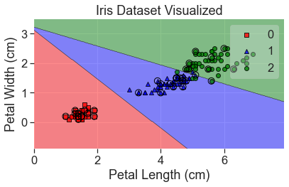
I’ll plot both the training and testing data. The testing data have been circled.
# Plot decision regions
plot_decision_regions(
    X_array, y, clf=gnb, legend=2, X_highlight=X_test_array, colors='red,blue,green'
)
add_labels()
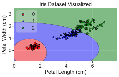
Some good things about Naive Bayes are that it
- Is extremely fast
- Generalizes to multiple classes well
- Works well for independent variables (see the warning below)
- Is good at natural language processing tasks like spam filtering
Some assumptions to be aware of are
- Naive Bayes assumes data are independent of each other. This is not valid in many cases. For example, the weather on one day is not independent of the weather on the previous day. The number of bathrooms in a house is not independent of the size of the house. Naive Bayes can still work surprisingly well when this assumption is invalid, but it’s important to remember.
- All features are assumed to contribute equally. That means that extraneous data with little value could decrease your performance.
- The GaussianNB classifier assumes a Gaussian distribution.
Logistic Regression
Logistic regression is a great machine learning model for classification problems. Logistic regression relies on finding proper weights for each input, just like linear regression, but then applies a nonlinear function on the results to turn it into a binary classifier. It’s probably the most popular method for binary classification.
The key to logistic regression in is finding the proper weight for every input. That would take a lot of work but, fortunately, we have machine learning to do that part. To learn more about logistic regression, see this post on using logistic regression to classify DNA splice junctions. Despite its name, logistic regression only works for classification, not regression (unlike linear regression).
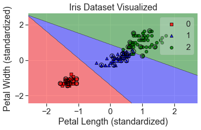
Standardization
For logistic regression, and many other machine learning algorithms, we will need to standardize the data first. This allows us to compare variables of different magnitude and keep our gradient descent model optimized.
We do this by making the mean of each variable 0 and the standard deviation 1. We do have to be careful in how we apply this to our training and testing datasets though. We can’t let any information about our test set affect our inputs, and that includes finding the mean and standard deviation of our test set and scaling based on that. So, we’ll have to find the parameters from our train set and use those to scale our test set. This means the mean of the test set won’t be exactly zero, but it should be close enough.
Scikit-learn has a StandardScaler that makes standardizing data easy.
scale = StandardScaler()
scale.fit(X_train)
X_std = scale.transform(X)
X_train_std = scale.transform(X_train)
X_test_std = scale.transform(X_test)
lgr = LogisticRegression(solver="lbfgs", multi_class="auto")
lgr.fit(X_train_std, y_train)
print(
    "{:.1%} of the test set was correct.".format(
        metrics.accuracy_score(y_test, lgr.predict(X_test_std))
    )
)
94.7% of the test set was correct.
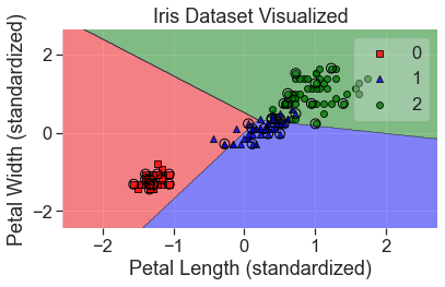
plot_decision_regions(
    X_std, y, clf=lgr, X_highlight=X_test_std, colors='red,blue,green'
)
add_labels(standardized=True)

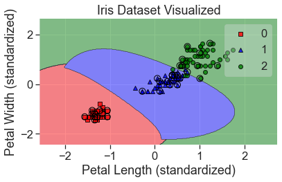
Tuning the Model
There are many hyperparameters in logistic regression that we can adjust to tune the model. There is a hyperparameter to control the normalization that is used in the penalization. Another that helps with regularization is \(C\), where \(C\) is the inverse of the regularization parameter lambda:
\[C = \frac{1}{\lambda}\]We can use a grid search to find the best hyperparameters and hopefully improve our model.
C_grid = np.logspace(-3, 3, 10)
max_iter_grid = np.logspace(2, 3, 6, dtype=int)
hyperparameters = dict(C=C_grid, max_iter=max_iter_grid)
lgr_grid = GridSearchCV(lgr, hyperparameters, cv=3)
# Re-fit and test after optimizing
lgr_grid.fit(X_train_std, y_train)
print(
    "{:.1%} of the test set was correct.".format(
        metrics.accuracy_score(y_test, lgr_grid.predict(X_test_std))
    )
)
94.7% of the test set was correct.
Let’s see what the best hyperparameters were
print(lgr_grid.best_estimator_)
LogisticRegression(C=0.46415888336127775, max_iter=100.0)
The value of \(C\) has been changed from the default of 1 to 0.46415888336127775 (np.logspace is great, but you get values like this). max_iter has remained at 100.
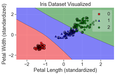
plot_decision_regions(
    X_std, y, clf=lgr_grid, X_highlight=X_test_std, colors='red,blue,green'
)
add_labels(standardized=True)
This both scored and looks much better.
Logistic regression is great for binary classification problems and can be extended to multiclass classification using a one vs. rest approach. However, for multiclass classification, there’s usually a better way: linear discriminant analysis.
Linear Discriminant Analysis
Linear discriminant analysis takes over where logistic regression left off. Logistic regression is best for two-case classification. LDA is better able to solve multi-class classification problems.
Like logistic regression, it assumes the features are Gaussian and uses Bayes’ Theorem to estimate the probability that new data belongs to each class. It does this by finding the mean and variance of each feature and forming a probability of which class the input data best matches. Based on these probabilities, it creates a linear boundaries between the classes. LDA can also do binary classification and is often the better model when there are few examples.
lda = LinearDiscriminantAnalysis()
lda.fit(X_train, y_train)
print(
    "{:.1%} of the test set was correct.".format(
        metrics.accuracy_score(y_test, lda.predict(X_test))
    )
)
94.7% of the test set was correct.
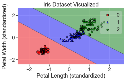
plot_decision_regions(
    X_array, y, clf=lda, X_highlight=X_test_array, colors='red,blue,green'
)
add_labels()
A couple things to note when using LDA:
- Outliers can have a big effect on the model, so it’s good to remove them first
- LDA assumes that the covariance of each class is equal, which may not be true in real-world data.
Quadratic Discriminant Analysis
QDA is very similar to LDA, except that it does not make an assumption about equal covariance. This page from the UC Business Analytics R Programming Guide provides a good background on LDA and QDA.
qda = QuadraticDiscriminantAnalysis()
qda.fit(X_train, y_train)
metrics.accuracy_score(y_test, qda.predict(X_test))
1.0
plot_decision_regions(
    X_array, y, clf=qda, X_highlight=X_test_array, colors='red,blue,green'
)
add_labels()
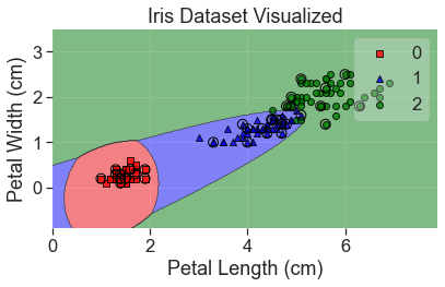
It’s interesting how well this did yet how it would classify a point in the bottom lefthand corner.
Support Vector Machines
Support vector machines (SVM) comes at classification from a different angle that the models we’ve seen before. Instead of directly minimizing the classification errors, we’ll try to maximize the margin between the different sets. The goal of SVM is to find the decision boundary which maximizes the distance between the closest samples (known as the support vectors) of one type on one side and those of another type on the other side of the boundary. In two dimensions that decision boundary will be a line, but in more dimensions it becomes a hyperplane.
Although it might sound simple, SVMs might be one of the most powerful shallow learning algorithms. They can provide really good performance with very minimal tweaking.
Like in logistic regression, we have a \(C\) parameter to control the amount of regularization. Another important hyperparameter is \(\gamma\), which determines whether or not to include points farther away from the decision boundary. The lower the value of \(\gamma\) the more points will be considered.
svm = SVC(kernel='linear')
svm.fit(X_train_std, y_train)
print(
    "{:.1%} of the test set was correct.".format(
        metrics.accuracy_score(y_test, svm.predict(X_test_std))
    )
)
97.4% of the test set was correct.
plot_decision_regions(
    X_std, y, clf=svm, X_highlight=X_test_std, colors='red,blue,green'
)
add_labels(standardized=True)

We can adjust the hyperparameters of the SVM to account for outliers (either giving them more or less weight), but in this case, it doesn’t seem necessary.
As you can see, one major limitation of the support vector machine algorithm we used above is that the decision boundaries are all linear. This is a major constraint (as it was with logistic regression and LDA), but there is a trick to get around that.
Support Vector Machines Kernel Trick
One of the best aspects of support vector machines is that they can be kernelized to solve nonlinear problems. We can create nonlinear combinations of the features and map them onto higher dimensional space so they are linearly separable.
\[\phi(x_1,x_2) = (z_1, z_2, z_3) = (x_1, x_2, x_1^2 + x_2^2)\]svm_kt = SVC(kernel='rbf')
svm_kt.fit(X_train_std, y_train)
print(
"{:.1%} of the test set was correct.".format(
metrics.accuracy_score(y_test, svm_kt.predict(X_test_std))
)
)
97.4% of the test set was correct.
plot_decision_regions(
    X_std, y, clf=svm_kt, X_highlight=X_test_std, colors='red,blue,green'
)
add_labels(standardized=True)
Some other things to keep in mind when using support vector machines:
- They work well with highly dimensional data
- If there’s a clear decision boundary in the data, it’s hard to beat SVMs
- SVMs don’t scale as well with very large datasets as some other models do
- SVMs perform better when the data are standardized
- They can do regression as well, although this is less common. The regression library is
sklearn.svm.SVR.
k-Nearest Neighbors
k-nearest neighbors is another powerful classifier. The concept is simple. At a given point in the dataset, the model finds the \(k\) nearest points and holds a majority-wins vote to determine the label at that point. The point is assigned whatever the majority of the \(k\) points closest to them are. It is a different style of classifier, known as a lazy learner. It is called lazy because it doesn’t try to build a function to generalize the data.
One good thing about these is that it is easy to add new data to the model. One downside is that it can have trouble scaling to very large datasets, because it never learns to generalize about the data. This means it has to remember every data point, which can take a lot of memory.
knn = KNeighborsClassifier()
knn.fit(X_train_std, y_train)
print(
    "{:.1%} of the test set was correct.".format(
        metrics.accuracy_score(y_test, knn.predict(X_test_std))
    )
)
100.0% of the test set was correct.
plot_decision_regions(
    X_std, y, clf=knn, X_highlight=X_test_std, colors='red,blue,green'
)
add_labels(standardized=True)

Some things to keep in mind about k-nearest neighbors:
- The curse of dimensionality greatly affects this algorithm. As there are more dimensions the data naturally become farther apart, so it requires a lot of data to use this model in highly dimensional space. One way to avoid this is to find the most important dimensions (or create new ones) and only use them.
- You can also use K nearest neighbors for regression problems. Instead of voting on the label, you find the \(k\) closest points and take the mean.
There is another algorithm similar to k-nearest neighbors, but it determines which training samples are most important and discards the other. This gives similar results but requires much less memory. This algorithm is known as learning vector quantization.
Decision Trees
The idea of a decision tree is to make a series of decisions that leads to the categorization of the data. Out of all of the machine learning algorithms, a decision tree is probably the most similar to how people actually think, and therefore it’s the easiest for people to understand and visualize decision trees. In this notebook, we’ve been able to visualize different algorithms because we are only looking at two dimensions, but for a decision tree, we can observe every step of how it made its decision.
Decision trees are nondeterministic, so we have to set a random state value to make our results repeatable.
tre = DecisionTreeClassifier(random_state=0)
tre.fit(X_train, y_train)
print(
    "{:.1%} of the test set was correct.".format(
        metrics.accuracy_score(y_test, tre.predict(X_test))
    ))
94.7% of the test set was correct.
plot_decision_regions(
    X_array, y, clf=tre, X_highlight=X_test_array, colors='red,blue,green'
)
add_labels()
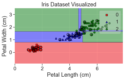
Notice that overfitting has led to a couple of odd decisions. This can be fixed by creating a large number of decision trees in what is known as a random forest.
Perceptron
We’ll also try a perceptron. Perceptrons are significant because they are biologically inspired in that they mirror the way a neuron works. They are the progenitor to much of the other algorithms and caused much of the interest in artificial neural networks. However, they are not actually very good classifiers and only work well in linearly separable cases. A single perceptron isn’t used for modern classification tasks and is only included here because of its historical importance to the field.
The perceptron model is closely related to linear and logistic regression in that it uses the sum of weighted inputs, but it relies on a step function as an activation.
per = Perceptron(max_iter=5, tol=None)
per.fit(X_train_std, y_train)
print(
    "{:.1%} of the test set was correct.".format(
        metrics.accuracy_score(y_test, per.predict(X_test_std))
    )
)
76.3% of the test set was correct.
plot_decision_regions(
    X_std, y, clf=per, X_highlight=X_test_std, colors='red,blue,green'
)
add_labels(standardized=True)
You can see that the model didn’t fit the data very well. There are ways to correct for this but there is no way to correct for non-linearly separable data with a single perceptron. To do that, we’ll use a multi-layer perceptron, also known as a neural network.
Neural Networks (Multi-layer perceptron)
A multi-layer perceptron, or, as it is more commonly known, a neural network, is in some ways the king of these algorithms. It is capable of dealing with linear or nonlinear data, of low or high dimensionality. It has an insatiable appetite for data, which makes it very powerful when there is sufficient data to train from. But all this capability has a downside, and that is it is the most computationally expensive to train.
There are many libraries that are specially built to work with neural networks, such as TensorFlow, CNTK, and MXNet. Scikit-learn has a neural network, but it does not work well it large scale productions. Due to the computational requirements, all the best neural network libraries can crunch numbers on a GPU or even a tensor processing unit (TPU). The neural network in Scikit-learn cannot do that, but it will work for our purposes here.
mlp = MLPClassifier(max_iter=500)
mlp.fit(X_train_std, y_train)
print(
    "{:.1%} of the test set was correct.".format(
        metrics.accuracy_score(y_test, mlp.predict(X_test_std))
    )
)
97.4% of the test set was correct.
plot_decision_regions(
    X_std, y, clf=mlp, X_highlight=X_test_std, colors='red,blue,green'
)
add_labels(standardized=True)
print(mlp.get_params)
<bound method BaseEstimator.get_params of MLPClassifier(max_iter=500)>
Hyperparameter Tuning a Neural Network
This model can be improved greatly by tuning its hyperparameters
alpha_grid = np.logspace(-5, 3, 5)
learning_rate_init_grid = np.logspace(-6, -2, 5)
max_iter_grid = [200, 2000]
hyperparameters = dict(
    alpha=alpha_grid, learning_rate_init=learning_rate_init_grid, max_iter=max_iter_grid
)
mlp_grid = GridSearchCV(mlp, hyperparameters)
mlp_grid.fit(X_train_std, y_train)
print(
    "{:.1%} of the test set was correct.".format(
        metrics.accuracy_score(y_test, mlp.predict(X_test_std))
    )
)
97.4% of the test set was correct.
print(mlp_grid.best_estimator_)
MLPClassifier(alpha=10.0, learning_rate_init=0.01)
plot_decision_regions(
    X_std, y, clf=mlp_grid, X_highlight=X_test_std, colors='red,blue,green'
)
add_labels(standardized=True)
Here’s a case where we went through a big grid search and used a very complex model, but the result doesn’t look that different from a support vector machine. There’s a good lesson here, at least with regard to simple datasets.
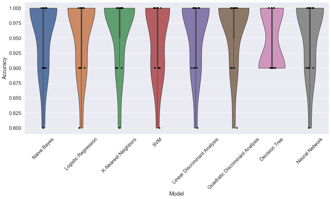
Comparing Algorithms
Which algorithm is best? We’ll test them all.
The perceptron model will be much worse than the others and it will distort a graph of the results, so I won’t include it.
models = []
models.append(('Naive Bayes', GaussianNB()))
models.append(('Logistic Regression', LogisticRegression(C=46.41588833612773)))
models.append(('K-Nearest Neighbors', KNeighborsClassifier()))
models.append(('SVM', SVC(kernel='rbf')))
models.append(('Linear Discriminant Analysis', LinearDiscriminantAnalysis()))
models.append(('Quadratic Discriminant Analysis', QuadraticDiscriminantAnalysis()))
models.append(('Decision Tree', DecisionTreeClassifier()))
#models.append(('Perceptron', Perceptron(max_iter=5)))
models.append(('Neural Network', mlp_grid.best_estimator_))
To get a fair estimate of which is the best model, we’ll break the model into a bunch of testing and training sets, and see which one works best overall.
# Create empty lists to store results
names = []
results = []

# Iterate through the models
iterations = 15
for name, model in models:
    kfold = model_selection.KFold(n_splits=iterations, shuffle=True, random_state=0)
    # Use the standardized data for all models
    cross_val = model_selection.cross_val_score(model, X_std, y, cv=kfold)
    names.append([name]*iterations)
    results.append(cross_val)
# flatten the lists
flat_names = [item for sublist in names for item in sublist]
flat_results = [item for sublist in results for item in sublist]
# Build a pandas dataframe
df = pd.DataFrame({'Model' : list(flat_names), 'Accuracy' : list(flat_results)})
fig, ax = plt.subplots()
fig.set_size_inches(18,8)
plt.xticks(rotation=45)
sns.violinplot(x='Model', y='Accuracy', data=df, cut=0)
ax = sns.stripplot(x='Model', y='Accuracy', data=df, color="black", jitter=0.1, size=5)