
How long do you have to read or watch Australian news before there’s any mention of the Northern Territory? Or someone living here, from here, or even anyone who’s ever been here? It shouldn’t take that long, but I assure you, it does. The truth is, the NT is mostly absent from national conversation that occurs in nationwide newspapers, telecasts, and the like. Why is that?
A geographic map does nothing to explain this. The Northern Territory of Australia looms large, appearing as an equal peer to the states. That scale makes sense—the territory covers the combined areas of France, Germany, and the U.K. with room to spare. But a geographic map misleads more than it elucidates. In reality, the Northern Territory has little impact on Australian politics, business, or sports. Land mass is a fine place to start, but for questions of culture, economics, and influence, it is irrelevant. What’s not seen in a geographic map is the actual population. Here the imbalance between the states and territories becomes striking. So how can we change the map to better explain Australian culture?
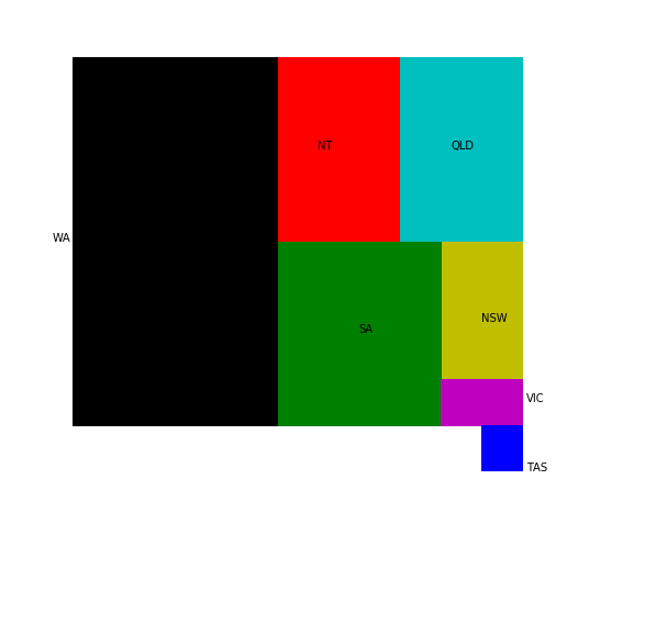
To explore this question, I’ve made two maps. The first should look roughly familiar, except that the intricate Australian coasts have been reduced to straight lines for ease of use.
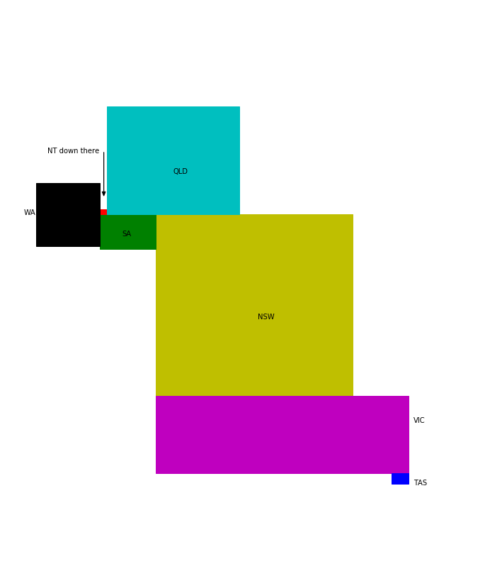
For the second map, I’ve adjusted the size of the territories based on their population. Australia is dominated by Queensland, New South Wales, and Victoria. The Northern Territory is tiny. While this map has no relation to the geographic realities of Australia, I think it’s actually more accurate to look at this map when you consider how Australia works.
Click here to see the code.