
Proper evaluations are underrated in machine learning. The choice of evaluation metric can dramatically influence the perceived performance of a model. The wrong metric can cover up an error that needs to be fixed.
In this post, I want to talk about two common ML metrics: Receiver Operating Characteristic (ROC) curves and Precision-Recall (PR) curves. This post aims to both demonstrate what they are, and explain why I prefer PR curves over ROC curves in most cases.
The Importance of Evaluation Metrics
At the heart of model evaluation lies a simple question: “How well does my model perform?” Evaluation metrics serve as the lens through which we view and interpret the performance of our models. The choice of the right metric is thus not merely a technicality but a foundational step in the modeling process.
Overview of ROC and PR Curves
ROC and PR curves are graphical representations that offer insights into the classification capabilities of a model across different thresholds. While both are used extensively in binary classification problems, they come from different theoretical underpinnings and provide unique perspectives on model performance.
-
ROC Curves: The ROC curve is a plot that displays the trade-off between the true positive rate (TPR) and the false positive rate (FPR) at various threshold settings. The area under the ROC curve (AUC-ROC) provides a single measure of overall model performance. The beauty of the ROC curve lies in its ability to present model performance across all classification thresholds, making it a robust tool for model comparison.
-
PR Curves: On the other hand, the PR curve focuses on the relationship between precision (the ratio of true positives to all positive predictions) and recall (the ratio of true positives to all actual positives). The area under the PR curve (AUC-PR) becomes particularly informative in scenarios with imbalanced datasets or when the cost of false positives is high.
While both metrics offer valuable insights, they are not interchangeable. The choice between ROC and PR curves can significantly affect how model performance is interpreted and reported.
Theoretical Background
Understanding the theoretical underpinnings of Receiver Operating Characteristic (ROC) curves and Precision-Recall (PR) curves is helpful for appreciating their applications and nuances in model evaluation. This section dives deep into the definitions, components, and interpretations of both curves.
Understanding ROC Curves
Definition and Explanation
The ROC curve illustrates the diagnostic ability of a binary classifier system as its discrimination threshold is varied. The curve is created by plotting the True Positive Rate (TPR) against the False Positive Rate (FPR) at various threshold settings.
-
True Positive Rate (TPR), also known as sensitivity, measures the proportion of actual positives that are correctly identified by the model.
-
False Positive Rate (FPR), is the proportion of actual negatives that are incorrectly classified as positives.
The ROC curve demonstrates the trade-off between sensitivity and specificity (1 - FPR) as the threshold is adjusted. The closer the curve follows the left-hand border and then the top border of the ROC space, the more accurate the test.
Area Under the ROC Curve (AUC-ROC)
The AUC-ROC metric provides a single value summarizing the overall performance of a classification model across all thresholds. An AUC of 1 indicates a perfect model, while an AUC of 0.5 suggests no discriminative power, akin to random guessing.
Understanding PR Curves
Definition and Explanation
Precision-Recall curves offer a different perspective, focusing on the relationship between precision (the ratio of true positives to all positive predictions) and recall (the same as TPR in the ROC curve context).
-
Precision measures the accuracy of the positive predictions made by the model, indicating the quality of the positive class predictions.
-
Recall, identical to TPR, measures the model’s ability to detect all actual positives.
The PR curve is particularly useful in scenarios with imbalanced datasets or when the focus is on the positive class’s predictive performance.
Area Under the PR Curve (AUC-PR)
Similar to the AUC-ROC, the area under the PR curve provides a single measure to summarize the model’s performance. High area values indicate both high recall and high precision, where high precision relates to a low false positive rate, and high recall relates to a low false negative rate.
Comparison Between ROC and PR Curves
While both ROC and PR curves are valuable tools for evaluating model performance, their applicability and informativeness can vary depending on the specific circumstances of the classification problem at hand.
Preferred Situations for ROC Curves
ROC curves are particularly useful when the datasets are balanced or when the costs of false positives and false negatives are roughly equivalent.
Preferred Situations for PR Curves
PR curves are more informative than ROC curves for imbalanced datasets or when the cost of false positives is high relative to false negatives. They provide a more nuanced view of the model’s ability to identify the positive class accurately.
Impact of Class Imbalance
In highly imbalanced datasets, the ROC curve can present an overly optimistic view of the model’s performance by inflating the true positive rate. In contrast, the PR curve, which focuses on the positive class, offers a more accurate reflection of the model’s predictive capabilities in such scenarios.
Understanding the theoretical distinctions between ROC and PR curves is crucial for correctly interpreting their implications for model performance. The choice between using a ROC or a PR curve depends on the specific characteristics of the problem being addressed, including the dataset’s balance and the relative costs of different types of errors. This knowledge forms the basis for the practical demonstrations and critical insights that follow, empowering you to make informed decisions in your machine learning endeavors.
Practical Demonstration with Python
In this section, we’ll demonstrate how to compute and plot Receiver Operating Characteristic (ROC) and Precision-Recall (PR) curves using Python. We’ll use a synthetic dataset for simplicity, but the methods apply to any binary classification dataset. Our goal is to provide practical insights into the differences between ROC and PR curves through hands-on coding examples.
import numpy as np
from sklearn.datasets import make_classification
from sklearn.model_selection import train_test_split
from sklearn.linear_model import LogisticRegression
from sklearn.metrics import roc_curve, auc, precision_recall_curve, average_precision_score
import matplotlib.pyplot as plt

# Generate a synthetic binary classification dataset
X, y = make_classification(n_samples=1000, n_features=20, n_classes=2, random_state=42)

# Split dataset into training and test sets
X_train, X_test, y_train, y_test = train_test_split(X, y, test_size=0.25, random_state=42)
Model Training
We’ll use a simple logistic regression model for demonstration. The focus is on the evaluation, so the choice of model is kept straightforward:
# Initialize and train the logistic regression model
model = LogisticRegression(random_state=42)
model.fit(X_train, y_train)
LogisticRegression(random_state=42)In a Jupyter environment, please rerun this cell to show the HTML representation or trust the notebook.
On GitHub, the HTML representation is unable to render, please try loading this page with nbviewer.org.
LogisticRegression(random_state=42)
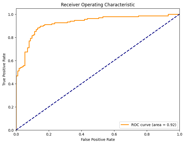
Calculating Metrics and Plotting ROC Curve
Let’s calculate the metrics needed for the ROC curve and plot it:
# Predict probabilities
y_probs = model.predict_proba(X_test)

# Compute ROC curve
fpr, tpr, thresholds = roc_curve(y_test, y_probs[:, 1])
roc_auc = auc(fpr, tpr)

# Plot ROC curve
plt.figure(figsize=(8, 6))
plt.plot(fpr, tpr, color='darkorange', lw=2, label='ROC curve (area = %0.2f)' % roc_auc)
plt.plot([0, 1], [0, 1], color='navy', lw=2, linestyle='--')
plt.xlim([0.0, 1.0])
plt.ylim([0.0, 1.05])
plt.xlabel('False Positive Rate')
plt.ylabel('True Positive Rate')
plt.title('Receiver Operating Characteristic')
plt.legend(loc="lower right")
plt.show()
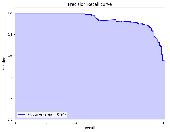
# Compute PR curve
precision, recall, _ = precision_recall_curve(y_test, y_probs[:, 1])
average_precision = average_precision_score(y_test, y_probs[:, 1])

# Plot PR curve
plt.figure(figsize=(8, 6))
plt.plot(recall, precision, color='blue', lw=2, label='PR curve (area = %0.2f)' % average_precision)
plt.fill_between(recall, precision, step='post', alpha=0.2, color='blue')
plt.xlabel('Recall')
plt.ylabel('Precision')
plt.ylim([0.0, 1.05])
plt.xlim([0.0, 1.0])
plt.title('Precision-Recall curve')
plt.legend(loc="lower left")
plt.show()
Example: When to Prefer ROC Curve
It’s commonly said that you might want to use ROC curves when the dataset is balanced and you care equally about false positives and false negatives. I think both PR and ROC curves work well in this case, so it isn’t a big factor for me.
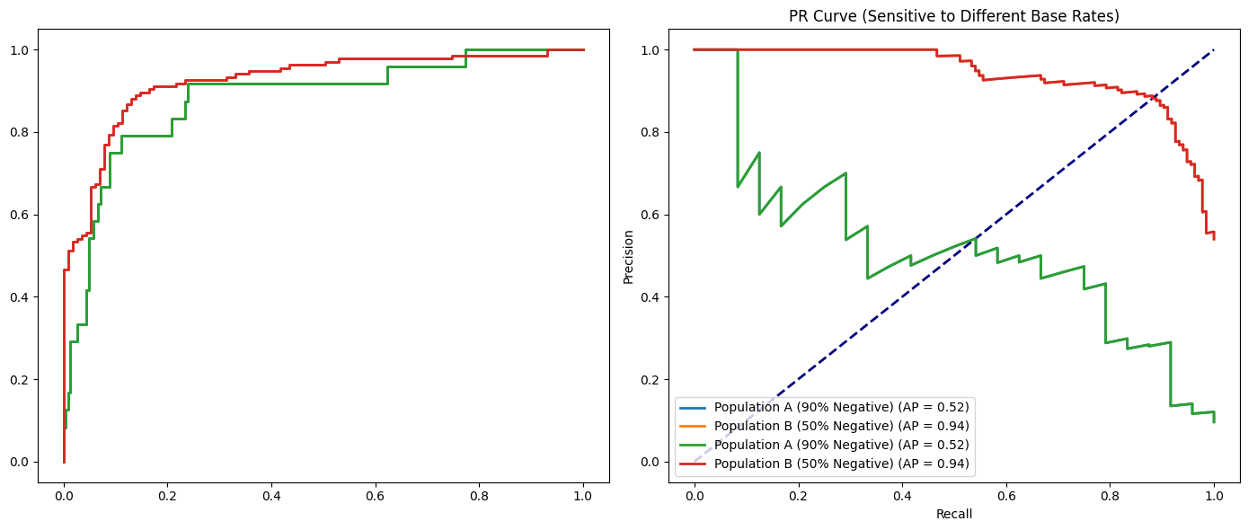
I think a better time is when you’re comparing results from different populations. For example, say you’ve run an experiment where the true positive percentage is half the population, and in another where it’s 1/10th the population. The PR curves will look different, but the ROC curves will look the same. In this case, you might want to use the ROC curves.
import numpy as np
import matplotlib.pyplot as plt
from sklearn.datasets import make_classification
from sklearn.linear_model import LogisticRegression
from sklearn.metrics import (
    roc_curve,
    precision_recall_curve,
    roc_auc_score,
    average_precision_score
)
from sklearn.model_selection import train_test_split

# Function to train model and plot curves
def plot_roc_pr_curves(X_train, X_test, y_train, y_test, label):
    # Train a logistic regression classifier
    model = LogisticRegression(solver='liblinear', random_state=42)
    model.fit(X_train, y_train)

    # Get predicted probabilities
    y_probs = model.predict_proba(X_test)[:, 1]

    # Compute ROC curve and AUC-ROC
    fpr, tpr, _ = roc_curve(y_test, y_probs)
    auc_roc = roc_auc_score(y_test, y_probs)

    # Compute PR curve and Average Precision
    precision, recall, _ = precision_recall_curve(y_test, y_probs)
    avg_precision = average_precision_score(y_test, y_probs)

    # Plot ROC curve
    plt.subplot(1, 2, 1)
    plt.plot(fpr, tpr, lw=2, label=f'{label} (AUC = {auc_roc:.2f})')

    # Plot PR curve
    plt.subplot(1, 2, 2)
    plt.plot(recall, precision, lw=2, label=f'{label} (AP = {avg_precision:.2f})')

# Generate Population A (90% negative, 10% positive)
X_A, y_A = make_classification(n_samples=1000, n_features=20, n_classes=2,
                               weights=[0.9, 0.1], random_state=42)
X_train_A, X_test_A, y_train_A, y_test_A = train_test_split(X_A, y_A, test_size=0.25, random_state=42)

# Generate Population B (50% negative, 50% positive)
X_B, y_B = make_classification(n_samples=1000, n_features=20, n_classes=2,
                               weights=[0.5, 0.5], random_state=42)
X_train_B, X_test_B, y_train_B, y_test_B = train_test_split(X_B, y_B, test_size=0.25, random_state=42)

# Plotting the ROC and PR curves for both populations
plt.figure(figsize=(14, 6))

# Plot ROC curves
plt.subplot(1, 2, 1)
plot_roc_pr_curves(X_train_A, X_test_A, y_train_A, y_test_A, label='Population A (90% Negative)')
plot_roc_pr_curves(X_train_B, X_test_B, y_train_B, y_test_B, label='Population B (50% Negative)')
plt.plot([0, 1], [0, 1], color='navy', lw=2, linestyle='--')
plt.xlabel('False Positive Rate')
plt.ylabel('True Positive Rate')
plt.title('ROC Curve (More Stable Across Populations)')
plt.legend(loc="lower right")

# Plot PR curves
plt.subplot(1, 2, 2)
plot_roc_pr_curves(X_train_A, X_test_A, y_train_A, y_test_A, label='Population A (90% Negative)')
plot_roc_pr_curves(X_train_B, X_test_B, y_train_B, y_test_B, label='Population B (50% Negative)')
plt.xlabel('Recall')
plt.ylabel('Precision')
plt.title('PR Curve (Sensitive to Different Base Rates)')
plt.legend(loc="lower left")

plt.tight_layout()
plt.show()
# Generate a balanced dataset
X_bal, y_bal = make_classification(n_samples=1000, n_features=20, n_classes=2,
                                   weights=[0.5, 0.5], random_state=42)

# Split into training and test sets
X_train_bal, X_test_bal, y_train_bal, y_test_bal = train_test_split(X_bal, y_bal, test_size=0.25, random_state=42)

# Train the model on balanced dataset
model_bal = LogisticRegression(solver='liblinear', random_state=42)
model_bal.fit(X_train_bal, y_train_bal)

# Predict probabilities for the balanced dataset
y_probs_bal = model_bal.predict_proba(X_test_bal)

# Compute metrics for ROC curve
fpr_bal, tpr_bal, _ = roc_curve(y_test_bal, y_probs_bal[:, 1])
roc_auc_bal = auc(fpr_bal, tpr_bal)

# Compute metrics for PR curve
precision_bal, recall_bal, _ = precision_recall_curve(y_test_bal, y_probs_bal[:, 1])
average_precision_bal = average_precision_score(y_test_bal, y_probs_bal[:, 1])

# Plotting both ROC and PR curves
fig, ax = plt.subplots(1, 2, figsize=(16, 6))

# ROC Curve
ax[0].plot(fpr_bal, tpr_bal, color='darkorange', lw=2, label='ROC curve (area = %0.2f)' % roc_auc_bal)
ax[0].plot([0, 1], [0, 1], color='navy', lw=2, linestyle='--')
ax[0].set_xlim([0.0, 1.0])
ax[0].set_ylim([0.0, 1.05])
ax[0].set_xlabel('False Positive Rate')
ax[0].set_ylabel('True Positive Rate')
ax[0].set_title('ROC Curve for a Balanced Dataset')
ax[0].legend(loc="lower right")

# PR Curve
ax[1].plot(recall_bal, precision_bal, color='blue', lw=2, label='PR curve (area = %0.2f)' % average_precision_bal)
ax[1].fill_between(recall_bal, precision_bal, step='post', alpha=0.2, color='blue')
ax[1].set_xlabel('Recall')
ax[1].set_ylabel('Precision')
ax[1].set_ylim([0.0, 1.05])
ax[1].set_xlim([0.0, 1.0])
ax[1].set_title('Precision-Recall Curve for a Balanced Dataset')
ax[1].legend(loc="lower left")

plt.show()
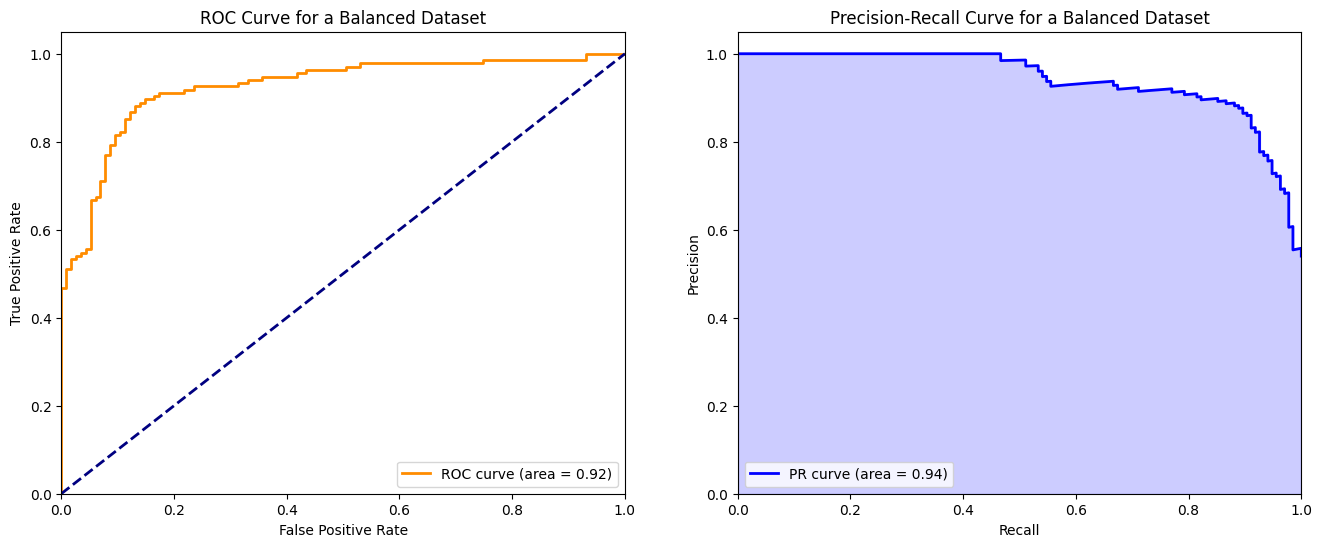
I very rarely use ROC curves though because in real life, data sets are almost never perfectly balanced.
Example: When to Prefer PR Curve
Scenario: You’re tasked with improving the precision of a spam detection model in an email application where the majority of emails are not spam (i.e., the negative class is much larger than the positive class). In this case, the cost of misclassifying a good email as spam (false positive) is high, and you’re particularly interested in the model’s ability to precisely identify spam emails.
For this scenario, let’s simulate an imbalanced dataset where the PR curve provides more insights due to the class imbalance and the higher cost associated with false positives.
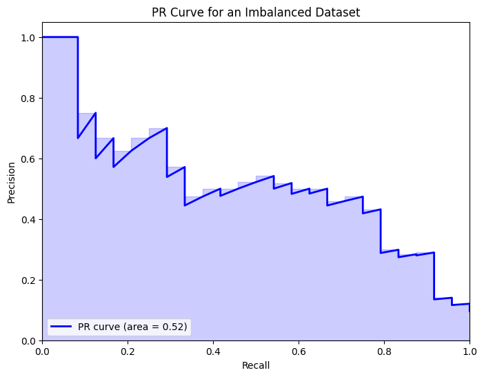
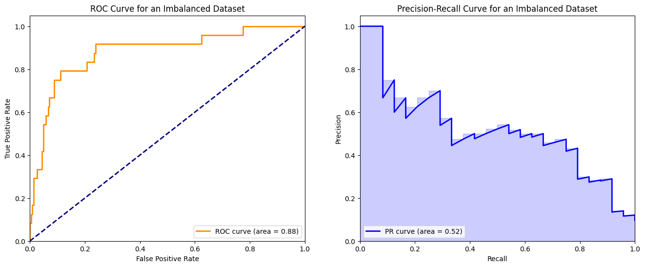
After training our model on the imbalanced dataset, as outlined earlier, we’ll compute and plot both the ROC and PR curves. The aim is to highlight the ROC curve’s shortcomings and the PR curve’s strengths in dealing with imbalanced datasets.
# Generate an imbalanced dataset
X_imbalanced, y_imbalanced = make_classification(n_samples=1000, n_features=20, n_classes=2, weights=[0.9, 0.1], random_state=42)

# Split into training and test sets
X_train_imb, X_test_imb, y_train_imb, y_test_imb = train_test_split(X_imbalanced, y_imbalanced, test_size=0.25, random_state=42)

# Train the model
model_imb = LogisticRegression(solver='liblinear', random_state=42)
model_imb.fit(X_train_imb, y_train_imb)

# Predict probabilities
y_probs_imb = model_imb.predict_proba(X_test_imb)

# Compute PR curve and AUC-PR
precision_imb, recall_imb, _ = precision_recall_curve(y_test_imb, y_probs_imb[:, 1])
average_precision_imb = average_precision_score(y_test_imb, y_probs_imb[:, 1])

# Plot PR curve
plt.figure(figsize=(8, 6))
plt.plot(recall_imb, precision_imb, color='blue', lw=2, label='PR curve (area = %0.2f)' % average_precision_imb)
plt.fill_between(recall_imb, precision_imb, step='post', alpha=0.2, color='blue')
plt.xlabel('Recall')
plt.ylabel('Precision')
plt.ylim([0.0, 1.05])
plt.xlim([0.0, 1.0])
plt.title('PR Curve for an Imbalanced Dataset')
plt.legend(loc="lower left")
plt.show()
# Predict probabilities for the imbalanced dataset
y_probs_imb = model_imb.predict_proba(X_test_imb)

# Compute metrics for ROC curve
fpr_imb, tpr_imb, _ = roc_curve(y_test_imb, y_probs_imb[:, 1])
roc_auc_imb = auc(fpr_imb, tpr_imb)

# Compute metrics for PR curve
precision_imb, recall_imb, _ = precision_recall_curve(y_test_imb, y_probs_imb[:, 1])
average_precision_imb = average_precision_score(y_test_imb, y_probs_imb[:, 1])

# Plotting both ROC and PR curves
fig, ax = plt.subplots(1, 2, figsize=(16, 6))

# ROC Curve
ax[0].plot(fpr_imb, tpr_imb, color='darkorange', lw=2, label='ROC curve (area = %0.2f)' % roc_auc_imb)
ax[0].plot([0, 1], [0, 1], color='navy', lw=2, linestyle='--')
ax[0].set_xlim([0.0, 1.0])
ax[0].set_ylim([0.0, 1.05])
ax[0].set_xlabel('False Positive Rate')
ax[0].set_ylabel('True Positive Rate')
ax[0].set_title('ROC Curve for an Imbalanced Dataset')
ax[0].legend(loc="lower right")

# PR Curve
ax[1].plot(recall_imb, precision_imb, color='blue', lw=2, label='PR curve (area = %0.2f)' % average_precision_imb)
ax[1].fill_between(recall_imb, precision_imb, step='post', alpha=0.2, color='blue')
ax[1].set_xlabel('Recall')
ax[1].set_ylabel('Precision')
ax[1].set_ylim([0.0, 1.05])
ax[1].set_xlim([0.0, 1.0])
ax[1].set_title('Precision-Recall Curve for an Imbalanced Dataset')
ax[1].legend(loc="lower left")

plt.show()
Analysis
ROC Curve: Despite the significant class imbalance, the ROC curve may still appear optimistic, potentially misleading evaluators about the model’s true performance. The high AUC-ROC could suggest a high ability to distinguish between classes when, in reality, the model’s performance on the minority class (positive class) might not be as strong as implied.
PR Curve: Contrarily, the PR curve provides a more realistic picture of the model’s performance, especially regarding its ability to identify the positive class amidst a large number of negative instances. The PR curve is more sensitive to the model’s performance on the minority class, making it a better choice for evaluation in imbalanced dataset scenarios.
Important Considerations
Understanding the PR Curve Baseline
One crucial difference between ROC and PR curves that’s often overlooked is their baseline for a random classifier.
For ROC curves, the baseline is always the diagonal line from (0,0) to (1,1), representing a random classifier with AUC = 0.5. This baseline is constant regardless of class distribution.
For PR curves, the baseline depends on the positive class proportion (prevalence). A random classifier would have precision equal to the prevalence at all recall levels. So for a dataset with 10% positives, the random baseline is a horizontal line at precision = 0.1, not 0.5.
This is why PR curves are more informative for imbalanced datasets: the baseline itself reflects the difficulty of the problem. A model that looks “good” on a PR curve has genuinely learned something useful about the positive class.
# Use the imbalanced dataset from before (90% negative, 10% positive)
prevalence = y_test_imb.mean()  # Proportion of positives

# Plot PR curve with proper baseline
plt.figure(figsize=(10, 6))
plt.plot(recall_imb, precision_imb, color='blue', lw=2, label='Model PR curve (AP = %0.2f)' % average_precision_imb)
plt.fill_between(recall_imb, precision_imb, step='post', alpha=0.2, color='blue')

# Add the random classifier baseline
plt.axhline(y=prevalence, color='red', linestyle='--', lw=2, label=f'Random baseline (prevalence = {prevalence:.2f})')

plt.xlabel('Recall')
plt.ylabel('Precision')
plt.ylim([0.0, 1.05])
plt.xlim([0.0, 1.0])
plt.title('PR Curve with Random Classifier Baseline')
plt.legend(loc="upper right")
plt.show()

print(f"Positive class prevalence: {prevalence:.2%}")
print(f"A random classifier would have precision ≈ {prevalence:.2%} at all recall levels")
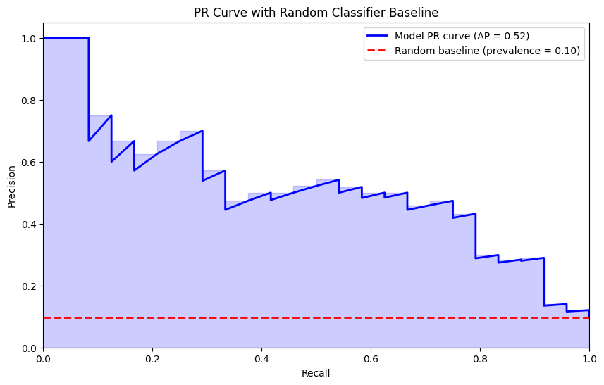
Positive class prevalence: 9.60%
A random classifier would have precision ≈ 9.60% at all recall levels
Selecting an Operating Threshold
ROC and PR curves show performance across all thresholds, but in practice you need to pick one. Here are common approaches:
For ROC curves - Youden’s J statistic:
- J = TPR - FPR (equivalently: Sensitivity + Specificity - 1)
- The optimal threshold maximizes J, finding the point furthest from the diagonal
- Good when you want to balance sensitivity and specificity
For PR curves - F1-optimal threshold:
- F1 = 2 × (Precision × Recall) / (Precision + Recall)
- The optimal threshold maximizes F1 score
- Good when you care about the harmonic mean of precision and recall
Other considerations:
- Business constraints may dictate a minimum precision or recall
- Cost-sensitive thresholds weight false positives and false negatives differently
- In medical diagnosis, you might prioritize high recall (catch all cases) over precision
# Finding optimal thresholds

from sklearn.metrics import f1_score

# Get thresholds from both curves
fpr_imb, tpr_imb, roc_thresholds = roc_curve(y_test_imb, y_probs_imb[:, 1])
precision_imb, recall_imb, pr_thresholds = precision_recall_curve(y_test_imb, y_probs_imb[:, 1])

# Youden's J statistic for ROC curve
j_scores = tpr_imb - fpr_imb
best_roc_idx = np.argmax(j_scores)
best_roc_threshold = roc_thresholds[best_roc_idx]

# F1 score for PR curve (need to handle the extra element in precision/recall arrays)
f1_scores = 2 * (precision_imb[:-1] * recall_imb[:-1]) / (precision_imb[:-1] + recall_imb[:-1] + 1e-10)
best_pr_idx = np.argmax(f1_scores)
best_pr_threshold = pr_thresholds[best_pr_idx]

print(f"Optimal threshold (Youden's J): {best_roc_threshold:.3f}")
print(f"  - TPR at this threshold: {tpr_imb[best_roc_idx]:.3f}")
print(f"  - FPR at this threshold: {fpr_imb[best_roc_idx]:.3f}")
print(f"  - Youden's J: {j_scores[best_roc_idx]:.3f}")
print()
print(f"Optimal threshold (F1): {best_pr_threshold:.3f}")
print(f"  - Precision at this threshold: {precision_imb[best_pr_idx]:.3f}")
print(f"  - Recall at this threshold: {recall_imb[best_pr_idx]:.3f}")
print(f"  - F1 score: {f1_scores[best_pr_idx]:.3f}")
Optimal threshold (Youden's J): 0.145
  - TPR at this threshold: 0.792
  - FPR at this threshold: 0.111
  - Youden's J: 0.681

Optimal threshold (F1): 0.194
  - Precision at this threshold: 0.474
  - Recall at this threshold: 0.750
  - F1 score: 0.581
Connection to F1 Score
The F1 score is the harmonic mean of precision and recall:
\[F1 = 2 \times \frac{Precision \times Recall}{Precision + Recall}\]This makes the PR curve directly relevant to F1 optimization. Each point on a PR curve corresponds to a specific F1 score, and you can visualize F1 iso-curves (curves of constant F1) on the PR plot.
The PR curve tells you the best possible F1 score your model can achieve (by finding the point that maximizes it). This is often more actionable than AUC-PR because F1 is a metric people actually use in production.
Calibration Caveat
An important limitation of both ROC and PR curves: they tell you nothing about probability calibration.
A model can have excellent AUC-ROC and AUC-PR while producing poorly calibrated probabilities. Calibration refers to whether predicted probabilities match actual frequencies. For example, among all predictions where the model outputs 0.7, do roughly 70% of them turn out to be positive?
Why this matters:
- If you need to combine predictions with other information (e.g., cost-benefit analysis), you need calibrated probabilities
- Uncalibrated probabilities can mislead stakeholders about confidence levels
- Threshold selection becomes unreliable with poor calibration
Recommendation: After evaluating with ROC/PR curves, always check calibration separately using:
- Calibration curves (reliability diagrams)
- Brier score
- Expected Calibration Error (ECE)
If calibration is poor, consider using Platt scaling or isotonic regression to calibrate your model’s outputs.
Final Thoughts
Summary: When to Use Each Curve
| Consideration | ROC Curve | PR Curve |
|---|---|---|
| Class balance | Balanced datasets | Imbalanced datasets |
| Primary focus | Overall discrimination | Positive class performance |
| Baseline | Always 0.5 (constant) | Equals prevalence (varies) |
| Cross-population comparison | More stable | Sensitive to base rate changes |
| Optimizing for | Sensitivity/Specificity trade-off | Precision/Recall (F1) trade-off |
My Recommendation
For most real-world problems, I recommend starting with PR curves because:
- Real data is rarely balanced - Most interesting classification problems involve rare events (fraud, disease, churn, etc.)
- The baseline is honest - PR curves don’t let you hide behind a favorable random baseline
- Direct connection to F1 - PR curves connect directly to F1 score, which is often what you’ll report anyway
- Focus on what matters - Usually we care more about finding positives correctly than about the negative class
Use ROC curves when:
- You genuinely have balanced data
- You’re comparing the same model across populations with different prevalences
- Both classes are equally important to classify correctly
And always remember: neither curve tells you about calibration. Check that separately!