
This notebook takes off from Visualize Parts of Speech 1, which ended with a visualization from a single text. In this notebook, we look at how to visually compare the part of speech usage in many texts.
import os
import re
from urllib import request

import get_gutenberg
import matplotlib
import matplotlib.pyplot as plt
import nltk
import pandas as pd
We’re going to use the class for gathering text we made previously.
books = [get_gutenberg.Book('Frankenstein', 'http://www.gutenberg.org/cache/epub/84/pg84.txt', 500),
         get_gutenberg.Book('Great Expectations', 'http://www.gutenberg.org/files/1400/1400-0.txt', 885),
         get_gutenberg.Book('A Tale of Two Cities', 'https://www.gutenberg.org/files/98/98-0.txt', 2400),
         get_gutenberg.Book('Pride and Prejudice', 'https://www.gutenberg.org/files/1342/1342-0.txt', 1200),
         get_gutenberg.Book("Alice's Adventures in Wonderland", 'https://www.gutenberg.org/files/11/11-0.txt', 1200),
         get_gutenberg.Book('Oliver Twist', 'http://www.gutenberg.org/cache/epub/730/pg730.txt', 500)]
# We'll grab this function from the Part of Speech notebook
def pos_plotter(parts_of_speech):
    '''This function inputs a specific list of lists that is shown in the Part of Speech notebook'''
    all_labels = ['common_nouns', 'verbs', 'adjectives', 'pronouns', 'adverbs', 'proper_nouns', 'conjunctions', 'prepositions', 'interjections', 'modals']
    pos_dict = dict(zip(all_labels, parts_of_speech))
    labels = []
    data = []
    for pos, lst in pos_dict.items():
        if lst:
            data.append(len(lst))
            labels.append(pos)
    fig1, ax1 = plt.subplots()
    ax1.pie(data, labels=labels)
    ax1.axis('equal')  # Equal aspect ratio ensures that pie is drawn as a circle.
    plt.show()
titles = []
for book in books:
    titles.append(book.title)
print(titles)
['Frankenstein', 'Great Expectations', 'A Tale of Two Cities', 'Pride and Prejudice', "Alice's Adventures in Wonderland", 'Oliver Twist']
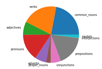
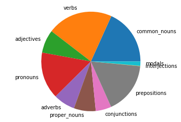
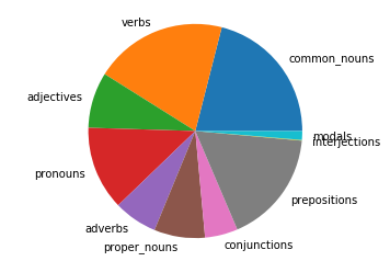
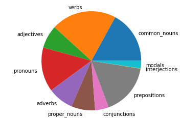
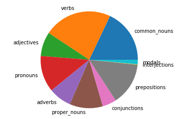
for book in books:
    pos_plotter(book.pos)
Frankenstein file already exists
Extracting text from file
Great Expectations file already exists
Extracting text from file
A Tale of Two Cities file already exists
Extracting text from file
Pride and Prejudice file already exists
Extracting text from file
Alice's Adventures in Wonderland file already exists
Extracting text from file
Oliver Twist file already exists
Extracting text from file
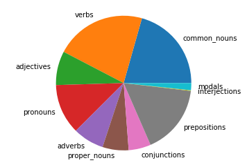
It is not easy to compare the relative part of speech usage using pie charts. A better way would be to make a horizontal bar chart for each book and then stack them vertically to compare. Let’s try that.
# We'll grab this function from the Part of Speech notebook
import matplotlib.pyplot as plt
def pos_plotter2(parts_of_speech):
    '''This function inputs a specific list of lists that is shown in the Part of Speech notebook'''
    all_labels = ['common_nouns', 'verbs', 'adjectives', 'pronouns', 'adverbs', 'proper_nouns', 'conjunctions', 'prepositions', 'interjections', 'modals']
    pos_dict = dict(zip(all_labels, parts_of_speech))
    labels=[]
    data=[]
    for pos, lst in pos_dict.items():
        if lst:
            data.append(len(lst))
            labels.append(pos)
    fig1, ax1 = plt.subplots()
    ax1.bar(data, labels=labels)
    ax1.axis('equal')  # Equal aspect ratio ensures that pie is drawn as a circle.
    plt.show()
nouns = []
verbs = []
adjectives = []
pronouns = []
adverbs = []
conjunctions = []
prepositions = []
interjections = []
modals = []
for book in books:
    nouns.append(len(book.pos[0]) + len(book.pos[5])) # common + proper
    verbs.append(len(book.pos[1]) + len(book.pos[9])) # verbs + modals
    adjectives.append(len(book.pos[2]))
    pronouns.append(len(book.pos[3]))
    adverbs.append(len(book.pos[4]))
    conjunctions.append(len(book.pos[6]))
    prepositions.append(len(book.pos[7]))
    interjections.append(len(book.pos[8]))
# Now let's put everything in a pandas dataframe
df = pd.DataFrame({'nouns': nouns, 'verbs': verbs, 'adjectives': adjectives, 'pronouns': pronouns, 'adverbs': adverbs,
                   'conjunctions': conjunctions, 'prepositions': prepositions, 'interjections': interjections})
df_norm = df.div(df.sum(axis=1), axis='index')
df_norm.head()
| nouns | verbs | adjectives | pronouns | adverbs | conjunctions | prepositions | interjections | |
|---|---|---|---|---|---|---|---|---|
| 0 | 0.246683 | 0.224138 | 0.075597 | 0.154036 | 0.065970 | 0.059315 | 0.173450 | 0.000812 |
| 1 | 0.253488 | 0.228029 | 0.075317 | 0.152568 | 0.070661 | 0.051144 | 0.167822 | 0.000970 |
| 2 | 0.287067 | 0.214025 | 0.084292 | 0.126739 | 0.065866 | 0.049669 | 0.171285 | 0.001057 |
| 3 | 0.248096 | 0.235704 | 0.075024 | 0.144551 | 0.083393 | 0.044378 | 0.167871 | 0.000983 |
| 4 | 0.290086 | 0.241904 | 0.080600 | 0.121415 | 0.076145 | 0.046469 | 0.141839 | 0.001542 |
We’ll need a function that will help convert the axes to percentages. Let’s make that now.
fig, ax = plt.subplots()
fig.set_size_inches(12, 12)
matplotlib.rcParams.update({'font.size': 18})

df_norm.plot.barh(stacked=True, ax=ax)

ax.set_title("Parts of speech usage in famous novels")

# Shrink current axis by 20%
box = ax.get_position()
ax.set_position([box.x0, box.y0, box.width * 0.8, box.height])

# Add book titles
ax.set_yticklabels(titles, minor=False)
# Put a legend to the right of the current axis
ax.legend(loc='center left', bbox_to_anchor=(1, 0.5))

plt.show()
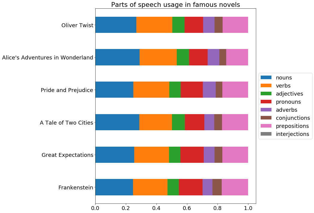
It looks like there’s a fair amount of consistency among famous authors in their part of speech distribution. This means it could be an effective tool for determining poor writing - if some text is significantly different in part of speech distribution, this could be a sign of poor writing.