
This post is an introduction to principal component analysis (PCA). It was originally written to accompany a presentation to the NOVA Deep Learning Meetup.
Table of Contents
Visualizing highly dimensional data
Data scientists routinely deal with data with lots of dimensions, including datasets with tens, hundreds, or even thousands of features. This presents an interesting set of challenges for data exploration. One of the best ways to approach a dataset is by visualizing it, but how can you visualize a dataset with so many dimensions? One way would be with a pairplot, which is made easy in Python by using the seaborn library. But there’s a limit to how much that scales.
Plotting every pair in a dataset with f features would result in \({f\choose 2}= \frac{f(f-1)}{2}\) features. If we had 100 features, that would be 4950 different plots, each of which contain only 2% of the data. Clearly, this is not going to work.
But just because the dataset has so many features doesn’t mean that all the features are equally important. Very often only a few of the features contain a disproportionate amount of the relevant signal. The key to extracting this signal is to find a way to capture as much of the variance of the data in as few dimensions as possible. This is where principal component analysis comes in. Principal component analysis, or PCA, is a technique to transform that highly dimensional dataset into a lower dimensional dataset while minimizing the loss of information. The goal of PCA is to find a linear combination of the f features that represent the most variance.
Principal component analysis overview
PCA is an important tool in statistical analysis and machine learning. Although it is commonly used to reduce the number of dimensions so that the data can be visualized, it serves other purposes as well. Many machine learning algorithms suffer from the curse of dimensionality, and reducing the number of dimensions is one possible approach to solve this. For example, k-nearest neighbors is a great algorithm but suffers considerably with highly-dimensional datasets. Preprocessing the data with PCA can remedy that.
PCA is, by itself, an unsupervised machine learning method because we are transforming the input X1, …, Xn without reference to a set of labels Y. However, it can be used on both supervised and unsupervised learning problems.
Let’s look at a simple example.
import numpy as np
import matplotlib.pyplot as plt
import random
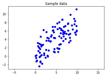
We’ll generate some sample data and take a look at it. To illustrate, we’ll start with two-dimensional data and try to reduce that to one dimension. This is a simple example, but the techniques work with any number of dimensions.
np.random.seed(0)
x = 10 * np.random.rand(100)
y = 0.75 * x + 2 * np.random.randn(100)
fig, ax = plt.subplots()
ax.axis('equal')
plt.scatter(x,y, c='b')
plt.title("Sample data");
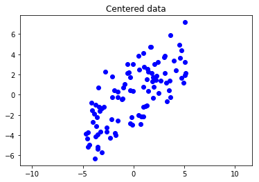
First, we center the data around \((0,0)\).
centered_x = x - np.mean(x)
centered_y = y - np.mean(y)
fig, ax = plt.subplots()
ax.axis('equal')
plt.scatter(centered_x, centered_y, c='b')
plt.title("Centered data");
Now, let’s put the data in a matrix. Then we can find the covariance matrix.
X = np.array(list(zip(centered_x, centered_y))).T
f'The matrix has a shape of {X.shape}'
'The matrix has a shape of (2, 100)'
Quick aside on covariance
Before we build our covariance matrix, let’s do a quick aside on covariance. Covariance is a measure of how much two variables vary together. For example, human height and weight have high covariance, while height and favorite color have no covariance. Price and demand for a good have negative covariance (except for Giffen and Veblen goods). The covariance of two random variables \(x\), \(y\) is
\[\sigma(x,y) = \frac{1}{n-1}\sum_{i=1}^{n}(x_i-\bar{x})(y_i-\bar{y})\]Covariance is very similar to correlation in that they’re both measurements of the relationship between variables. Covariance isn’t normalized in any way, thus it could be any value from \(-\infty\) to \(\infty\). This makes it hard to compare covariances. That’s where correlation comes in, which is scaled to be a value between -1 and 1. Unlike covariance, correlation is dimensionless, which allows it to be compared against other correlations.
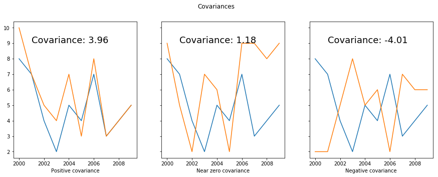
Let’s look at a quick example. Say we want to pick a stock that will allow us to hedge against the stock market. That is, we want a stock with a negative covariance with the overall market. We’ll plot how the different stocks have varied compared with the overall stock market.
num_samples = 10
np.random.seed(0)
random.seed(0)
start_year = 2000
years = range(start_year, start_year+num_samples)
stock_market = np.array(random.choices(range(10), k=num_samples))
stock_a = stock_market + np.round(np.random.normal(scale=1, size=num_samples))
stock_b = np.array(random.choices(range(10), k=num_samples))
stock_c = 10-1*(stock_market + np.round(np.random.normal(scale=1, size=num_samples)))
def cov(x, y):
    return np.sum((x-x.mean())*(y-y.mean()))/(len(x)-1)
fig, axs = plt.subplots(nrows=1, ncols=3, sharey=True, figsize=(15, 5))
axs[0].plot(years, stock_market)
axs[0].plot(years, stock_a)
axs[0].set_xlabel("Positive covariance")
axs[0].text(2001,9,'Covariance: ' + str(round(cov(stock_market, stock_a), 2)), fontsize=18)
axs[1].plot(years, stock_market)
axs[1].plot(years, stock_b)
axs[1].set_xlabel("Near zero covariance")
axs[1].text(2001,9,'Covariance: ' + str(round(cov(stock_market, stock_b), 2)), fontsize=18)
axs[2].plot(years, stock_market)
axs[2].plot(years, stock_c)
axs[2].set_xlabel("Negative covariance")
axs[2].text(2001,9,'Covariance: ' + str(round(cov(stock_market, stock_c), 2)), fontsize=18)
fig.suptitle("Covariances");
Covariance matrices
We use the covariance to calculate the entries in a covariance matrix. The covariance matrix is a symmetric square matrix where \(C_{i,j} = \sigma(x_i, x_j)\). This means that the diagonals are \(C_{i,i} = \sigma(x_i, x_i)\), which is just the variance of that variable. If we put our data into a matrix \(X\in\mathbb{R}^{n×d}\), we can calculate the covariance matrix with \(C = \frac{XX^T}{n-1}\)
In Python, you can do matrix multiplication with the @ symbol.
def covariance_matrix(X):
    n = X.shape[1]
    return (X @ X.T) / (n-1)
Back to PCA
Now that we’ve talked about covariance, let’s go back to our sample dataset and calculate the covariance matrix.
cov_mat = covariance_matrix(X)
cov_mat
array([[8.39573893, 6.19090878],
       [6.19090878, 8.57494881]])
Now we extract the eigenvalues and eigenvectors from the matrix.
e_vals, e_vecs = np.linalg.eig(cov_mat)
print("Eigenvalues: ", e_vals)
print("Eigenvectors: ", e_vecs)
Eigenvalues:  [ 2.29378667 14.67690107]
Eigenvectors:  [[-0.71220507 -0.70197147]
 [ 0.70197147 -0.71220507]]
How do we know which eigenvector is which principal component? For that, we look to the eigenvalues. The square root of the eigenvalue tells us the magnitude of that axis, so the higher eigenvalue will correspond to the first principal component.
Let’s find the first principal component.
sorted_vals = sorted(e_vals, reverse=True)
index = [sorted_vals.index(v) for v in e_vals]
i = np.argsort(index)
sorted_vecs = e_vecs[:,i]
Now we extract the principal components.
pc1 = sorted_vecs[:, 0]
pc2 = sorted_vecs[:, 1]
The loadings are the eigenvectors weighted by the square root of the eigenvalues.
\[Loadings = Eigenvectors \sqrt{Eigenvalues}\]Let’s find those.
loading1 = np.sqrt(sorted_vals[0]) * pc1
loading2 = np.sqrt(sorted_vals[1]) * pc2
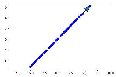
Now we’ll plot the original data along with the first principal component. The first principal component is in the direction of the most variance of the data, so it should go up and to the right along with the data. Note that the direction (which end the arrow is pointing) of the principal component doesn’t matter, so down and to the left would be correct as well.
scale_factor = -2
fig, ax = plt.subplots()
ax.plot(X[0,:], X[1,:], 'bo')
ax.arrow(0, 0, scale_factor*loading1[0], scale_factor*loading1[1], head_width=0.8)
ax.axis('equal')
plt.title('First principal component')
plt.show()
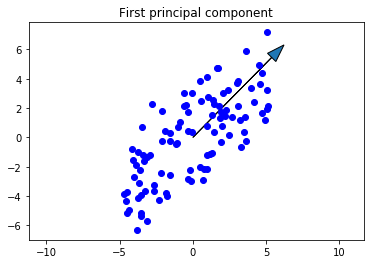
This is exactly what we were looking for. Now let’s project the data onto the first principal component.
proj_mat = pc1.reshape(2,1) @ pc1.reshape(1,2)
X_projected = proj_mat @ X
fig, ax = plt.subplots()
ax.plot(X_projected[0,:], X_projected[1,:],'bo')
ax.arrow(0, 0, scale_factor*loading1[0], scale_factor*loading1[1], head_width=0.8)
ax.axis('equal')
plt.show()
We clearly have a lot of the variance, but not all of it. How much did we lose? Let’s calculate how much of the variance can be explained with this projection.
var_exp1 = sorted_vals[0]/sum(sorted_vals)
f'We explained {var_exp1:.1%} of the variance using only the first principal component.'
'We explained 86.5% of the variance using only the first principal component.'
We have both principal components, so just to check our work, let’s plot the second and see that it makes sense. It should be:
- Smaller in magnitude than the first
- Orthogonal to the first principal component
- In the direction of the maximum remaining variance
scale_factor = -2
fig, ax = plt.subplots()
ax.plot(X[0,:], X[1,:], 'bo')
ax.arrow(0, 0, scale_factor*loading1[0], scale_factor*loading1[1], head_width=0.8)
ax.arrow(0, 0, scale_factor*loading2[0], scale_factor*loading2[1], head_width=0.8)
ax.axis('equal')
plt.title('Both principal components')
plt.show()
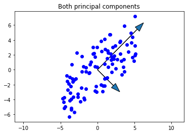
Looks good!