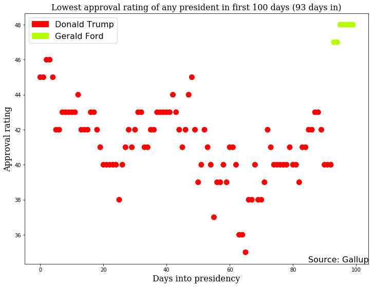
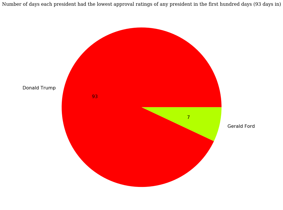
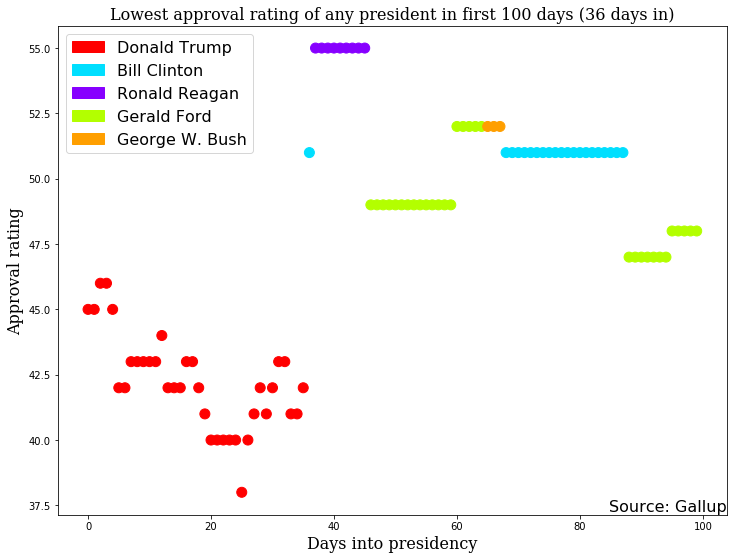
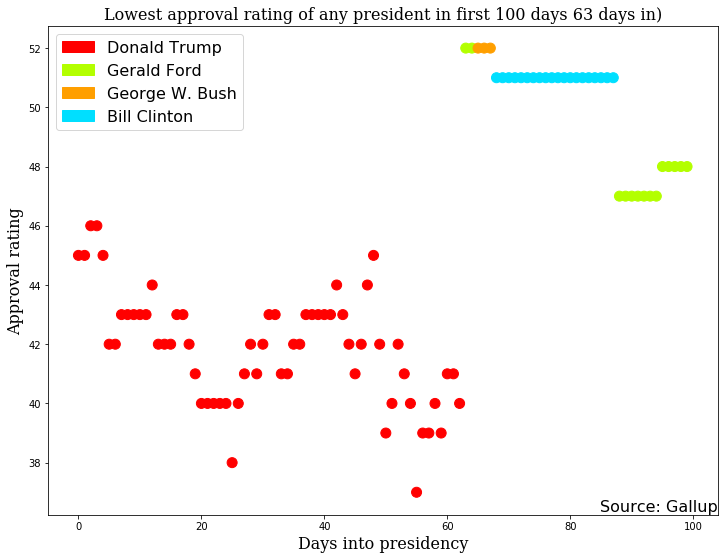
I was curious which presidents have had the lowest approval rating at different times in their presidencies. For example, which president had the lowest approval rating on the first day of their presidency? What about the tenth or fiftieth day? I wanted to make a chart that showed lowest approval rating for each day in office, and which president that approval rating was associated with.
This notebook shows all the code required to do that.
import os
from datetime import datetime
from collections import Counter
import pandas as pd
import matplotlib.patches as mpatches
import matplotlib.pyplot as plt
from matplotlib import font_manager as fm
Here’s the path to all the data. The data were copied from http://www.presidency.ucsb.edu/data/popularity.php and saved as tsv files. The first Gallup poll for this question was on 07/22/1941, which was in FDR’s third term, so FDR has not been included.
djt_path = os.getcwd() + '/data/djt.tsv'
bho_path = os.getcwd() + '/data/bho.tsv'
gwb_path = os.getcwd() + '/data/gwb.tsv'
wjc_path = os.getcwd() + '/data/wjc.tsv'
ghwb_path = os.getcwd() + '/data/ghwb.tsv'
rwr_path = os.getcwd() + '/data/rwr.tsv'
jec_path = os.getcwd() + '/data/jec.tsv'
grf_path = os.getcwd() + '/data/grf.tsv'
rmn_path = os.getcwd() + '/data/rmn.tsv'
lbj_path = os.getcwd() + '/data/lbj.tsv'
jfk_path = os.getcwd() + '/data/jfk.tsv'
dde_path = os.getcwd() + '/data/dde.tsv'
hst_path = os.getcwd() + '/data/hst.tsv'
Now let’s read in all the data.
djt = pd.read_table(djt_path)
bho = pd.read_table(bho_path)
gwb = pd.read_table(gwb_path)
wjc = pd.read_table(wjc_path)
ghwb = pd.read_table(ghwb_path)
rwr = pd.read_table(rwr_path)
jec = pd.read_table(jec_path)
grf = pd.read_table(grf_path)
rmn = pd.read_table(rmn_path)
lbj = pd.read_table(lbj_path)
jfk = pd.read_table(jfk_path)
dde = pd.read_table(dde_path)
hst = pd.read_table(hst_path)
Let’s make a list of all the president’s names.
presidents = [djt, bho, gwb, wjc, ghwb, rwr, jec, grf, rmn, lbj, jfk, dde, hst]

# And we'll need a list of their names
president_names = [
    "Donald Trump",
    "Barack Obama",
    "George W. Bush",
    "Bill Clinton",
    "George H.W. Bush",
    "Ronald Reagan",
    "Jimmy Carter",
    "Gerald Ford",
    "Richard Nixon",
    "Lyndon Johnson",
    "John F. Kennedy",
    "Dwight Eisenhower",
    "Harry Truman",
]
There are extra columns in the dataframe that we won’t use, so let’s remove them.
for x in range(len(presidents)):
    del presidents[x]['President']
    del presidents[x]['Unnamed: 3']
We’ll need their inauguration dates.
inauguration_dates = [
    "01/20/2017",
    "01/20/2009",
    "01/20/2001",
    "01/20/1993",
    "01/20/1989",
    "01/20/1981",
    "01/20/1977",
    "08/09/1974",
    "01/20/1969",
    "11/22/1963",
    "01/20/1961",
    "01/20/1953",
    "04/12/1945",
]
Now let’s add a column that contains the number of days into their administration. We’ll need a helper function to make the dates easier to work with.
def conv(date):
    return datetime.strptime(date, '%m/%d/%Y')
Let’s find how many days into the administration each poll represents.
for x in range(len(presidents)):
    presidents[x]["time_in_admin"] = presidents[x]["Start Date"].apply(conv) - conv(
        inauguration_dates[x]
    )
    # Now let's extract the actual value
    presidents[x]["days_in_admin"] = presidents[x]["time_in_admin"].apply(
        lambda row: row.days
    )
Polls are not conducted every day. Let’s build a function to find the most recent poll numbers for a given day if there are no poll number for that day.
def find_closest_date(array, value):
    """Find the closest date that a poll was released."""
    for x in range(len(array)):
        if array[x] <= value:
            # We want to return x, but we want to make sure there are more
            # polls
            if x == 0:
                # Only return the value if it is exact
                if array[x] == value:
                    return x
                else:
                    break
            return x
OK, build a function that extracts the minimum and maximum approval rating from a list of all presidents. Note that I’m not actually using the max part here.
def get_min_max(day):
    min_approval = 100  # Set values that will easily be beaten
    max_approval = 0
    for x in range(len(presidents)):
        closest = find_closest_date(presidents[x]['days_in_admin'], day)
        #print("{pres}'s approval rating on his {day}th day was {rating}".format(pres=president_names[x], day=day, rating=presidents[x]['Approving'][closest]))
        if not closest:
            continue
        if presidents[x]['Approving'][closest] < min_approval:
            min_approval = presidents[x]['Approving'][closest]
            min_president = president_names[x]
        if presidents[x]['Approving'][closest] > max_approval:
            max_approval = presidents[x]['Approving'][closest]
            max_president = president_names[x]
    return min_president, min_approval, max_president, max_approval
A full eight years is around 2920 days (excluding leap years). I’m just going to focus on the first 100 days.
num_days = 100
Now let’s find which president had the lowest approval rating for each day.
min_pres = []
min_value = []
max_pres = []
max_value = []
all_lists = [min_pres, min_value, max_pres, max_value]
for x in range(num_days):
    values = get_min_max(x)
    for x, lst in zip(values, all_lists):
        lst.append(x)
Let’s make a list of a color for each president from Trump to Truman.
all_colors = [
    "#FF0000",
    "#0000FF",
    "#FF9F00",
    "#00DFFF",
    "#FF00CF",
    "#8700FF",
    "#FFFF00",
    "#B3FF00",
    "#A70053",
    "#01A129",
    "#003EB5",
    "#00EC00",
    "#000000",
]
Now let’s combine the names with the colors in a dictionary.
colordict = {}
for p, c in zip(president_names, all_colors):
    colordict[p] = c
We’re going to need a list of colors by day. Let’s make that now.
min_colors = [colordict[min_pres] for min_pres in min_pres]
To reduce clutter, we’re only going to label presidents who are on the graph. Let’s grab those colors and patches.
graph_patches = []
graph_colors = []
for pres in Counter(min_pres).keys():
    graph_colors.append(colordict[pres])
    graph_patches.append(mpatches.Patch(color=colordict[pres], label=pres))
OK, now let’s graph this.
a = range(num_days)

# Let's make the plot big
# Get current size
fig_size = plt.rcParams["figure.figsize"]
# Set figure width to 12 and height to 9
fig_size[0] = 12
fig_size[1] = 9
plt.rcParams["figure.figsize"] = fig_size

plt.scatter(a, min_value, color=min_colors, s=100)  # s is the size
plt.legend(handles=graph_patches, prop={'size': 16})

font = {'family': 'serif',
        'color':  'k',
        'weight': 'normal',
        'size': 16,
        }

plt.title("Lowest approval rating of any president in first 100 days (36 days in)",
          fontdict=font)
plt.xlabel("Days into presidency", fontdict=font)
plt.ylabel("Approval rating", fontdict=font)
plt.annotate('Source: Gallup',
             xy=(1, 0),
             xycoords='axes fraction',
             fontsize=16,
             horizontalalignment='right',
             verticalalignment='bottom')
plt.show()
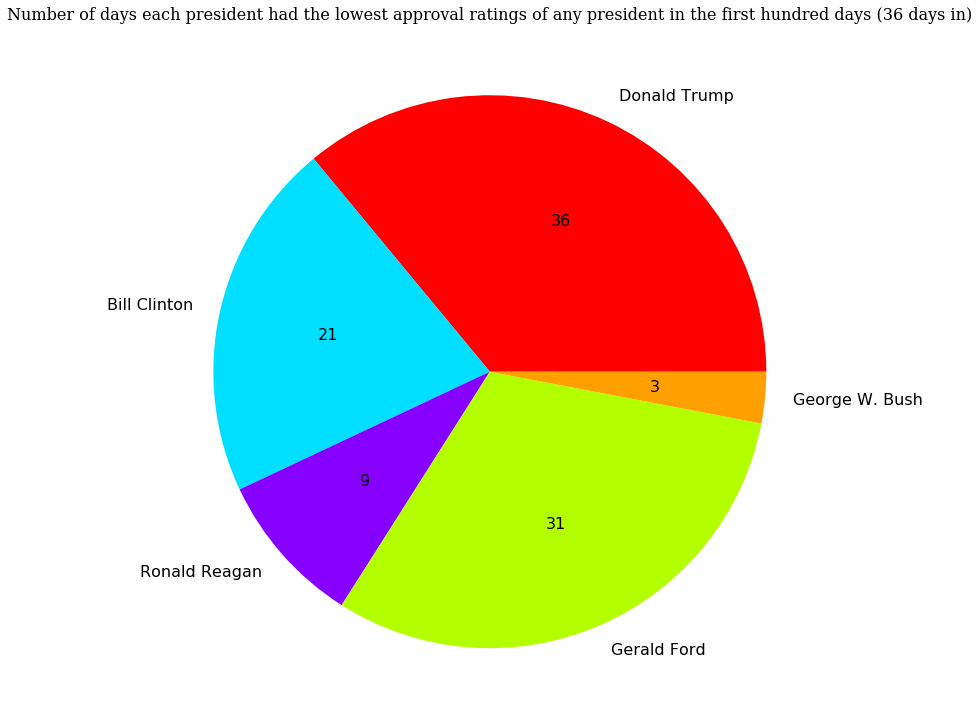
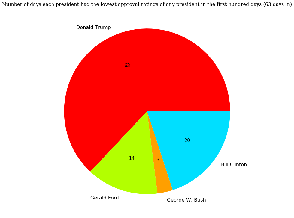
OK, now let’s make a pie chart that shows the total number of days each president has had the lowest approval rating.
fig = plt.figure(1, figsize=(12, 12))
ax = fig.add_axes([0.1, 0.1, 0.8, 0.8])
plt.title("Number of days each president had the lowest approval ratings of any president in the first hundred days (36 days in)",
          fontdict=font)

labels = list(Counter(min_pres).keys())
values = list(Counter(min_pres).values())

patches, texts, autotexts = ax.pie(
    values, labels=labels, autopct="%1.f", colors=graph_colors)

proptease = fm.FontProperties()
proptease.set_size('16')
plt.setp(autotexts, fontproperties=proptease)
plt.setp(texts, fontproperties=proptease)

plt.show()
Update (63 days in):
Update 2 (93 days in):
