In this post I’m going to build on the last post on Working with US Census Bureau Data and discuss how to visualize it. That post walked through working with the Census Bureau’s API, so in this post I’ll skip those details.
Table of Contents
- Get a Population DataFrame
- Get Selected Population Profile
- Merge Them
- Plotting
- Mean Earnings for Workers
- Larger Graph
- Visualizing Percentage Differences
import os
import pandas as pd
import requests
import matplotlib.pyplot as plt
from matplotlib.patches import Patch
from matplotlib.ticker import FuncFormatter
API_KEY = os.getenv('CENSUS_API_KEY')
Get a Population DataFrame
We start by getting a dataframe of population data, like we showed in the last post. In this post, I’m going to be using 2023 data because it’s available for the tables I’m looking at.
year=2023
base_url = f"https://api.census.gov/data/{year}/acs/acs1/spp"
params = {
    "get": "POPGROUP,POPGROUP_LABEL",  # Request codes and labels
    "for": "us:1",                     # National level
    "key": API_KEY                     # Your API key
}
# Make the request
response = requests.get(base_url, params=params)

# Check if request was successful
response.raise_for_status()

# Parse JSON response
data = response.json()

# Create DataFrame from the response (skip header row)
popgroups_df = pd.DataFrame(data[1:], columns=data[0])

# Convert to appropriate data types
popgroups_df = popgroups_df.convert_dtypes()
popgroups_df
| POPGROUP | POPGROUP_LABEL | us | |
|---|---|---|---|
| 0 | 2675 | Native Village of Ekuk alone or in any combina... | 1 |
| 1 | 2680 | Native Village of Fort Yukon alone or in any c... | 1 |
| 2 | 2828 | Yakutat Tlingit Tribe alone or in any combination | 1 |
| 3 | 2779 | Salamatof Tribe alone or in any combination | 1 |
| 4 | 2799 | Tsimshian alone or in any combination | 1 |
| ... | ... | ... | ... |
| 5540 | 2311 | French Canadian/French American Indian alone | 1 |
| 5541 | 2318 | Heiltsuk Band alone | 1 |
| 5542 | 232 | United Houma Nation tribal grouping alone | 1 |
| 5543 | 2320 | Hiawatha First Nation alone | 1 | Selected
| 5544 | 2328 | Kahkewistahaw First Nation alone | 1 |
5545 rows × 3 columns
Get Selected Population Profile
Now let’s get the Selected Population Profile table.
def get_spp_table(year: int = 2023,
                  variables: str = "NAME,S0201_214E", # Default to median‑household‑income column
                  geography: str = "us:1",
                  api_key: str | None = None,
                  timeout: int = 20) -> pd.DataFrame:
    """
    Download the full ACS‑1‑year Selected Population Profile (S0201) table
    for all population groups at the chosen geography.
    """
    if api_key is None:
        api_key = os.getenv("CENSUS_API_KEY")
    if not api_key:
        raise ValueError("Census API key not provided (argument or CENSUS_API_KEY).")

    base_url = f"https://api.census.gov/data/{year}/acs/acs1/spp"

    # Wildcard for *all* population‑group strings — allowed for string predicates
    params = {
        "get": variables,
        "for": geography,
        "POPGROUP": "*",          # same as POPGROUP:* in query string
        "key": api_key
    }

    try:
        resp = requests.get(base_url, params=params, timeout=timeout)
        resp.raise_for_status()
        data = resp.json()
    except requests.exceptions.RequestException as e:
        raise RuntimeError(f"Census API request failed: {e}") from e
    except ValueError as e:
        raise RuntimeError(f"Unable to decode JSON: {e}") from e

    if not isinstance(data, list) or len(data) < 2:
        raise RuntimeError(f"Unexpected response format: {data}")

    # First row is the header
    df = pd.DataFrame(data[1:], columns=data[0])

    # POPGROUP is returned automatically because it’s a default‑display variable
    # Convert any numeric columns that arrive as text
    numeric_cols = [c for c in df.columns if c.endswith(("E", "EA"))]
    df[numeric_cols] = df[numeric_cols].apply(pd.to_numeric, errors="coerce")

    return df
df = get_spp_table(year=2023)
df
| NAME | S0201_214E | POPGROUP | us | |
|---|---|---|---|---|
| 0 | NaN | 77719 | 001 | 1 |
| 1 | NaN | 82531 | 002 | 1 |
| 2 | NaN | 81643 | 003 | 1 |
| 3 | NaN | 53927 | 004 | 1 |
| 4 | NaN | 55195 | 005 | 1 |
| ... | ... | ... | ... | ... |
| 363 | NaN | 81340 | 921 | 1 |
| 364 | NaN | 102394 | 930 | 1 |
| 365 | NaN | 141182 | 931 | 1 |
| 366 | NaN | 149067 | 932 | 1 |
| 367 | NaN | 50883 | 946 | 1 |
368 rows × 4 columns
Merge Them
Merge them.
mdf = pd.merge(df, popgroups_df, on='POPGROUP')
mdf.head(10)
| NAME | S0201_214E | POPGROUP | us_x | POPGROUP_LABEL | us_y | |
|---|---|---|---|---|---|---|
| 0 | NaN | 77719 | 001 | 1 | Total population | 1 |
| 1 | NaN | 82531 | 002 | 1 | White alone | 1 |
| 2 | NaN | 81643 | 003 | 1 | White alone or in combination with one or more... | 1 |
| 3 | NaN | 53927 | 004 | 1 | Black or African American alone | 1 |
| 4 | NaN | 55195 | 005 | 1 | Black or African American alone or in combinat... | 1 |
| 5 | NaN | 61061 | 006 | 1 | American Indian and Alaska Native alone | 1 |
| 6 | NaN | 65637 | 009 | 1 | American Indian and Alaska Native alone or in ... | 1 |
| 7 | NaN | 111817 | 012 | 1 | Asian alone | 1 |
| 8 | NaN | 105393 | 016 | 1 | Chinese alone | 1 |
| 9 | NaN | 108417 | 031 | 1 | Asian alone or in combination with one or more... | 1 |
df = mdf.drop(['NAME', 'us_x', 'us_y'], axis=1)
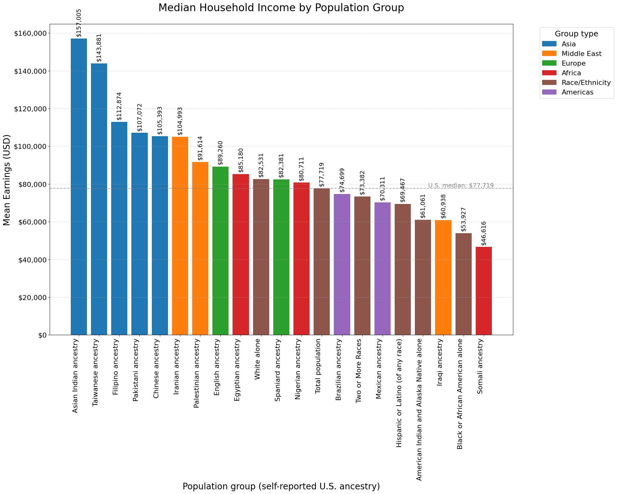
Plotting
# Define label groups
ethnicities = [
    'Total population', 'White alone', 'Black or African American alone',
    'Hispanic or Latino (of any race)', 'American Indian and Alaska Native alone',
    'Two or More Races'
]
asia = ['Taiwanese alone', 'Asian Indian alone', 'Pakistani alone', 'Chinese alone', 'Filipino alone']
europe = ['English', 'Spaniard']
americas = ['Brazilian', 'Mexican']
africa = ['Nigerian', 'Egyptian', 'Congolese', 'Somali']
me = ['Iranian', 'Iraqi', 'Palestinian']

labels = ethnicities + asia + europe + americas + africa + me

# Filter for just those groups
selected = df[df['POPGROUP_LABEL'].isin(labels)].copy()
# Region‐type map for coloring
region_map = {lbl: 'Race/Ethnicity'      for lbl in ethnicities}
region_map.update({lbl: 'Asia'       for lbl in asia})
region_map.update({lbl: 'Europe'     for lbl in europe})
region_map.update({lbl: 'Americas'   for lbl in americas})
region_map.update({lbl: 'Africa'     for lbl in africa})
region_map.update({lbl: 'Middle East'for lbl in me})
selected['GroupType'] = selected['POPGROUP_LABEL'].map(region_map)

# Build DisplayLabel (“… ancestry” for each ancestry group)
display_map = {}
for lbl in ethnicities:
    display_map[lbl] = lbl
for lbl in asia + europe + americas + africa + me:
    base = lbl[:-6] if lbl.endswith(' alone') else lbl
    display_map[lbl] = f"{base} ancestry"
selected['DisplayLabel'] = selected['POPGROUP_LABEL'].map(display_map)
# Sort descending by income
selected_sorted = selected.sort_values('S0201_214E', ascending=False)
# Choose a colormap (tab10 has at least 6 distinct colors)
palette = plt.get_cmap('tab10').colors

region_order = [
    'Asia',
    'Middle East',
    'Europe',
    'Africa',
    'Americas',
    'Race/Ethnicity',
]

# Build a stable color map
color_map = {
    region: palette[i]
    for i, region in enumerate(region_order)
}
def plot_helper(df,
                display_column,
                y_label='Median Household Income (USD)',
                title="Median Household Income by Selected Population Groups"):
    # Plot
    plt.rcParams.update({
        "axes.titlesize": 24,
        "axes.labelsize": 20,
        "xtick.labelsize": 16,
        "ytick.labelsize": 16,
        "legend.fontsize": 16,
    })

    fig, ax = plt.subplots(figsize=(20, 16))

    bars = ax.bar(
        df['DisplayLabel'],
        df[display_column],
        color=[color_map[gt] for gt in df['GroupType']]
    )

    # X-axis labels
    positions = range(len(df))
    ax.set_xticks(positions)
    ax.set_xticklabels(
        df['DisplayLabel'],
        rotation=90,
        ha='right'
    )

    # Axis labels & title
    ax.set_xlabel("Population group (self-reported U.S. ancestry)")
    ax.set_ylabel("Mean Earnings (USD)")
    ax.set_title(title, pad=30)

    # Format y-axis with commas
    ax.yaxis.set_major_formatter(FuncFormatter(lambda x, _: f"${int(x):,}"))

    # Annotate bars
    ax.bar_label(
        bars,
        labels=[f"${v:,}" for v in df[display_column]],
        padding=5,
        rotation=90,
        fontsize=14
    )

    # Grid lines
    ax.grid(axis='y', linestyle='--', alpha=0.5)

    # U.S. median reference line
    total_val = df.loc[
        df['POPGROUP_LABEL'] == 'Total population',
        display_column
    ].iloc[0]
    ax.axhline(total_val, linestyle='--', linewidth=1.5, alpha=0.7, color='gray')

    # Label the reference line at right edge
    n = len(df)
    ax.text(
        n - 0.5, total_val,
        f"U.S. median: ${total_val:,}",
        va='bottom', ha='right',
        fontsize=14, color='gray'
    )

    # Legend
    unique_gt = df['GroupType'].unique()
    handles = [Patch(color=color_map[gt], label=gt) for gt in unique_gt]
    ax.legend(
        handles=handles,
        title="Group type",
        title_fontsize=18,
        bbox_to_anchor=(1.05, 1),
        loc='upper left'
    )

    plt.tight_layout()

    # Save
    plt.savefig(
        'earnings_by_group_vertical.png',
        dpi=300,
        bbox_inches='tight'
    )
plot_helper(selected_sorted, 'S0201_214E', y_label='Mean Earnings (USD)', title="Median Household Income by Population Group")
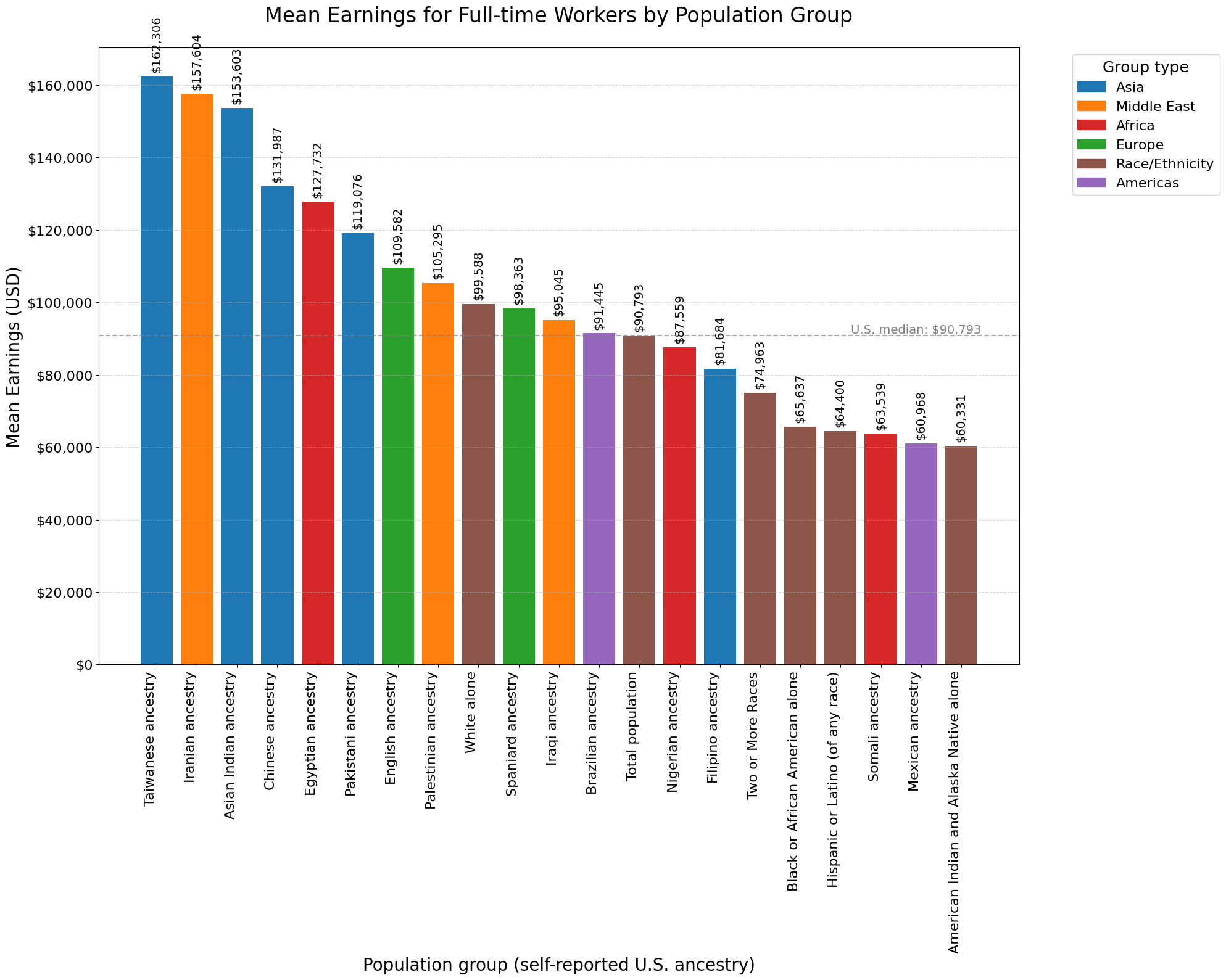
Mean Earnings for Workers
We could also look at mean earnings for workers.
We’re going to https://api.census.gov/data/2022/acs/acs1/spp/variables.xml to get the right variables. In this case, we want to look at “Mean earnings (dollars) for full-time, year-round workers”. This is split between male and female, so to get a single number you could take the average, or, better yet, the weighted average.
There are six different tables. Two are US-wide for individuals (male and female).
<var xml:id="S0201_239E" label="Estimate!!INCOME IN THE PAST 12 MONTHS (IN 2022 INFLATION-ADJUSTED DOLLARS)!!Individuals!!Mean earnings (dollars) for full-time, year-round workers:!!Female" concept="Selected Population Profile in the United States" predicate-type="int" group="S0201" limit="0" attributes="S0201_239EA,S0201_239M,S0201_239MA"/>

<var xml:id="S0201_238E" label="Estimate!!INCOME IN THE PAST 12 MONTHS (IN 2022 INFLATION-ADJUSTED DOLLARS)!!Individuals!!Mean earnings (dollars) for full-time, year-round workers:!!Male" concept="Selected Population Profile in the United States" predicate-type="int" group="S0201" limit="0" attributes="S0201_238EA,S0201_238M,S0201_238MA"/>
And two separate ones for Puerto Rico (also male and female):
<var xml:id="S0201PR_239E" label="Estimate!!INCOME IN THE PAST 12 MONTHS (IN 2022 INFLATION-ADJUSTED DOLLARS)!!Individuals!!Mean earnings (dollars) for full-time, year-round workers:!!Female" concept="Selected Population Profile in Puerto Rico" predicate-type="int" group="S0201PR" limit="0" attributes="S0201PR_239EA,S0201PR_239M,S0201PR_239MA"/>

<var xml:id="S0201PR_238E" label="Estimate!!INCOME IN THE PAST 12 MONTHS (IN 2022 INFLATION-ADJUSTED DOLLARS)!!Individuals!!Mean earnings (dollars) for full-time, year-round workers:!!Male" concept="Selected Population Profile in Puerto Rico" predicate-type="int" group="S0201PR" limit="0" attributes="S0201PR_238EA,S0201PR_238M,S0201PR_238MA"/>
And at the household level, we have US-wide and just in Puerto Rico.
<var xml:id="S0201_216E" label="Estimate!!INCOME IN THE PAST 12 MONTHS (IN 2022 INFLATION-ADJUSTED DOLLARS)!!Households!!With earnings!!Mean earnings (dollars)" concept="Selected Population Profile in the United States" predicate-type="int" group="S0201" limit="0" attributes="S0201_216EA,S0201_216M,S0201_216MA"/>

<var xml:id="S0201PR_216E" label="Estimate!!INCOME IN THE PAST 12 MONTHS (IN 2022 INFLATION-ADJUSTED DOLLARS)!!Households!!With earnings!!Mean earnings (dollars)" concept="Selected Population Profile in Puerto Rico" predicate-type="int" group="S0201PR" limit="0" attributes="S0201PR_216EA,S0201PR_216M,S0201PR_216MA"/>
mean_earnings_df = get_spp_table(year=2023, variables="NAME,S0201_238E")
Again, we’re going to merge our table with the popgroups table.
mean_earnings_mdf = pd.merge(mean_earnings_df, popgroups_df, on='POPGROUP')
mean_earnings_mdf.head()
| NAME | S0201_238E | POPGROUP | us_x | POPGROUP_LABEL | us_y | |
|---|---|---|---|---|---|---|
| 0 | NaN | 90793 | 001 | 1 | Total population | 1 |
| 1 | NaN | 99588 | 002 | 1 | White alone | 1 |
| 2 | NaN | 95957 | 003 | 1 | White alone or in combination with one or more... | 1 |
| 3 | NaN | 65637 | 004 | 1 | Black or African American alone | 1 |
| 4 | NaN | 66831 | 005 | 1 | Black or African American alone or in combinat... | 1 |
mean_earnings_df = mean_earnings_mdf.drop(['NAME', 'us_x', 'us_y'], axis=1)
mean_earnings_selected = mean_earnings_df[mean_earnings_df['POPGROUP_LABEL'].isin(labels)].copy()
mean_earnings_selected['GroupType'] = mean_earnings_selected['POPGROUP_LABEL'].map(region_map)
mean_earnings_selected['DisplayLabel'] = mean_earnings_selected['POPGROUP_LABEL'].map(display_map)
# Sort descending by income
mean_earnings_selected_sorted = mean_earnings_selected.sort_values('S0201_238E', ascending=False)
plot_helper(mean_earnings_selected_sorted, 'S0201_238E', y_label='Mean Earnings (USD)', title="Mean Earnings for Full-time Workers by Population Group")
Larger Graph
Let’s look at more groups. To do so, we’ll need to flip the graph to allow for more room.
# Define label groups
ethnicities = [
    'Total population', 'White alone', 'Black or African American alone',
    'Hispanic or Latino (of any race)', 'American Indian and Alaska Native alone',
    'Native Hawaiian and Other Pacific Islander alone', 'Some Other Race alone',
    'Two or More Races'
]

asia = [
    'Asian alone', 'Taiwanese alone', 'Asian Indian alone', 'Pakistani alone',
    'Chinese alone', 'Japanese alone', 'Korean alone', 'Vietnamese alone',
    'Filipino alone', 'Bangladeshi alone', 'Indonesian alone', 'Hmong alone',
    'Cambodian alone', 'Thai alone', 'Laotian alone',
    # +10 new
    'Sri Lankan alone', 'Nepalese alone', 'Bhutanese alone', 'Mongolian alone',
    'Tibetan alone', 'Kazakh alone', 'Uzbek alone', 'Kyrgyz alone',
    'Afghan alone', 'Malaysian alone'
]

europe = [
    'French (except Basque)', 'German', 'English', 'Spaniard', 'Italian',
    'Dutch', 'Swedish', 'Norwegian', 'Greek', 'Polish', 'Romanian',
    'Hungarian', 'Belgian',
    # +12 new
    'Russian', 'Ukrainian', 'Portuguese', 'Swiss', 'Austrian', 'Czech',
    'Bulgarian', 'Belarusian', 'Finnish', 'Irish', 'Scottish', 'Welsh'
]

americas = [
    'Brazilian', 'Mexican', 'Puerto Rican', 'Cuban', 'Dominican', 'Haitian',
    'Jamaican', 'Trinidadian and Tobagonian', 'Colombian', 'Venezuelan',
    'Peruvian', 'Chilean', 'Uruguayan', 'Bolivian', 'Ecuadorian',
    'Costa Rican', 'Guatemalan', 'Honduran', 'Salvadoran', 'Panamanian'
]

africa = [
    'Nigerian', 'Egyptian', 'Congolese', 'Nigerien', 'Malian', 'Botswana',
    'Kenya', 'Ethiopian', 'Ghanaian', 'Somali', 'Cabo Verdean',
    'South African', 'Moroccan', 'Algerian', 'Tunisian', 'Senegalese',
    'Ugandan', 'Sudanese', 'Rwandan', 'Cameroonian', 'Gabonese',
    'Zambian', 'Zimbabwean'
]

me = [
    'Iranian', 'Iraqi', 'Syrian', 'Lebanese', 'Jordanian', 'Turkish',
    'Palestinian',
    'Israeli', 'Saudi Arabian', 'Emirati', 'Qatari', 'Kuwaiti', 'Omani'
]

labels = ethnicities + asia + europe + americas + africa + me
# Filter to only selected labels
selected = df[df['POPGROUP_LABEL'].isin(labels)].copy()

# Map to group types for coloring
region_map = {lbl: 'Race/Ethnicity' for lbl in ethnicities}
region_map.update({lbl: 'Asia'       for lbl in asia})
region_map.update({lbl: 'Europe'     for lbl in europe})
region_map.update({lbl: 'Americas'   for lbl in americas})
region_map.update({lbl: 'Africa'     for lbl in africa})
region_map.update({lbl: 'Middle East'for lbl in me})
selected['GroupType'] = selected['POPGROUP_LABEL'].map(region_map)

# Build a display‐name map that adds “ancestry” to ancestry groups
display_map = {}

# Leave the broad race/ethnicity categories unchanged
for lbl in ethnicities:
    display_map[lbl] = lbl

# For everything else, strip any trailing " alone" then add " American"
for lbl in asia + europe + americas + africa + me:
    base = lbl[:-6] if lbl.endswith(' alone') else lbl
    display_map[lbl] = f"{base} ancestry"

# Apply it
selected['DisplayLabel'] = selected['POPGROUP_LABEL'].map(display_map)
Now let’s plot it.
# Sort so the largest value is at the top
selected_sorted = selected.sort_values('S0201_214E', ascending=True)

# Wide figure to prevent text and bars from overlapping
fig, ax = plt.subplots(figsize=(18, 20))

# Horizontal bars
bars = ax.barh(
    selected_sorted['DisplayLabel'],
    selected_sorted['S0201_214E'],
    color=[color_map[gt] for gt in selected_sorted['GroupType']]
)

# Labels & title
ax.set_xlabel('Median Household Income (USD)', fontsize=16)
ax.set_title('Median Household Income by Selected Population Groups (2023)', fontsize=20, pad=20)

# Format x-axis ticks with commas
ax.xaxis.set_major_formatter(FuncFormatter(lambda x, _: f"{int(x):,}"))

# Annotate each bar with value
ax.bar_label(
    bars,
    labels=[f"${v:,}" for v in selected_sorted['S0201_214E']],
    padding=6,
    fontsize=14
)

# Grid lines
ax.grid(axis='x', linestyle='--', alpha=0.5)
ax.tick_params(axis='y', labelsize=12)

# U.S. median reference line
total_val = selected_sorted.loc[
    selected_sorted['POPGROUP_LABEL'] == 'Total population',
    'S0201_214E'
].iloc[0]
ax.axvline(total_val, linestyle='--', color='gray', alpha=0.7)
ax.text(
    total_val,
    -2,
    f"U.S. median: ${total_val:,}",
    va='top', ha='left',
    fontsize=14, color='gray'
)

# Legend
unique_gt = selected_sorted['GroupType'].unique()
handles = [Patch(color=color_map[gt], label=gt) for gt in unique_gt]
ax.legend(
    handles=handles,
    title='Group Type',
    title_fontsize=16,
    fontsize=14,
    bbox_to_anchor=(1.05, 1),
    loc='upper left'
)

plt.tight_layout(rect=[0, 0, 0.85, 1])  # leave room for legend

# Save & display
plt.savefig(
    'median_income_by_group_horizontal.png',
    dpi=300,
    bbox_inches='tight'
)
plt.show()

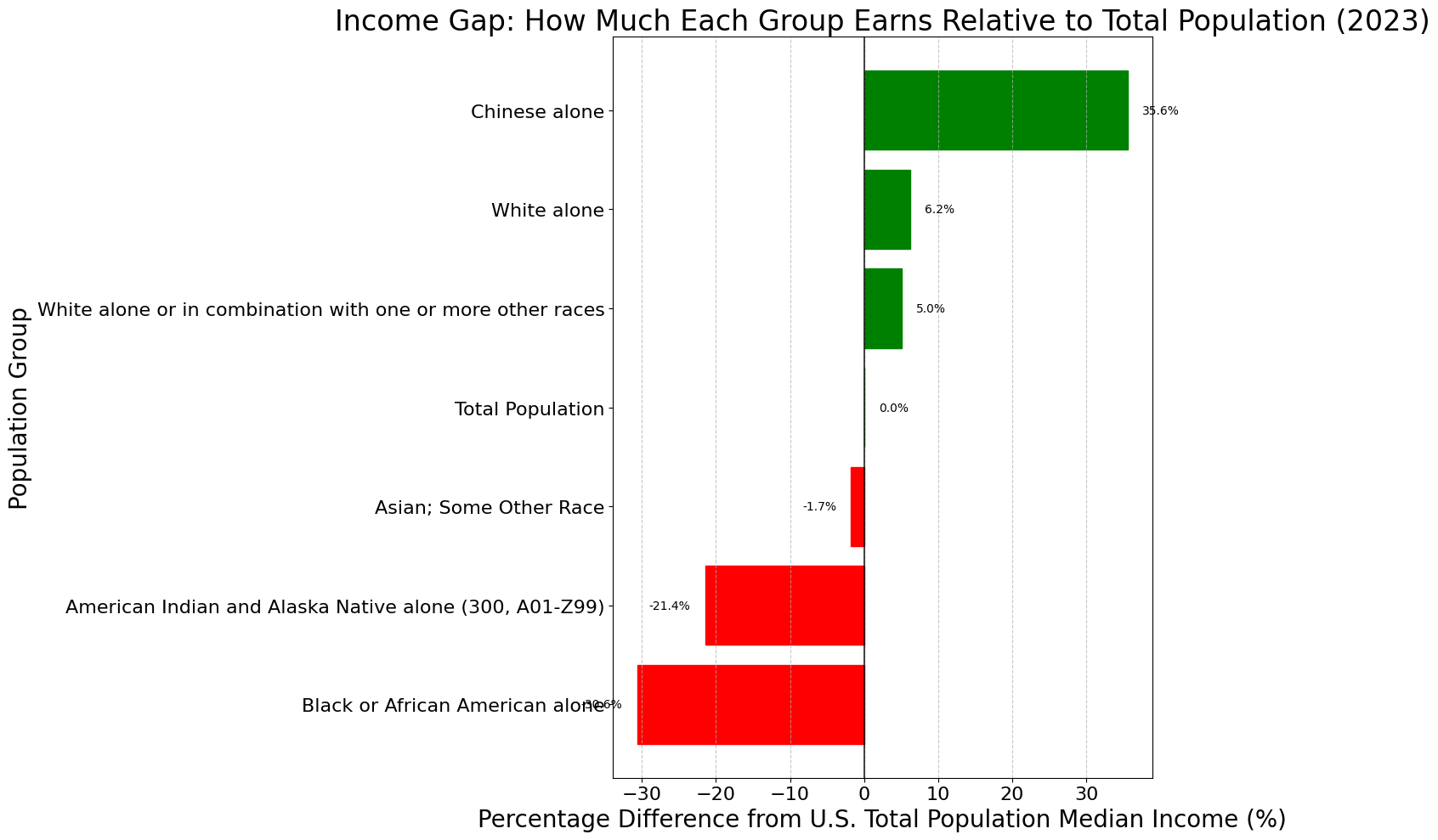
Visualizing Percentage Differences
YEAR     = 2023                                          # latest SPP with this slice
DATASET  = f"https://api.census.gov/data/{YEAR}/acs/acs1/spp"
FIELDS   = "NAME,S0201_214E,POPGROUP"                    # median household income + population group
URL      = (f"{DATASET}?get={FIELDS}"
            f"&for=us:1&key={API_KEY}")
resp = requests.get(URL, timeout=30)
rows = resp.json()

# Convert to pandas DataFrame
df = pd.DataFrame(rows[1:], columns=rows[0])
df['S0201_214E'] = pd.to_numeric(df['S0201_214E'], errors='coerce')
df.head()
| NAME | S0201_214E | POPGROUP | us | |
|---|---|---|---|---|
| 0 | United States | 77719 | 001 | 1 |
| 1 | United States | 82531 | 002 | 1 |
| 2 | United States | 81643 | 003 | 1 |
| 3 | United States | 53927 | 004 | 1 |
| 4 | United States | 55195 | 005 | 1 |
!curl -o census_popgroup_dict.py https://gist.githubusercontent.com/jss367/44e041c913f87a11b2830e01e295c241/raw/14423b1e2ffaad75afd641c81e7435065d2c43d6/gistfile1.txt
  % Total    % Received % Xferd  Average Speed   Time    Time     Time  Current
                                 Dload  Upload   Total   Spent    Left  Speed
100  6427  100  6427    0     0  16179      0 --:--:-- --:--:-- --:--:-- 16148
from census_popgroup_dict import code_to_population
df['population'] = df['POPGROUP'].apply(lambda x: code_to_population.get(str(x), "Unknown code"))
# Clean up
df = df[df['population'] != 'Unknown code']
df = df.drop_duplicates()
# Sort the dataframe by median income in descending order
df_sorted = df.sort_values('S0201_214E', ascending=False)

# Calculate income relative to total population
total_pop_income = df[df['POPGROUP'] == '001']['S0201_214E'].iloc[0]
df['income_ratio'] = df['S0201_214E'] / total_pop_income
df['percent_of_total'] = df['income_ratio'] * 100 - 100

# Create a simplified dataframe for better visualization
# Extract race/ethnicity categories (top level identifiers)
main_categories = ['001', '002', '003', '004', '006', '010', '013', '016', '019', '022', '023', '026', '029', '043', '046', '112', '118', '120', '125']
df_main = df[df['POPGROUP'].isin(main_categories)].copy()
df_main.head()
| NAME | S0201_214E | POPGROUP | us | population | income_ratio | percent_of_total | |
|---|---|---|---|---|---|---|---|
| 0 | United States | 77719 | 001 | 1 | Total Population | 1.000000 | 0.000000 |
| 1 | United States | 82531 | 002 | 1 | White alone | 1.061915 | 6.191536 |
| 2 | United States | 81643 | 003 | 1 | White alone or in combination with one or more... | 1.050490 | 5.048958 |
| 3 | United States | 53927 | 004 | 1 | Black or African American alone | 0.693872 | -30.612849 |
| 5 | United States | 61061 | 006 | 1 | American Indian and Alaska Native alone (300, ... | 0.785664 | -21.433626 |
# Income ratio compared to total population (as percentage difference)
plt.figure(figsize=(14, 10))
df_main_sorted = df_main.sort_values('percent_of_total')
bars = plt.barh(df_main_sorted['population'], df_main_sorted['percent_of_total'])

# Color bars based on whether they're above or below average
for i, bar in enumerate(bars):
    if df_main_sorted.iloc[i]['percent_of_total'] >= 0:
        bar.set_color('green')
    else:
        bar.set_color('red')

plt.axvline(x=0, color='black', linestyle='-', alpha=0.7)
plt.xlabel('Percentage Difference from U.S. Total Population Median Income (%)')
plt.ylabel('Population Group')
plt.title('Income Gap: How Much Each Group Earns Relative to Total Population (2023)')
plt.grid(axis='x', linestyle='--', alpha=0.7)

# Add percentage values as labels
for i, v in enumerate(df_main_sorted['percent_of_total']):
    text_color = 'black'
    plt.text(v + (2 if v >= 0 else -2), i, f'{v:.1f}%', va='center', ha='left' if v >= 0 else 'right', color=text_color)

plt.tight_layout()
plt.savefig('income_gap_percentage.png')
plt.show()