
In this post I want to make a few points about \(r\), the Pearson correlation coefficient, and \(R^2\), the coefficient of determination. They’re so widely used that I think some of the implicit assumptions behind them can become lost.
Table of Contents
- Variance Explained
- Defining R^2
- Why “Explained by \(X\)” Is Justified
- One Important Caveat
- Non-linear data
- So what is R² in the non-linear case?
- What about R itself?
- Important Note about Non-linearity
- Forcing through the origin
- Non-linear regression
- Adding more variables: R² can only go up
- R² depends on the range of your data
We’ll start with a simple linear example. Let’s generate some data.
import numpy as np
import pandas as pd
import matplotlib.pyplot as plt
import seaborn as sns
from scipy import stats
from sklearn.linear_model import LinearRegression
from sklearn.preprocessing import PolynomialFeatures
from sklearn.metrics import r2_score
from IPython.display import display, HTML, Markdown

plt.style.use('seaborn-v0_8-whitegrid')
np.random.seed(42)

# Helper function for consistent plotting
def setup_ax(ax, title, xlabel, ylabel):
    ax.set_title(title, fontsize=12, fontweight='bold')
    ax.set_xlabel(xlabel)
    ax.set_ylabel(ylabel)
np.random.seed(42)
n = 100

# Generate data with linear relationship
x = np.random.uniform(0, 10, n)
y = 2 + 3 * x + np.random.normal(0, 3, n)
plt.scatter(x,y);
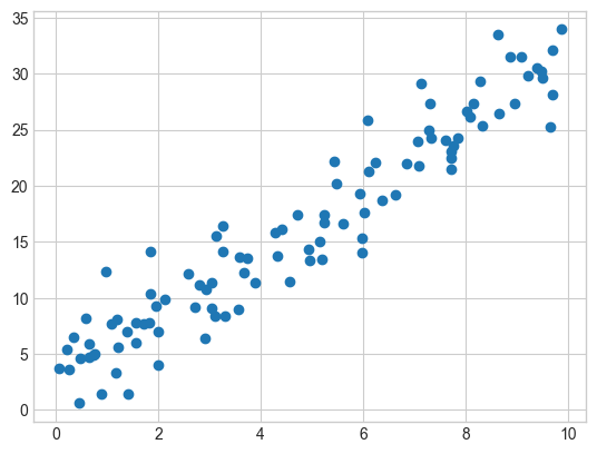
We have a scatter plot of two values, x and y. It shows a relationship that appears to be mostly linear. We can calculate the correlation coefficient between these two variables. To do that, we’ll use the Pearson correlation coefficient, commonly represented as \(r\).
As you may or may not recall, the sample Pearson correlation coefficient is as follows:
\[r = \frac{\sum (X_i - \bar{X})(Y_i - \bar{Y})} {\sqrt{\sum (X_i - \bar{X})^2 \sum (Y_i - \bar{Y})^2}}\]It measures the strength and direction of the linear relationship between two variables. It’s important to recognize that the linear assumption is already baked into the process once we start using the Pearson correlation coefficient. It gets used so commonly that it’s easy to forget that this assumption is sitting in the background.
It tries to answer the question, “If X is above average, is Y above average?” The numerator describes the joint movement, and is positive when they move in the same direction and negative when they move in the opposite. This is essentially the (unnormalized) covariance. The denominator just normalizes it so that it’s unitless and [-1, 1].
This linearity also means that the “variance explained” interpretation of \(r^2\) is really answering a specific question: Of all possible linear functions of X, the best one (in a least-squares sense) accounts for a fraction \(r^2\) of the variance in Y.
So it’s like we’re asking “how much variance could a linear function of X account for?” and \(r^2\) is the answer.
Let’s calculate the correlation coefficient and see what we get.
# Calculate Pearson r
r_pearson = np.corrcoef(x, y)[0, 1]
print(r_pearson)
0.9529657473628446
It’s very high, which is what we would expect based on eye-balling the data.
Variance Explained
Now let’s think about how much variation is explained by a linear model. In general, we can think in terms of this formula:
\[\text{Total variation} = \text{Explained variation} + \text{Unexplained variation}\]Expressing that in terms of what we have, that’s:
\[Y_i - \bar{Y} = (\hat{Y}_i - \bar{Y}) + (Y_i - \hat{Y}_i)\]Where:
- \(Y_i\) - The actual observed value of the dependent variable for observation \(i\).
- \(\bar{Y}\) - The sample mean of all observed Y values: \(\bar{Y} = \frac{1}{n} \sum_{i=1}^n Y_i\)
- \(\hat{Y}_i\) - The predicted value for observation \(i\) from the regression model. This is the “fitted value”.
Let’s talk about what each term represents.
- Left side: \(Y_i - \bar{Y}\) The total deviation of observation \(i\) from the mean. How far the actual value is from the overall average.
- First term on right: \(\hat{Y}_i - \bar{Y}\) The explained deviation. How much of the deviation from the mean is explained by the model.
- Second term on right: \(Y_i - \hat{Y}_i\) The residual error term. The part not explained by the model.
That’s for a single observation. But we aren’t only interested in a single observation — we care about overall variation. Since variation is measured by squared deviations from the mean, the next step is to square this decomposition and sum over all observations.
To do this, we square both sides and sum over all \(i\):
\[\sum_{i=1}^{n}(Y_i - \bar{Y})^2 = \sum_{i=1}^{n}(\hat{Y}_i - \bar{Y})^2 + \sum_{i=1}^{n}(Y_i - \hat{Y}_i)^2 + 2\sum_{i=1}^{n}(\hat{Y}_i - \bar{Y})(Y_i - \hat{Y}_i)\]The critical result is that the cross-term vanishes. This is because the residuals \(e_i = Y_i - \hat{Y}_i\) from OLS are orthogonal to the fitted values \(\hat{Y}_i\). This follows directly from the OLS normal equations: since \(\hat{Y} = X(X^\top X)^{-1}X^\top Y\), the residuals \(e = Y - \hat{Y}\) satisfy \(X^\top e = 0\), which means \(\hat{Y}^\top e = 0\) (since \(\hat{Y}\) is a linear combination of the columns of \(X\)). The fact that the residuals also sum to zero (from the intercept normal equation) takes care of the \(\bar{Y}\) shift.
So we get the clean decomposition: \(\underbrace{\sum_{i=1}^{n}(Y_i - \bar{Y})^2}_{\text{SST}} = \underbrace{\sum_{i=1}^{n}(\hat{Y}_i - \bar{Y})^2}_{\text{SSR (regression)}} + \underbrace{\sum_{i=1}^{n}(Y_i - \hat{Y}_i)^2}_{\text{SSE (error)}}\)
- SST — Total Sum of Squares
- SSR — Regression Sum of Squares
- SSE — Error Sum of Squares
Defining R^2
Now divide everything by SST: \(1 = \frac{\text{SSR}}{\text{SST}} + \frac{\text{SSE}}{\text{SST}}\)
We define: \(R^2 = \frac{\text{SSR}}{\text{SST}} = 1 - \frac{\text{SSE}}{\text{SST}}\)
Since SST is proportional to \(\operatorname{Var}(Y)\) (it equals \(n \cdot \operatorname{Var}(Y)\) up to a degrees-of-freedom adjustment), and SSR is proportional to \(\operatorname{Var}(\hat{Y})\), we have: \(R^2 = \frac{\operatorname{Var}(\hat{Y})}{\operatorname{Var}(Y)}\)
This is literally the fraction of the total variance in \(Y\) that is captured by the model’s predictions (which are a function of \(X\)). The remainder, \(1 - R^2\), is the fraction left in the residuals.
Why “Explained by \(X\)” Is Justified
The fitted values \(\hat{Y}\) are a deterministic function of \(X\). So \(\operatorname{Var}(\hat{Y})\) is variance that comes entirely from variation in \(X\) (filtered through the estimated linear relationship). The residual variance is whatever \(X\) could not account for. So saying “\(R^2\) is the proportion of variance in \(Y\) explained by \(X\)” is a direct restatement of this decomposition.
One Important Caveat
This decomposition is exact for OLS with an intercept. If you drop the intercept, or use a nonlinear model, the cross-term does not necessarily vanish, and the interpretation of \(R^2\) becomes murkier. This is why some textbooks warn against using \(R^2\) in those settings.
Non-linear data
This is important because it means that if the fit isn’t linear, then r isn’t going to tell us much about the relationship. Take a look at this example where we have a strong relationship between x and y, but the relationship is not linear (it’s quadratic), so the r value is low.
np.random.seed(42)
n = 30

# Generate data with quadratic relationship
x = np.random.uniform(-3, 3, n)
y = 1 + 0.5 * x + 2 * x**2 + np.random.normal(0, 2, n)

# Pearson r (linear correlation)
r_pearson = np.corrcoef(x, y)[0, 1]
r_squared_from_r = r_pearson ** 2

# R² from quadratic regression
poly = PolynomialFeatures(degree=2, include_bias=False)
x_poly = poly.fit_transform(x.reshape(-1, 1))
model = LinearRegression()
model.fit(x_poly, y)
y_pred = model.predict(x_poly)
R_squared_from_reg = r2_score(y, y_pred)

# Plot just the left graph
fig, ax = plt.subplots(figsize=(8, 6))

x_line = np.linspace(-3, 3, 100)
y_linear = np.poly1d(np.polyfit(x, y, 1))(x_line)
y_quad = np.poly1d(np.polyfit(x, y, 2))(x_line)

ax.scatter(x, y, alpha=0.6, label='Data')
ax.plot(x_line, y_linear, 'r--', linewidth=2, label=f'Linear fit (r²={r_squared_from_r:.3f})')
ax.plot(x_line, y_quad, 'g-', linewidth=2, label=f'Quadratic fit (R²={R_squared_from_reg:.3f})')
ax.legend()
# ax.set_title('Quadratic Data: r² ≠ R²', fontsize=14, fontweight='bold')
ax.set_xlabel('x')
ax.set_ylabel('y')

plt.tight_layout()
plt.show()

So what is R² in the non-linear case?
In the simple linear case, the story flows naturally from r to r²: we start with the Pearson correlation and discover that squaring it gives the proportion of variance explained. So it’s tempting to think R² works the same way in general — that there’s some “R” we compute first, and then square.
But that’s not how it goes. In the general case, R² is defined directly:
\[R^2 = 1 - \frac{SSE}{SST} = 1 - \frac{\sum(Y_i - \hat{Y}_i)^2}{\sum(Y_i - \bar{Y})^2}\]No correlation coefficient is involved. We’re just comparing two things: how much total variance there is in \(Y\) (SST), and how much variance is left over after our model has done its best (SSE). The ratio \(\frac{SSE}{SST}\) is the fraction of variance the model failed to explain, so \(1\) minus that is the fraction it did explain.
This definition works for any model — linear, quadratic, a neural network, whatever. All it needs are the observed values \(Y_i\) and the predicted values \(\hat{Y}_i\). It doesn’t care how those predictions were generated.
Let’s see this concretely with our quadratic example.
# R² by hand for the quadratic model
SSE = np.sum((y - y_pred) ** 2)
SST = np.sum((y - np.mean(y)) ** 2)

R2_by_hand = 1 - SSE / SST

print(f"SST (total variance):    {SST:.2f}")
print(f"SSE (residual variance): {SSE:.2f}")
print(f"R² = 1 - SSE/SST:       {R2_by_hand:.4f}")
print(f"R² from sklearn:         {R_squared_from_reg:.4f}")
SST (total variance):    900.77
SSE (residual variance): 80.49
R² = 1 - SSE/SST:       0.9106
R² from sklearn:         0.9106
Same number, no correlation coefficient in sight. We just asked: “how much of the spread in Y did the model’s predictions capture?”
What about R itself?
In the simple linear case, \(R^2 = r^2\), so \(r\) is the natural starting point and \(r^2\) is derived from it. But in the general case, the direction reverses. \(R^2\) is the primitive quantity, and if you want an “\(R\)” you just take the positive square root:
\[R = \sqrt{R^2}\]This is sometimes called the multiple correlation coefficient. It equals the Pearson correlation between the observed values \(Y\) and the fitted values \(\hat{Y}\):
# R is just the correlation between Y and Y-hat
R_from_sqrt = np.sqrt(R_squared_from_reg)
R_from_corr = np.corrcoef(y, y_pred)[0, 1]

print(f"√R²:              {R_from_sqrt:.4f}")
print(f"corr(Y, Ŷ):       {R_from_corr:.4f}")
√R²:              0.9543
corr(Y, Ŷ):       0.9543
Same thing. But notice that R here isn’t telling us anything that R² didn’t already tell us — it’s just a rescaling. It doesn’t have a direction (it’s always non-negative), and it doesn’t correspond to any single predictor’s relationship with \(Y\). In practice, people rarely report R in the multiple/non-linear setting. R² is the quantity that has a direct interpretation: the fraction of variance explained.
Important Note about Non-linearity
There are two different linearities we care about! One is the linear associations with x. This is what the Pearson’s r is measuring—the linear associations with x. Another linearity we care about is the linearity in the parameters. When we say polynomial regression is linear, we mean:
\(y = \beta_0 + \beta_1 x + \beta_2 x^2\) That’s linear in the coefficients.
But Pearson’s r doesn’t know about x^2. It only looks at x.
We’ll talk more about non-linearities later.
Recap
- r = Pearson correlation coefficient (between two variables)
- r² = Square of Pearson correlation
- R = Multiple correlation coefficient
- R² = Coefficient of determination (proportion of variance explained)
In simple linear regression, R² = r². But this breaks down elsewhere.
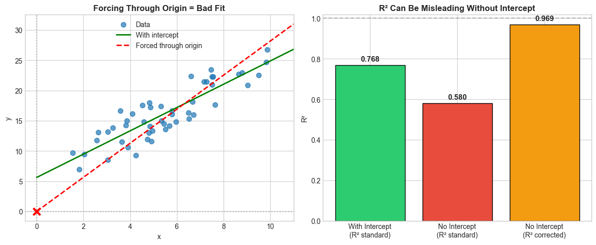
Forcing through the origin
There’s another important point to make. The equations we’ve used assume the model can have any intercept. That is, even when \(X\) is 0, there can still be some nonzero value for \(Y\). Sometimes you might not want this — it can be reasonable to force a model through the origin \((0,0)\). But be aware that doing so breaks the standard R² formula.
Why? Recall that the clean decomposition \(SST = SSR + SSE\) relies on the cross-term vanishing. That cross-term vanishes because OLS residuals are orthogonal to the fitted values and sum to zero. The “sum to zero” part comes from the intercept’s normal equation: \(\sum e_i = 0\). If you drop the intercept, residuals no longer need to sum to zero, the cross-term doesn’t vanish, and the decomposition falls apart.
The standard formula
The formula we’ve been using is:
\[R^2_{\text{standard}} = 1 - \frac{SSE}{SST} = 1 - \frac{\sum(Y_i - \hat{Y}_i)^2}{\sum(Y_i - \bar{Y})^2}\]Here, \(SST\) measures total variance around the mean \(\bar{Y}\). This formula can go negative for a no-intercept model — meaning the model fits worse than simply predicting the mean for every observation. That’s not a bug; it’s telling you the truth. Forcing through the origin when the data doesn’t pass through the origin really can be worse than a flat line at \(\bar{Y}\).
The corrected formula
When there’s no intercept, some references use a different \(SST\) that measures total variance around zero instead of the mean:
\[R^2_{\text{no-intercept}} = 1 - \frac{\sum(Y_i - \hat{Y}_i)^2}{\sum Y_i^2}\]This version is always between 0 and 1, but it’s answering a different question: “how much better is my model than predicting \(Y = 0\)?” That’s a much lower bar. It tends to give inflated values and isn’t directly comparable to the standard R². So I don’t like to use the corrected formula (or, of course, the standard formula). I think far better is to not force the model through the origin unless you really have to.
Let’s see both in action.
One other thing to note is the difference can be either subtle or extreme. If the intercept is not far from the origin, the effect is likely to be subtle, as in the case below.
# Demonstrate the no-intercept problem
np.random.seed(123)

# Data that doesn't pass through origin
x = np.random.uniform(1, 10, 50)
y = 5 + 2 * x + np.random.normal(0, 2, 50)  # Intercept is 5, not 0!

# Fit with intercept (correct)
model_with_intercept = LinearRegression(fit_intercept=True)
model_with_intercept.fit(x.reshape(-1, 1), y)
y_pred_with = model_with_intercept.predict(x.reshape(-1, 1))

# Fit without intercept (forced through origin)
model_no_intercept = LinearRegression(fit_intercept=False)
model_no_intercept.fit(x.reshape(-1, 1), y)
y_pred_without = model_no_intercept.predict(x.reshape(-1, 1))

# Calculate R² both ways for no-intercept model
ss_res = np.sum((y - y_pred_without) ** 2)
ss_tot_centered = np.sum((y - np.mean(y)) ** 2)  # Centered around mean
ss_tot_origin = np.sum(y ** 2)  # Centered around zero

r2_standard = 1 - ss_res / ss_tot_centered  # Standard formula
r2_no_intercept = 1 - ss_res / ss_tot_origin  # Correct formula for no-intercept

# Visualization
fig, axes = plt.subplots(1, 2, figsize=(12, 5))

# Left: The fits
x_line = np.linspace(0, 11, 100)
y_with = model_with_intercept.predict(x_line.reshape(-1, 1))
y_without = model_no_intercept.predict(x_line.reshape(-1, 1))

axes[0].scatter(x, y, alpha=0.7, s=50, label='Data')
axes[0].plot(x_line, y_with, 'g-', linewidth=2, label=f'With intercept')
axes[0].plot(x_line, y_without, 'r--', linewidth=2, label=f'Forced through origin')
axes[0].axhline(y=0, color='gray', linestyle=':', alpha=0.5)
axes[0].axvline(x=0, color='gray', linestyle=':', alpha=0.5)
axes[0].scatter([0], [0], color='red', s=100, zorder=5, marker='x', linewidths=3)
axes[0].legend()
axes[0].set_xlim(-0.5, 11)
setup_ax(axes[0], 'Forcing Through Origin = Bad Fit', 'x', 'y')

# Right: R² comparison
r2_correct = r2_score(y, y_pred_with)
labels = ['With Intercept\n(R² standard)', 'No Intercept\n(R² standard)', 'No Intercept\n(R² corrected)']
values = [r2_correct, r2_standard, r2_no_intercept]
colors = ['#2ecc71', '#e74c3c', '#f39c12']

bars = axes[1].bar(labels, values, color=colors, edgecolor='black')
axes[1].axhline(y=1, color='gray', linestyle='--', alpha=0.5, label='R² = 1')
axes[1].set_ylabel('R² Value')
setup_ax(axes[1], 'R² Can Be Misleading Without Intercept', '', 'R²')

for bar, val in zip(bars, values):
    axes[1].text(bar.get_x() + bar.get_width()/2, bar.get_height() + 0.02,
                 f'{val:.3f}', ha='center', fontsize=11, fontweight='bold')

plt.tight_layout()
plt.show()

print("Results:")
print(f"  With intercept (correct): R² = {r2_correct:.3f}")
print(f"  No intercept, standard formula: R² = {r2_standard:.3f}")
print(f"  No intercept, corrected formula: R² = {r2_no_intercept:.3f}")
Results:
  With intercept (correct): R² = 0.768
  No intercept, standard formula: R² = 0.580
  No intercept, corrected formula: R² = 0.969
However, when the intercept is far away from the origin, the model is way worse than just predicting the mean, and the R^2 value is negative.
# Demonstrate the no-intercept problem
np.random.seed(123)

# Data that doesn't pass through origin
x = np.random.uniform(1, 10, 50)
y = 45 + 2 * x + np.random.normal(0, 2, 50)  # Intercept is 45, not 0!

# Fit with intercept (correct)
model_with_intercept = LinearRegression(fit_intercept=True)
model_with_intercept.fit(x.reshape(-1, 1), y)
y_pred_with = model_with_intercept.predict(x.reshape(-1, 1))

# Fit without intercept (forced through origin)
model_no_intercept = LinearRegression(fit_intercept=False)
model_no_intercept.fit(x.reshape(-1, 1), y)
y_pred_without = model_no_intercept.predict(x.reshape(-1, 1))

# Calculate R² both ways for no-intercept model
ss_res = np.sum((y - y_pred_without) ** 2)
ss_tot_centered = np.sum((y - np.mean(y)) ** 2)  # Centered around mean
ss_tot_origin = np.sum(y ** 2)  # Centered around zero

r2_standard = 1 - ss_res / ss_tot_centered  # Standard formula
r2_no_intercept = 1 - ss_res / ss_tot_origin  # Correct formula for no-intercept

# Visualization
fig, axes = plt.subplots(1, 2, figsize=(12, 5))

# Left: The fits
x_line = np.linspace(0, 11, 100)
y_with = model_with_intercept.predict(x_line.reshape(-1, 1))
y_without = model_no_intercept.predict(x_line.reshape(-1, 1))

axes[0].scatter(x, y, alpha=0.7, s=50, label='Data')
axes[0].plot(x_line, y_with, 'g-', linewidth=2, label=f'With intercept')
axes[0].plot(x_line, y_without, 'r--', linewidth=2, label=f'Forced through origin')
axes[0].axhline(y=0, color='gray', linestyle=':', alpha=0.5)
axes[0].axvline(x=0, color='gray', linestyle=':', alpha=0.5)
axes[0].scatter([0], [0], color='red', s=100, zorder=5, marker='x', linewidths=3)
axes[0].legend()
axes[0].set_xlim(-0.5, 11)
setup_ax(axes[0], 'Forcing Through Origin = Bad Fit', 'x', 'y')

# Right: R² comparison
r2_correct = r2_score(y, y_pred_with)
labels = ['With Intercept\n(R² standard)', 'No Intercept\n(R² standard)', 'No Intercept\n(R² corrected)']
values = [r2_correct, r2_standard, r2_no_intercept]
colors = ['#2ecc71', '#e74c3c', '#f39c12']

bars = axes[1].bar(labels, values, color=colors, edgecolor='black')
axes[1].axhline(y=1, color='gray', linestyle='--', alpha=0.5, label='R² = 1')
axes[1].set_ylabel('R² Value')
setup_ax(axes[1], 'R² Can Be Misleading Without Intercept', '', 'R²')

for bar, val in zip(bars, values):
    axes[1].text(bar.get_x() + bar.get_width()/2, bar.get_height() + 0.02,
                 f'{val:.3f}', ha='center', fontsize=11, fontweight='bold')

plt.tight_layout()
plt.show()

print("Results:")
print(f"  With intercept (correct): R² = {r2_correct:.3f}")
print(f"  No intercept, standard formula: R² = {r2_standard:.3f}")
print(f"  No intercept, corrected formula: R² = {r2_no_intercept:.3f}")
Here, we have a negative value for R^2. This might be surprising. Does this mean that R is imaginary? No, I wouldn’t say so. It’s because the real definition of R^2 is 1 minus the proportion of the total variance that remains unexplained:
\[R^2 = 1 - \frac{SSE}{SST}\]it’s not
\[R^2 = \left(\mathrm{corr}(Y, \hat{Y})\right)^2\]That is a special result that holds under specific conditions. Specifically, when:
- You are doing ordinary least squares
- The model includes an intercept
- The loss function is squared error
Under those conditions, the equation holds and you will not get a negative number for R^2.
Non-linear regression
Before we go further, it’s worth clarifying something about the quadratic example from earlier. You might have looked at \(\hat{Y} = \beta_0 + \beta_1 X + \beta_2 X^2\) and thought: “that’s non-linear regression.” It’s not. It’s still linear regression.
“Linear” in “linear regression” refers to linearity in the parameters, not in \(X\). As long as the model can be written as a linear combination of the parameters:
\[\hat{Y} = \beta_0 + \beta_1 f_1(X) + \beta_2 f_2(X) + \cdots\]it’s linear regression, regardless of how wild the \(f_k(X)\) functions are. Polynomial regression, spline regression, regression with \(\log(X)\) or \(\sin(X)\) as features — all linear regression. The OLS machinery applies, the normal equations hold, and the SST = SSR + SSE decomposition works.
True nonlinear regression occurs when at least one parameter enters the model nonlinearly, so the model cannot be written as a linear combination of fixed basis functions and the least-squares objective is no longer quadratic in the parameters.
What happens to R²?
And this is where R² gets into trouble again — for the same structural reason as the no-intercept case. The clean decomposition \(SST = SSR + SSE\) relied on the OLS normal equations, which gave us the orthogonality between residuals and fitted values. Non-linear least squares doesn’t produce those normal equations, so the cross-term no longer vanishes. That means:
\[SST \neq SSR + SSE\]You can still compute \(R^2 = 1 - \frac{SSE}{SST}\), and it still has the intuitive meaning of “what fraction of variance did my predictions capture.” But it loses the guarantees that come with the decomposition — in particular, it’s no longer bounded between 0 and 1. Let’s see this.
from scipy.optimize import curve_fit

np.random.seed(42)

# Generate exponential decay data
x_nl = np.linspace(0.5, 5, 60)
y_nl = 10 * np.exp(-0.8 * x_nl) + np.random.normal(0, 0.5, 60)

# Fit non-linear model: y = a * exp(-b * x)
def exp_decay(x, a, b):
    return a * np.exp(-b * x)

popt, _ = curve_fit(exp_decay, x_nl, y_nl, p0=[10, 1])
y_pred_nl = exp_decay(x_nl, *popt)

# Check the decomposition
SST = np.sum((y_nl - np.mean(y_nl)) ** 2)
SSE = np.sum((y_nl - y_pred_nl) ** 2)
SSR = np.sum((y_pred_nl - np.mean(y_nl)) ** 2)

R2 = 1 - SSE / SST

print(f"SST:         {SST:.2f}")
print(f"SSR:         {SSR:.2f}")
print(f"SSE:         {SSE:.2f}")
print(f"SSR + SSE:   {SSR + SSE:.2f}")
print(f"Difference:  {SST - (SSR + SSE):.2f}  (cross-term residual)")
print(f"\nR² = 1 - SSE/SST = {R2:.4f}")
SST:         213.89
SSR:         206.76
SSE:         11.15
SSR + SSE:   217.91
Difference:  -4.02  (cross-term residual)

R² = 1 - SSE/SST = 0.9479
Notice that \(SSR + SSE \neq SST\) — there’s a non-zero cross-term. In the linear case that difference would be exactly zero. Here it’s not, because the non-linear least squares residuals aren’t orthogonal to the fitted values in the same way.
The R² value itself is still perfectly interpretable: the model’s predictions capture that fraction of the variance in \(Y\). But you should be aware that this number doesn’t come from a clean decomposition anymore — it’s just a descriptive measure of fit, not a consequence of the algebra.
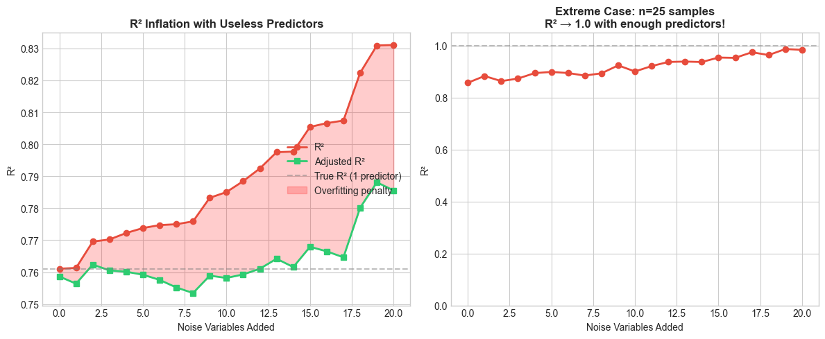
Adding more variables: R² can only go up
There’s a subtle but important property of R² in OLS: it can never decrease when you add a predictor. Think about why — the model with \(p + 1\) predictors can always set the new coefficient to zero and recover the \(p\)-predictor model exactly. So SSE can only go down (or stay the same), and since SST doesn’t change, \(R^2 = 1 - SSE/SST\) can only go up.
This means you can inflate R² by just throwing in more variables, even if they’re pure noise. Let’s watch this happen.
# Demonstrate R² inflation with useless predictors
np.random.seed(42)
n = 100

# True model: y = 3 + 2*x1 + noise
x1 = np.random.normal(0, 1, n)
y = 3 + 2 * x1 + np.random.normal(0, 1, n)

# Generate random noise variables (completely unrelated to y)
noise_vars = np.random.normal(0, 1, (n, 20))

# Track R² as we add more useless predictors
r2_values = []
adj_r2_values = []

for k in range(21):  # 0 to 20 noise variables
    if k == 0:
        X = x1.reshape(-1, 1)
    else:
        X = np.column_stack([x1, noise_vars[:, :k]])

    model = LinearRegression()
    model.fit(X, y)
    y_pred = model.predict(X)

    # Calculate R²
    r2 = r2_score(y, y_pred)
    r2_values.append(r2)

    # Calculate adjusted R²
    p = X.shape[1]  # number of predictors
    adj_r2 = 1 - (1 - r2) * (n - 1) / (n - p - 1)
    adj_r2_values.append(adj_r2)

# Visualization
fig, axes = plt.subplots(1, 2, figsize=(12, 5))

# Left: R² vs Adjusted R²
x_axis = range(21)
axes[0].plot(x_axis, r2_values, 'o-', color='#e74c3c', linewidth=2, markersize=6, label='R²')
axes[0].plot(x_axis, adj_r2_values, 's-', color='#2ecc71', linewidth=2, markersize=6, label='Adjusted R²')
axes[0].axhline(y=r2_values[0], color='gray', linestyle='--', alpha=0.5, label='True R² (1 predictor)')
axes[0].fill_between(x_axis, r2_values, adj_r2_values, alpha=0.2, color='red', label='Overfitting penalty')
axes[0].set_xlabel('Number of Noise Variables Added')
axes[0].set_ylabel('R² Value')
axes[0].legend(loc='center right')
setup_ax(axes[0], 'R² Inflation with Useless Predictors', 'Noise Variables Added', 'R²')

# Right: The danger shown more dramatically
# Use a small sample to exaggerate
np.random.seed(42)
n_small = 25
x1_small = np.random.normal(0, 1, n_small)
y_small = 3 + 2 * x1_small + np.random.normal(0, 1, n_small)

r2_small = []
for k in range(21):
    noise_small = np.random.normal(0, 1, (n_small, k)) if k > 0 else np.empty((n_small, 0))
    X_small = np.column_stack([x1_small.reshape(-1, 1), noise_small]) if k > 0 else x1_small.reshape(-1, 1)
    model = LinearRegression()
    model.fit(X_small, y_small)
    r2_small.append(r2_score(y_small, model.predict(X_small)))

axes[1].plot(x_axis, r2_small, 'o-', color='#e74c3c', linewidth=2, markersize=6)
axes[1].axhline(y=1.0, color='gray', linestyle='--', alpha=0.5)
axes[1].set_ylim(0, 1.05)
setup_ax(axes[1], f'Extreme Case: n={n_small} samples\nR² → 1.0 with enough predictors!',
         'Noise Variables Added', 'R²')

plt.tight_layout()
plt.show()

print(f"With n=100 samples:")
print(f"  True model R² (1 predictor): {r2_values[0]:.3f}")
print(f"  R² with 20 noise variables:  {r2_values[-1]:.3f} (+{r2_values[-1]-r2_values[0]:.3f})")
print(f"  Adjusted R² with 20 noise:   {adj_r2_values[-1]:.3f}")
print(f"\nWith n=25 samples:")
print(f"  R² with 20 noise variables:  {r2_small[-1]:.3f}")
print(f"\nWith enough predictors (>= n-1), R² approaches 1.0 regardless of signal!")
With n=100 samples:
  True model R² (1 predictor): 0.761
  R² with 20 noise variables:  0.831 (+0.070)
  Adjusted R² with 20 noise:   0.786

With n=25 samples:
  R² with 20 noise variables:  0.984

With enough predictors (>= n-1), R² approaches 1.0 regardless of signal!
On the left, R² marches steadily upward — even though every variable after the first is pure noise. The red shaded area is the gap between R² and adjusted R²: the overfitting penalty. On the right, the situation is even more dramatic: with only 25 observations, R² approaches 1.0 with enough predictors. Once you have as many predictors as data points, you can fit the data perfectly — and R² will happily tell you your model is flawless.
Adjusted R²
The fix is to penalize for model complexity. Adjusted R² replaces the raw sums of squares with their degrees-of-freedom-corrected versions:
\[\bar{R}^2 = 1 - \frac{SSE \,/\, (n - p - 1)}{SST \,/\, (n - 1)}\]where \(p\) is the number of predictors and \(n\) is the number of observations. You’ll also see this written equivalently as:
\[\bar{R}^2 = 1 - (1 - R^2) \frac{n - 1}{n - p - 1}\]The numerator, \(SSE / (n - p - 1)\), is an unbiased estimator of \(\sigma^2\) (the true error variance). The denominator, \(SST / (n - 1)\), is an unbiased estimator of \(\text{Var}(Y)\). So adjusted R² is essentially asking: “what fraction of variance does my model explain, after accounting for the fact that more parameters will always reduce SSE mechanically?”
Unlike R², adjusted R² can decrease when you add a useless variable — the penalty for the lost degree of freedom outweighs the tiny reduction in SSE. That’s exactly what the green line shows: it levels off and drops as noise variables pile up, even as the red line keeps climbing.
One caveat: adjusted R² is a bias correction, not an information-theoretic criterion.
R² depends on the range of your data
There’s one more thing worth keeping in mind. The same underlying relationship can produce wildly different R² values depending on the range of \(X\) values in your sample. R² is a property of the sample, not the relationship.
Why? Because \(SST = \sum(Y_i - \bar{Y})^2\) depends on how spread out your \(Y\) values are, which in turn depends on how spread out your \(X\) values are. If you sample \(X\) over a narrow range, there’s less total variance in \(Y\) to “explain,” so the noise eats up a larger share of it. Widen the range of \(X\), and the signal dominates — same noise, same relationship, higher R².
# Same relationship, different X ranges
np.random.seed(42)

# True relationship: y = 2 + 3x + noise(sd=5)
def generate_data(x_min, x_max, n=100):
    x = np.random.uniform(x_min, x_max, n)
    y = 2 + 3 * x + np.random.normal(0, 5, n)  # Same noise level!
    return x, y

# Three scenarios: narrow, medium, wide X range
scenarios = [
    ('Narrow (x: 4-6)', 4, 6),
    ('Medium (x: 0-10)', 0, 10),
    ('Wide (x: -20 to 30)', -20, 30)
]

fig, axes = plt.subplots(1, 3, figsize=(14, 4))

r2_list = []
for idx, (name, x_min, x_max) in enumerate(scenarios):
    x, y = generate_data(x_min, x_max)

    # Fit and calculate R²
    model = LinearRegression()
    model.fit(x.reshape(-1, 1), y)
    y_pred = model.predict(x.reshape(-1, 1))
    r2 = r2_score(y, y_pred)
    r2_list.append(r2)

    # Plot
    axes[idx].scatter(x, y, alpha=0.6, s=30)
    x_line = np.linspace(x_min - 2, x_max + 2, 100)
    y_line = model.predict(x_line.reshape(-1, 1))
    axes[idx].plot(x_line, y_line, 'r-', linewidth=2)
    axes[idx].set_title(f'{name}\nR² = {r2:.3f}')
    axes[idx].set_xlabel('x')
    axes[idx].set_ylabel('y')

plt.tight_layout()
plt.show()

print("Same relationship (y = 2 + 3x + noise), same noise level (σ=5):")
print(f"\n  Narrow X range (4-6):     R² = {r2_list[0]:.3f}")
print(f"  Medium X range (0-10):    R² = {r2_list[1]:.3f}")
print(f"  Wide X range (-20 to 30): R² = {r2_list[2]:.3f}")
print(f"\nR² varies from {min(r2_list):.3f} to {max(r2_list):.3f} for the SAME relationship!")
print("This is because R² depends on the variance of X in your sample.")
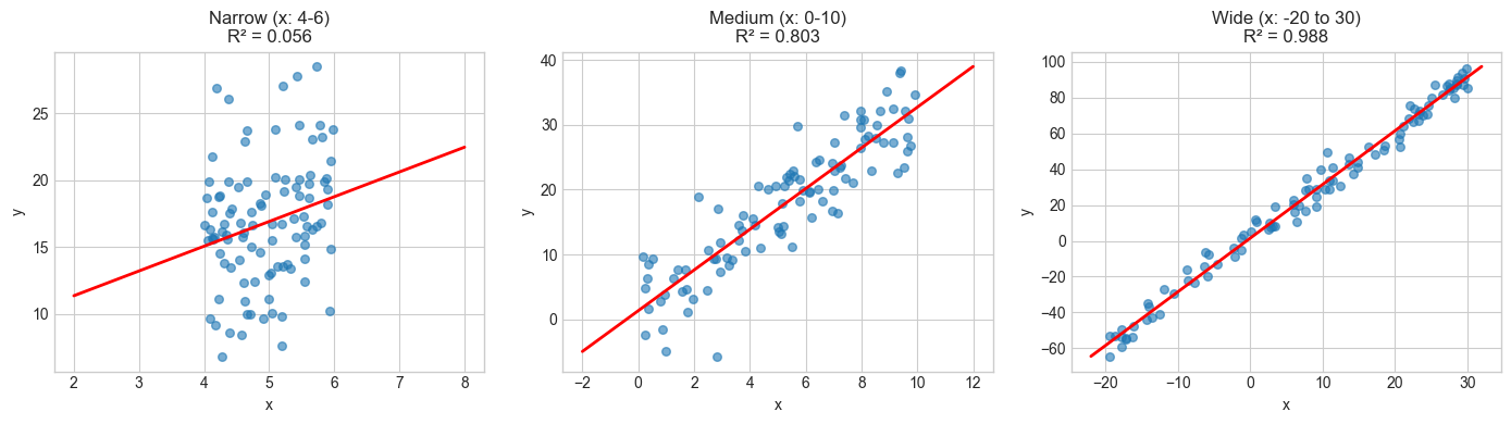
Same relationship (y = 2 + 3x + noise), same noise level (σ=5):

  Narrow X range (4-6):     R² = 0.056
  Medium X range (0-10):    R² = 0.803
  Wide X range (-20 to 30): R² = 0.988

R² varies from 0.056 to 0.988 for the SAME relationship!
This is because R² depends on the variance of X in your sample.
Same slope, same noise, same true relationship, but R² ranges from low to high just because we changed where we sampled \(X\). This is why comparing R² values across studies or datasets can be misleading: a low R² might just mean the predictor didn’t vary much in that particular sample, not that the relationship is weak.