I recently came across the numbers of convictions and executions in the latter half of 18th century England. The number of executions varied and it wasn’t immediately clear if there were any larger trends.
| Convictions | Executions | |
|---|---|---|
| 1749-58 | 527 | 365 |
| 1759-68 | 372 | 206 |
| 1769-78 | 787 | 357 |
| 1779-88 | 1152 | 531 |
| 1789-98 | 770 | 191 |
| 1799-1808 | 804 | 126 |
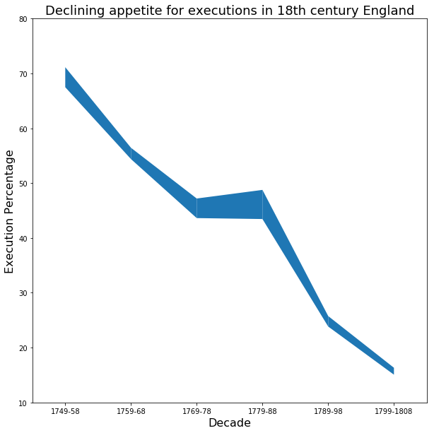
But I found that once you look at the number of executions relative to convictions, the growing distaste in executions in Georgian England becomes far more apparent.
| Convictions | Executions | Percentage | |
|---|---|---|---|
| 1749-58 | 527 | 365 | 69.3 |
| 1759-68 | 372 | 206 | 55.4 |
| 1769-78 | 787 | 357 | 45.4 |
| 1779-88 | 1152 | 531 | 46.1 |
| 1789-98 | 770 | 191 | 24.8 |
| 1799-1808 | 804 | 126 | 15.7 |
I graphed change in the percentage against time but also included the total number of executions by varying the line thickness. I think it’s interesting because it shows the decline in the percentage of executions while reminding us that there were still a tremendous number of executions. And while the overall trend is clear and good, there are major setbacks along the way.
x = np.array(range(6))
y = df['Percentage']
widths = df['Executions'].values / 100
decade = df.index
import matplotlib.patches as patch

fig, ax = plt.subplots(1, 1, figsize=(10, 10))
ax.set_xlim(-.5,5.5)
ax.set_ylim(10,80)

new_w = np.array(widths)

for i in range(len(x)-1):
    c = [[x[i], y[i]+new_w[i]/2.],
         [x[i+1], y[i+1]+new_w[i+1]/2.],
         [x[i+1], y[i+1]-new_w[i+1]/2.],
         [x[i], y[i]-new_w[i]/2.]
        ]
    p = patch.Polygon(c)
    ax.add_patch(p)
plt.xlabel("Decade", fontsize=16)
plt.ylabel("Execution Percentage", fontsize=16)
plt.title("Declining appetite for executions in 18th century England", fontsize=18)
plt.xticks(x, decade)
plt.show()