
This post shows how Bayesian updating works when we observe new evidence. We compare four different prior beliefs about the probability of success of some event. Priors vary along two dimensions:
- Location – what probability do we believe a priori?
- Strength – how strongly do we believe it? (number of pseudo-observations encoded in the Beta prior)
import matplotlib.pyplot as plt
import numpy as np
import scipy.stats as stats
Let’s define some priors. We use the Beta–Binomial model, where a prior is Beta(α, β). After observing successes and failures, the posterior becomes Beta(α + successes, β + failures).
A Beta prior encodes two distinct pieces of information:
- Location: α / (α + β) — the expected probability
- Strength: α + β — the equivalent number of prior observations (some would also do α + β - 2, but let’s skip that detail)
Think of it as phantom data you’ve already seen. When you say “I expect 10%,” you’re setting the location. When you specify how confident you are, you’re setting the strength:
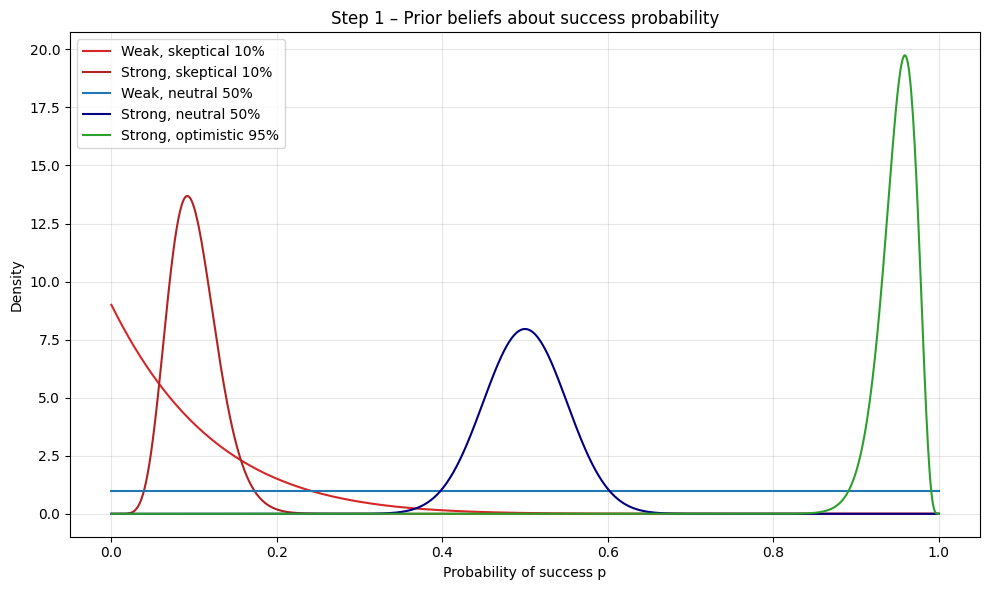
- Weak prior (low strength): “10%, but I’m flexible” = Beta(1, 9)
- Just 10 phantom trials. One contradictory result could shift your belief significantly.
- Strong prior (high strength): “10%, and I’d need overwhelming evidence to budge” = Beta(10, 90)
- 100 phantom trials. It would take many observations to overcome this prior belief.
The same applies to 50-50 beliefs:
- Weak 50-50: Beta(1, 1) = “I have no information; one result could swing me in either direction”
- Strong 50-50: Beta(50, 50) = “I’ve effectively seen 100 balanced outcomes already”
Always specify both components when stating a prior: the probability (location) and the effective sample size (strength) that determines how resistant it is to new evidence.
In the Beta–Binomial model a prior p∼Beta(α,β) is conjugate to the Binomial likelihood. After observing k successes in n Bernoulli trials the posterior is another Beta:
\[p(p\mid k,n)=\mathrm{Beta}\bigl(\alpha+k,\;\beta+n-k\bigr).\]You can read the update literally: add the new successes to the prior “success” count (α) and the new failures (n−k) to the prior “failure” count (β). The prior therefore acts like (α+β) phantom observations, and the data just extend that tally.
priors: list[dict[str, object]] = [
    {
        "label": "Weak, skeptical 10%",  # believe success is ~10 %, but weakly held
        "alpha": 1,
        "beta": 9,
        "color": "tab:red",
    },
    {
        "label": "Strong, skeptical 10%",  # same mean, but 100 pseudo-trials (!)
        "alpha": 10,
        "beta": 90,
        "color": "firebrick",
    },
    {
        "label": "Weak, neutral 50%",  # flat prior
        "alpha": 1,
        "beta": 1,
        "color": "tab:blue",
    },
    {
        "label": "Strong, neutral 50%",  # 100 pseudo-trials centred at 0.5
        "alpha": 50,
        "beta": 50,
        "color": "navy",
    },
    {
        "label": "Strong, optimistic 95%",  # believe success is ~95 %, stronger than the data
        "alpha": 95,
        "beta": 5,
        "color": "tab:green",
    },
]
Let’s go ahead and plot our priors.
x = np.linspace(0, 1, 1000)

fig_prior, ax_prior = plt.subplots(figsize=(10, 6))
ax_prior.set_title("Step 1 – Prior beliefs about success probability")
ax_prior.set_xlabel("Probability of success p")
ax_prior.set_ylabel("Density")

for prior in priors:
    pdf = stats.beta(prior["alpha"], prior["beta"]).pdf(x)
    ax_prior.plot(x, pdf, label=prior["label"], color=prior["color"])

ax_prior.legend()
ax_prior.grid(alpha=0.3)
fig_prior.tight_layout()
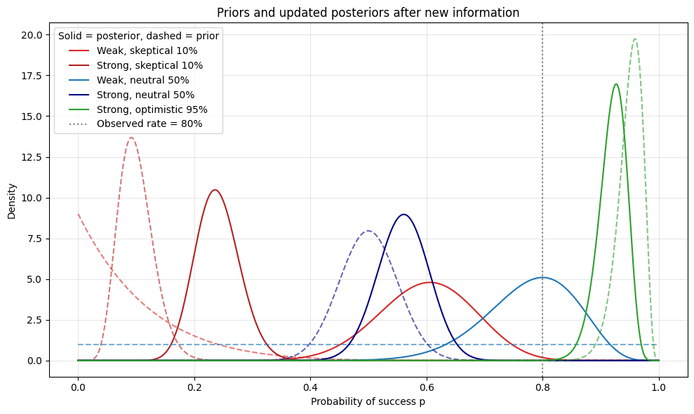
Now, let’s imagine we gather some new evidence. Let’s say we run 25 trials, getting 20 successes and 5 failures.
SUCCESS_COUNT = 20
FAIL_COUNT = 5
Let’s update our priors with this new information.
for prior in priors:
    # Posterior parameters
    prior["alpha_post"] = prior["alpha"] + SUCCESS_COUNT
    prior["beta_post"] = prior["beta"] + FAIL_COUNT
Now, let’s plot it. We’ll plot the old beliefs (the priors) in dashed lines and the new beliefs (the posteriors) in solid lines. We can see everything moving closer to the observed rate (the dashed vertical line).
fig_post, ax_post = plt.subplots(figsize=(10, 6))
ax_post.set_title("Priors and updated posteriors after new information")
ax_post.set_xlabel("Probability of success p")
ax_post.set_ylabel("Density")

for prior in priors:
    # Plot prior (dashed)
    pdf_prior = stats.beta(prior["alpha"], prior["beta"]).pdf(x)
    ax_post.plot(
        x,
        pdf_prior,
        linestyle="--",
        color=prior["color"],
        alpha=0.6,
    )
    # Plot posterior (solid)
    pdf_post = stats.beta(prior["alpha_post"], prior["beta_post"]).pdf(x)
    ax_post.plot(x, pdf_post, linestyle="-", color=prior["color"], label=prior["label"])

# Vertical reference line at the observed success rate
observed_rate = SUCCESS_COUNT / (SUCCESS_COUNT + FAIL_COUNT)
ax_post.axvline(
    observed_rate,
    linestyle=":",
    color="gray",
    linewidth=1.5,
    label=f"Observed rate = {observed_rate:.0%}",
)

ax_post.legend(title="Solid = posterior, dashed = prior")
ax_post.grid(alpha=0.3)
fig_post.tight_layout()
We can also look at the shift in mean probability.
fig_shift, ax_shift = plt.subplots(figsize=(10, 4))
ax_shift.set_title("Step 3 – Shift in mean probability after observing data")
ax_shift.set_ylim(0, 1)
ax_shift.set_ylabel("Mean p")
ax_shift.set_xticks(range(len(priors)))
ax_shift.set_xticklabels([p["label"] for p in priors], rotation=20, ha="right")

# Horizontal reference line at the observed success rate
observed_rate = SUCCESS_COUNT / (SUCCESS_COUNT + FAIL_COUNT)
ax_shift.axhline(
    observed_rate,
    linestyle=":",
    color="gray",
    linewidth=1.5,
    label=f"Observed rate = {observed_rate:.0%}",
)

for idx, prior in enumerate(priors):
    mean_prior = prior["alpha"] / (prior["alpha"] + prior["beta"])
    mean_post = prior["alpha_post"] / (prior["alpha_post"] + prior["beta_post"])

    # Plot prior mean as a dot
    ax_shift.plot(idx, mean_prior, "o", color=prior["color"], markersize=8)
    # Arrow to posterior mean
    ax_shift.annotate(
        "",
        xy=(idx, mean_post),
        xytext=(idx, mean_prior),
        arrowprops=dict(arrowstyle="->", color=prior["color"], lw=2),
    )
    # Posterior mean dot
    ax_shift.plot(idx, mean_post, "s", color=prior["color"], markersize=8)

ax_shift.grid(axis="y", alpha=0.3)
fig_shift.tight_layout()
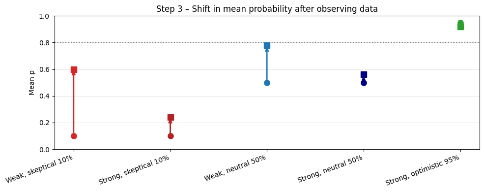
We can see in the two images above how much more weak priors (α + β small) move in response to new information than the strong priors. Additionally, the further the new information is from your priors, i.e., the more “surprised” you are by it, the more your beliefs change.