
Data visualization is an essential tool for data scientists, enabling them to both explore and explain data. It is one of the most important tasks in their toolkit. Despite its significance, I frequently encounter exploratory data analysis (EDA) visualizations that mask important aspects of the data. This causes people to misunderstand their data and make bad decisions based on it. In my experience, the plots that cause this the most are violin and box plots. In this post, I will demonstrate some of the drawbacks of violin plots and box plots and I will suggest some alternative visualizations that offer a clearer representation of data.
First, let’s ask, “What’s the point of EDA? Why am I plotting the data in the first place?” The point is to understand the data. There are lot of things you need to be looking for when doing data exploration. You need to notice patterns, outliers, abnormal distributions, and problems. There could be problems with the data entry that you need to find and correct. You need to be on the lookout for anomalies. You need to understand what your data are telling you. You can’t assume the data will look a certain way. Thus, you need to make sure your plotting techniques would surface and not hide any such issues.
You might wonder, “It’s just a tool. How can it be bad? Isn’t it the data scientist who must use it correctly?” While this argument has merit, I have encountered so many examples of misuse with these specific tools that it’s hard not to get suspicious that something is inherently wrong with them. As data scientists often reuse code and plots in their explorations, it becomes important to choose visualizations that can be trusted. Therefore, I advise against using violin and box plots in exploratory data analysis.
OK, let’s jump in.
Table of Contents
Violin Plots
Violin plots are increasingly popular tools for visualizing data. A violin plot is a combination of a box plot and a kernel density plot. Let’s take a look at one.
import seaborn as sns
import matplotlib.pyplot as plt
import numpy as np
np.random.seed(0)

# Create normally distributed data
normal_data = np.random.normal(0, 1, 500)

# Plotting
fig, ax = plt.subplots(figsize=(8, 6))

sns.violinplot(y=normal_data, ax=ax)
ax.set_title('Violin Plot of Normal Distribution')

plt.tight_layout()
plt.show()
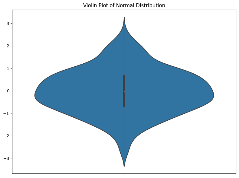
I think the main problem I have with violin plots is that they value aesthetics over clear data representation. In a standard violin plot, the kernel density estimation (KDE) is mirrored on both sides to form a symmetrical, aesthetically pleasing figure (the ‘violin’). First, I generally dislike all smoothing of data. I don’t think it should ever be done in EDA—if your data are spiky, you need to know that. Smoothing is just saying, “I changed the way the data looks to make it look nicer.” This seems like a very bad idea.
Also, I don’t like that half of the plot provides absolutely no information. It’s just there to look nice. Hopefully, people don’t misread anything into this symmetry. But I don’t see the benefit of adding symmetry when it isn’t part of the data. In the best case, people ignore it, but in the worst case, people think it suggests something symmetrical about the data that isn’t there.
It makes all your data into a nice violin shape (assuming all your violins look like stingrays). But this naturally raises a question, “What if you don’t have violin-shaped data? What if your data distribution ISN’T violin-shaped?” THAT’S a problem.
Gap in Data
Let’s look at a few examples of datasets with gaps in them. This can happen, especially in the case where some data are missing. Let’s look at a narrow concentration of data.
np.random.seed(0)

# Normal with Gap
normal_data = np.random.normal(0, 2, 1000)
normal_with_gap_data = normal_data[(normal_data < 0) | (normal_data > 1)]

# Narrow Concentrations
concentrations_data = np.concatenate(
    [np.random.normal(0, 0.05, 300), np.random.normal(5, 0.05, 300), np.random.normal(10, 0.05, 300)]
)

# Plot the violin plots
fig, axes = plt.subplots(2, 2, figsize=(12, 10))

sns.violinplot(ax=axes[0, 0], y=normal_with_gap_data)
axes[0, 0].set_title("Violin Plot: Normal with Gap")
axes[0, 1].hist(normal_with_gap_data, bins=30, edgecolor="black")
axes[0, 1].set_title("Histogram: Normal with Gap")


sns.violinplot(ax=axes[1, 0], y=concentrations_data)
axes[1, 0].set_title("Violin Plot: Narrow Concentrations")
axes[1, 1].hist(concentrations_data, bins=100, edgecolor="black")
axes[1, 1].set_title("Histogram: Narrow Concentrations")

plt.tight_layout()
plt.show()
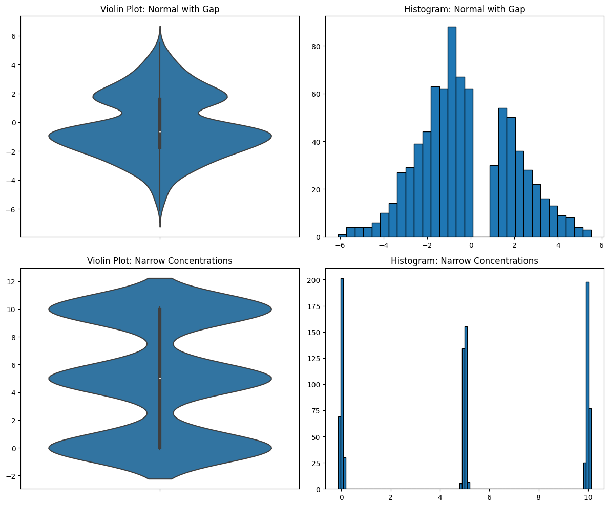
You can see how the smoothing completely obscures the true distribution of the data. There’s something very important going on in the first data distribution. For some reason, there are no numbers between 0 and 1, though there are everywhere else between -6 and 6. If you’re doing EDA, you need to see this and you need to dig into it. The effects of the missing data are still visible in the violin plot, but it looks like a simple bimodal distribution. But it’s not! It’s a normal distribution with missing data. You need your EDA tools to tell you this.
In the second data distribution, there are three tight concentrations of data, but the violin plot makes it look like they are spread out and even slightly overlapping. They are not and you need to know this.
Sample Size
Moving on, let’s talk about one of the most important things in statistical analysis: sample size. Question: How do violin plots represent this most-important feature? Answer: By completely hiding it.
np.random.seed(0)

large_sample = np.random.uniform(0, 1, 1000)
small_sample = np.random.uniform(0, 1, 15)

# Plot the violin plots
fig, axes = plt.subplots(2, 2, figsize=(12, 10))

sns.violinplot(ax=axes[0, 0], y=large_sample)
axes[0, 0].set_title("Violin Plot: Large Sample")
axes[0, 1].hist(large_sample, bins=30, edgecolor="black")
axes[0, 1].set_title("Histogram: Large Sample")

sns.violinplot(ax=axes[1, 0], y=small_sample)
axes[1, 0].set_title("Violin Plot: Small Sample Size")
axes[1, 1].hist(small_sample, bins=30, edgecolor="black")
axes[1, 1].set_title("Histogram: Small Sample Size")

plt.tight_layout()
plt.show()
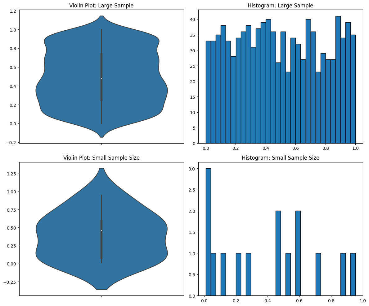
You can’t tell the sample size in the violin plots. But in the histograms you can, and you can see that you don’t have enough data in the second case for it to be meaningful.
Forces Violin Shape
Let me make another point based on those graphs above. I sampled from a uniform distribution, but it still came out looking like a normal distribution. That’s another problem with violin plots—they force the data into a violin shape even when it’s not accurate.
Hallucinated Negative Numbers
OK, let’s look at another casualty of the smoothing. Here I have a dataset with all positive numbers. But the smoothing that the violin plot does makes it look like there are lots of negative numbers in the dataset.
np.random.seed(0)

# Generate some example data that's strictly positive
data = np.abs(np.random.randn(100)) + 0.1

# Create a violin plot
sns.violinplot(data=data)
plt.title("Violin Plot with Smoothing")
plt.show()
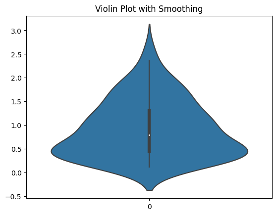
It makes it look like there’s data when there’s not. I think that a plot that makes data appear to exist that isn’t is immediately disqualifying. And you see this with all kinds of data distributions. Here are a bunch more.
np.random.seed(0)

# Data generation
data_exp = np.random.exponential(scale=1, size=1000)
data_chi2 = np.random.chisquare(df=4, size=1000)
data_lognormal = np.random.lognormal(mean=0, sigma=1, size=1000)

fig, axs = plt.subplots(3, 2, figsize=(15, 20))

# Exponential Distribution
sns.violinplot(y=data_exp, ax=axs[0, 0])
axs[0, 0].set_title("Violin Plot with Exponential Distribution")
axs[0, 0].set_ylabel("Value")
axs[0, 1].hist(data_exp, bins=30, edgecolor="k")
axs[0, 1].set_title("Histogram with Exponential Distribution")
axs[0, 1].set_ylabel("Frequency")

# Chi-Squared Distribution
sns.violinplot(y=data_chi2, ax=axs[1, 0])
axs[1, 0].set_title("Violin Plot with Chi-Squared Distribution")
axs[1, 0].set_ylabel("Value")
axs[1, 1].hist(data_chi2, bins=30, edgecolor="k")
axs[1, 1].set_title("Histogram with Chi-Squared Distribution")
axs[1, 1].set_ylabel("Frequency")

# Lognormal Distribution
sns.violinplot(y=data_lognormal, ax=axs[2, 0])
axs[2, 0].set_title("Violin Plot with Lognormal Distribution")
axs[2, 0].set_ylabel("Value")
axs[2, 1].hist(data_lognormal, bins=30, edgecolor="k")
axs[2, 1].set_title("Histogram with Lognormal Distribution")
axs[2, 1].set_ylabel("Frequency")

plt.tight_layout()
plt.show()
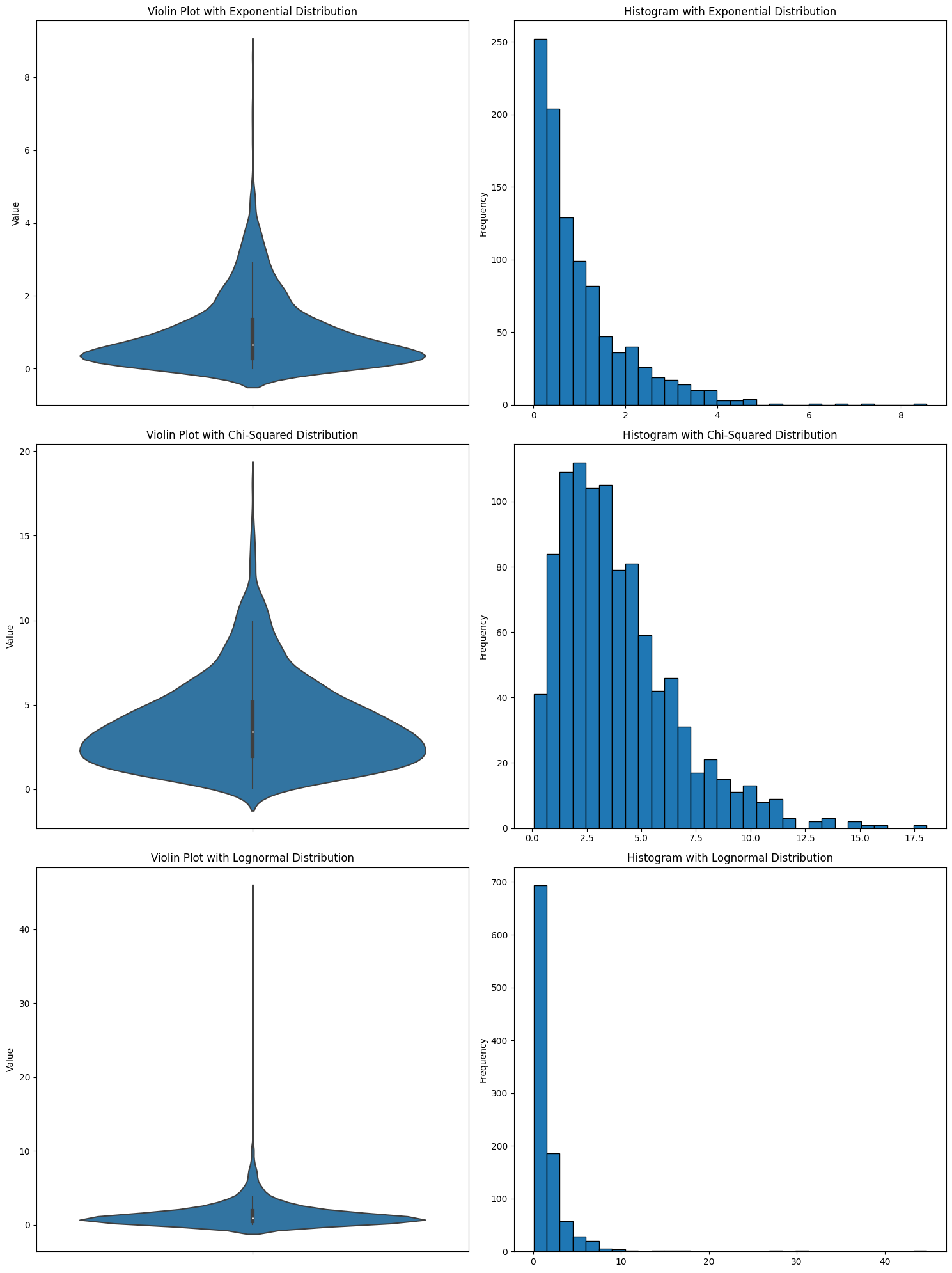
In every case, it looks like there are negative numbers. But there aren’t. I’ve seen someone use a violin plot and get confused about why there were suddenly negative numbers in the data.
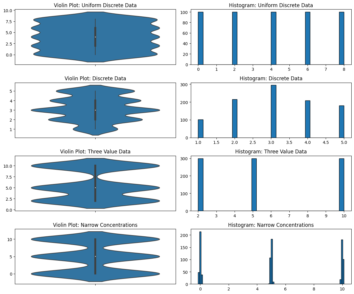
Discrete Data
Another problem with violin plots is in how they deal with discrete data. KDEs, because of their smoothing, are completely unable to distinguish discrete from continuous data. Why is this a problem? Again, because you’re exploring data that you potentially do not know much about. Maybe you think it’s continuous but it’s not—you would need to know that but a violin plot isn’t going to show it. Maybe some of the data of that variable has been rounded to integers and some of it hasn’t. Maybe you don’t know that the data is discrete (perhaps it was rounded and it shouldn’t be), or maybe you don’t know that you shouldn’t be using KDEs with discrete data. I’ve seen both cases.
# Uniform Discrete Distribution
uniform_discrete_data = np.repeat(np.arange(0, 10, 2), 100)

# Discrete Data
discrete_data = np.random.choice([1, 2, 3, 4, 5], size=1000, p=[0.1, 0.2, 0.3, 0.2, 0.2])

three_value_data = np.concatenate([np.full(300, 2), np.full(300, 5), np.full(300, 10)])

# Narrow Concentrations
concentrations_data = np.concatenate(
    [np.random.normal(0, 0.05, 300), np.random.normal(5, 0.05, 300), np.random.normal(10, 0.05, 300)]
)

# Plot the violin plots
fig, axes = plt.subplots(4, 2, figsize=(12, 10))

sns.violinplot(ax=axes[0, 0], y=uniform_discrete_data)
axes[0, 0].set_title("Violin Plot: Uniform Discrete Data")
axes[0, 1].hist(uniform_discrete_data, bins=30, edgecolor="black")
axes[0, 1].set_title("Histogram: Uniform Discrete Data")

sns.violinplot(ax=axes[1, 0], y=discrete_data)
axes[1, 0].set_title("Violin Plot: Discrete Data")
axes[1, 1].hist(discrete_data, bins=30, edgecolor="black")
axes[1, 1].set_title("Histogram: Discrete Data")

sns.violinplot(ax=axes[2, 0], y=three_value_data)
axes[2, 0].set_title("Violin Plot: Three Value Data")
axes[2, 1].hist(three_value_data, bins=30, edgecolor="black")
axes[2, 1].set_title("Histogram: Three Value Data")

sns.violinplot(ax=axes[3, 0], y=concentrations_data)
axes[3, 0].set_title("Violin Plot: Narrow Concentrations")
axes[3, 1].hist(concentrations_data, bins=100, edgecolor="black")
axes[3, 1].set_title("Histogram: Narrow Concentrations")

plt.tight_layout()
plt.show()
Violin Plots for Explaining Data
I mentioned that data visualization serves both EDA and explaining data. You might argue that you could have “violin plot-safe” data and therefore it’s fine to use a violin plot. Perhaps there’s a time for this. However, I still don’t like it for explaining data. The people looking at your plots don’t know if there’s something they’re missing about the data. Maybe they won’t know or care and just like the way it looks. But people who care more about the look of the data than about its meaning probably shouldn’t be making decisions based on data.
We’ve been mostly focused on the KDE aspect of violin plots. That’s primarily because that’s the most salient component, but also because I wanted to talk about box plots separately. Let’s jump into that.
Box Plots
Box plots, much like violin plots, are a commonly used tool for visualizing the distribution of data. And, like violin plots, I have problems with them.
It’s basically the five-number summary of data in a graphical form. I like the five-number summary. It’s the minimum, lower quartile, median, upper quartile, and maximum, of a dataset, and I think that’s a good start to describing a dataset. (As a side note, my main gripe with the five-number summary is that it should be the six-number summary and include the sample size, but let’s put that aside.)
But as anyone familiar with Anscombe’s quartet knows, you often need more than that. The reason I don’t like box plots is that they appear to be a visualization of your dataset, but it is literally just a pretty picture version of the five-number summary. I would rather see the raw numbers and be more conscious of my ignorance about the dataset than have a box plot and think I understand it better than I do. Let me explain.
Let’s look at a box plot.
np.random.seed(0)
normal_data = np.random.normal(5, 1, 500)

# Plotting
fig, ax = plt.subplots(figsize=(8, 6))

sns.boxplot(y=normal_data, ax=ax)
ax.set_title("Box Plot: Can You Guess the Distribution?")

plt.tight_layout()
plt.show()
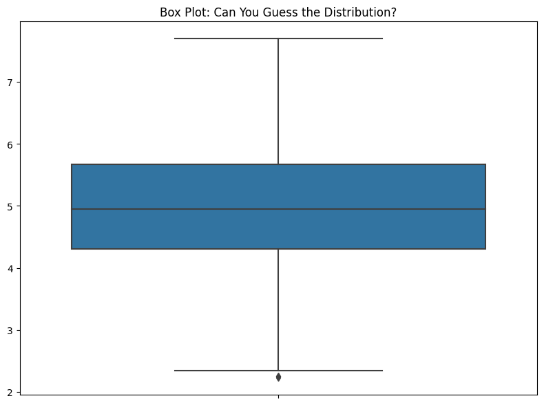
If I ever see a box plot in a presentation, I have to stop them and say, “OK, but what’s the data look like?” If someone’s showing me data in a live Jupyter Notebook, I’ll ask them to show me some other ways to represent the data. I have, time and again, found that there’s more to the data that is hidden by the box plot. The problem is, when you look at this, you have no idea how little you know about the data.
Distribution
The most important drawback of a boxplot is that it completely hides the distribution. Take a look at all the plots below. I have several different distributions and they all look the same. If the five-number summary statistics are the same, the box plot is the same.
np.random.seed(0)

# Uniform Data
uniform_data = np.random.uniform(2, 8, 800)

# Clusters
cluster_1 = np.random.normal(3, 0.2, 300)
cluster_2 = np.random.normal(5, 0.2, 300)
cluster_3 = np.random.normal(7, 0.2, 300)
clusters = np.concatenate([cluster_1, cluster_2, cluster_3])

# Bimodal Distribution
bimodal_data = np.concatenate([np.random.normal(2, 0.5, 400), np.random.normal(8, 0.5, 400)])

# Bimodal with Overlap
bimodal_data_with_overlap = np.concatenate([np.random.normal(0, 1, 500), np.random.normal(5, 1, 500)])

# Nested Distributions
inner_cluster = np.random.normal(5, 0.5, 200)
outer_cluster = np.concatenate([np.random.normal(3, 0.2, 300), np.random.normal(7, 0.2, 300)])
nested_distributions = np.concatenate([inner_cluster, outer_cluster])

# Nonrandom Uniform
nonrandom_uniform = np.linspace(2, 8, num=200)

# Plotting
fig, axes = plt.subplots(6, 2, figsize=(12, 16))

sns.boxplot(ax=axes[0, 0], y=uniform_data)
axes[0, 0].set_title("Box Plot: Uniform Distribution")
axes[0, 1].hist(uniform_data, bins=30, edgecolor="black")
axes[0, 1].set_title("Histogram: Uniform Distribution")

sns.boxplot(ax=axes[1, 0], y=clusters)
axes[1, 0].set_title("Box Plot: Clusters")
axes[1, 1].hist(clusters, bins=30, edgecolor="black")
axes[1, 1].set_title("Histogram: Clusters")

sns.boxplot(ax=axes[2, 0], y=bimodal_data)
axes[2, 0].set_title("Box Plot: Bimodal Distribution")
axes[2, 1].hist(bimodal_data, bins=30, edgecolor="black")
axes[2, 1].set_title("Histogram: Bimodal Distribution")

sns.boxplot(ax=axes[3, 0], y=bimodal_data_with_overlap)
axes[3, 0].set_title("Box Plot: Bimodal with Overlap")
axes[3, 1].hist(bimodal_data_with_overlap, bins=30, edgecolor="black")
axes[3, 1].set_title("Histogram: Bimodal with Overlap")

sns.boxplot(ax=axes[4, 0], y=nested_distributions)
axes[4, 0].set_title("Box Plot: Nested Distributions")
axes[4, 1].hist(nested_distributions, bins=30, edgecolor="black")
axes[4, 1].set_title("Histogram: Nested Distributions")

sns.boxplot(ax=axes[5, 0], y=nonrandom_uniform)
axes[5, 0].set_title("Box Plot: Nonrandom Uniform Distribution")
axes[5, 1].hist(nonrandom_uniform, bins=20, edgecolor="black")
axes[5, 1].set_title("Histogram: Nonrandom Uniform Distribution")

plt.tight_layout()
plt.show()
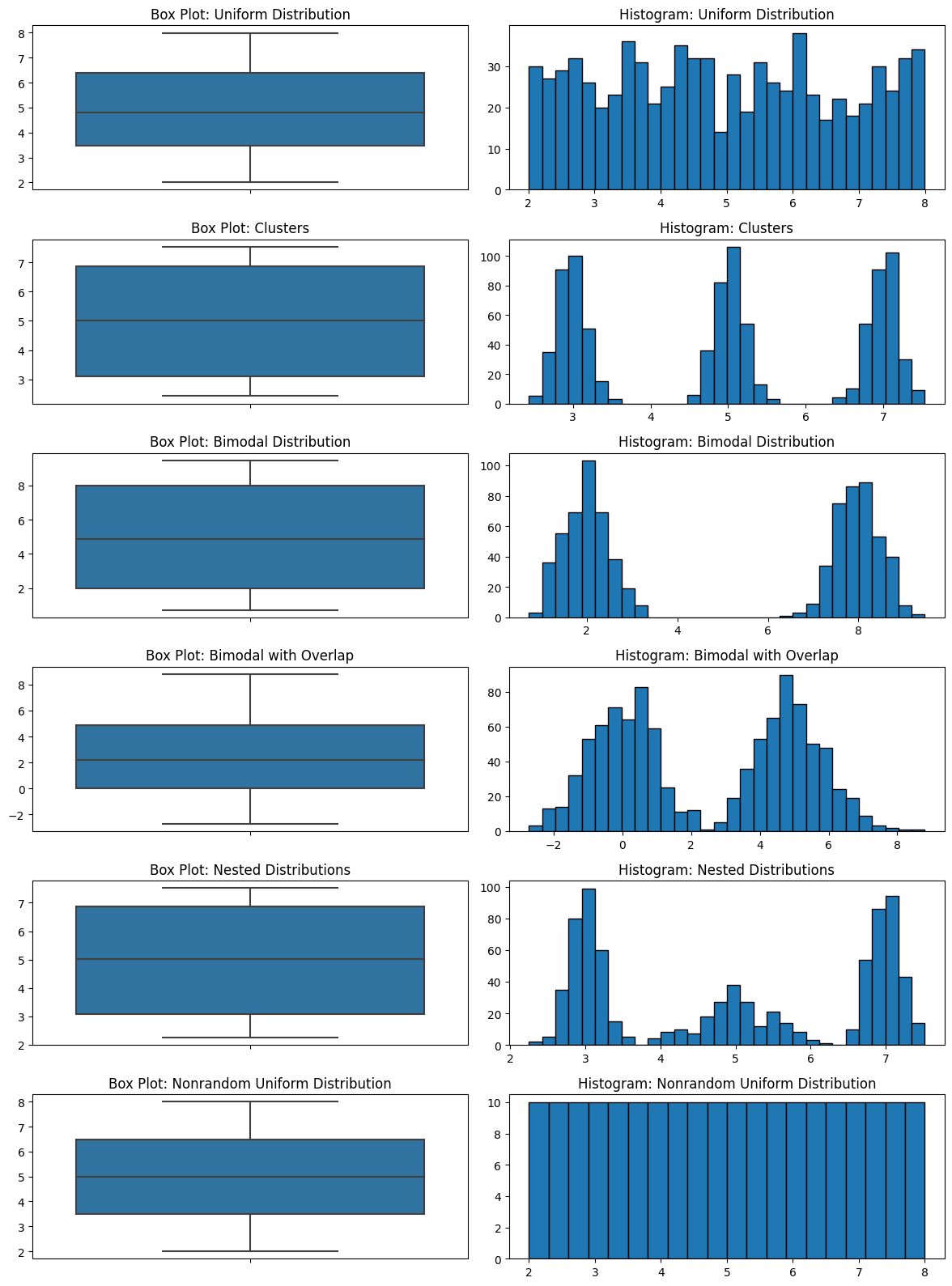
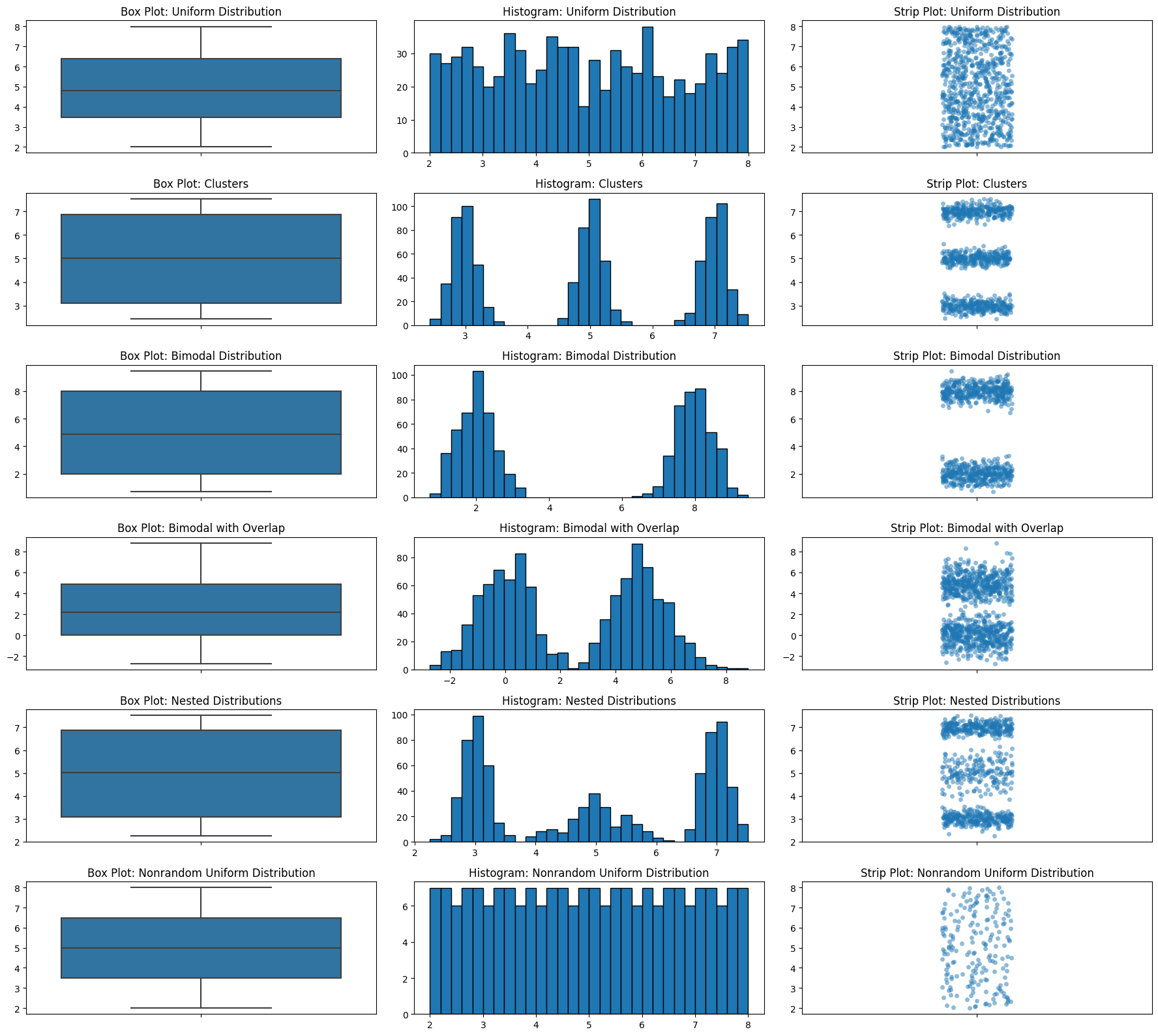
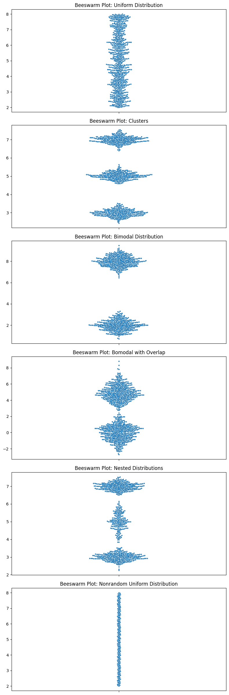
There are completely different things going on in these datasets, and the boxplots look the same. This is not good for EDA.
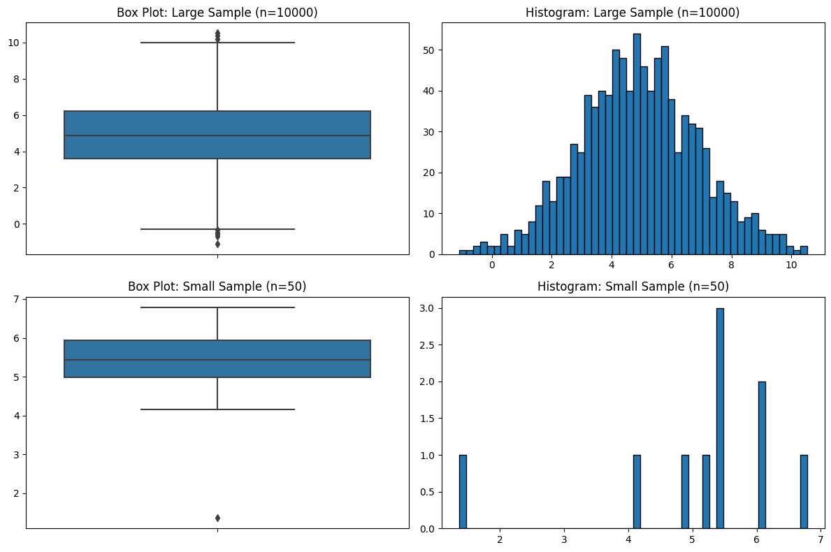
Sample Size
You might have sensed a theme regarding sample size, and it’s that I think the field of statistics pays far too little attention to it. Just like with violin plots, and just like the five-number summaries, box plots have no indication of sample size.
np.random.seed(0)

num_few_samples = 5

large_sample = np.random.normal(5, 2, 1000)
small_sample = np.random.normal(5, 2, 10)

# Plotting
fig, axes = plt.subplots(2, 2, figsize=(12, 8))

# Box plots on the left
sns.boxplot(ax=axes[0, 0], y=large_sample)
axes[0, 0].set_title('Box Plot: Large Sample (n=10000)')
sns.boxplot(ax=axes[1, 0], y=small_sample)
axes[1, 0].set_title('Box Plot: Small Sample (n=50)')

# Histograms on the right
axes[0, 1].hist(large_sample, bins=50, edgecolor='black')
axes[0, 1].set_title('Histogram: Large Sample (n=10000)')
axes[1, 1].hist(small_sample, bins=50, edgecolor='black')
axes[1, 1].set_title('Histogram: Small Sample (n=50)')

plt.tight_layout()
plt.show()
Focusing on the Wrong Data
Another thing I don’t like about box plots is how they emphasize the wrong part of the data. Let’s look at an example.
exponential = np.clip(np.random.exponential(scale=2, size=1000), 0, 10)

# Plotting
fig, axes = plt.subplots(1, 2, figsize=(12, 8))

sns.boxplot(ax=axes[0], y=exponential)
axes[0].set_title('Box Plot: Exponential Distribution')
axes[1].hist(exponential, bins=30, edgecolor='black')
axes[1].set_title('Histogram: Exponential Distribution')

plt.tight_layout()
plt.show()
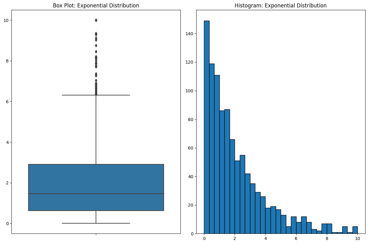
If you look at the box plot, your eyes are drawn to where all the action is in the data. But box plots do something counterintuitive. Bins that contain a lot of data are COMPRESSED. In this case, over half of the data are between 0 and 2, and when you look at the histogram, that’s where your eyes are drawn. But because the data are so dense around this area, they’re squeezed into a small part of the plot. This is the kind of thing that you get used to and it’s fine if you’re familiar with it, but I see a lot of people get tripped up by it.
Improving Box Plots
A natural question is, how can we make it better? Fortunately, I think there are things we can do to improve box plots. My main one is by overlaying the raw data on top of it, as you can see below.
np.random.seed(0)

# Bimodal distribution
bimodal_dist = np.concatenate([np.random.normal(3, 0.5, 500), np.random.normal(7, 0.5, 500)])

# Box Plot
sns.boxplot(y=bimodal_dist)

# Strip Plot
sns.stripplot(y=bimodal_dist, color='black');
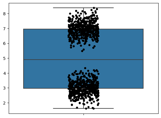
I like seeing all the data. You can see what’s really going on here. But when you look at the raw data, I don’t think the box plot actually adds much. After all, it’s just telling you the five-number summary.
Better Options
I wouldn’t leave you without some better options, so let’s talk about those.
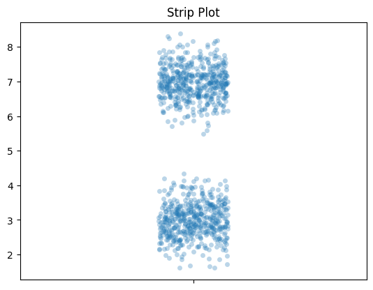
Strip Plots
Like I said above, I think adding the raw data looks good. This is a strip plot. And once you have that, you don’t need the box plot. My favorite thing to do with the strip plot is to add an alpha value, so dots are light and become darker when they are more densely packed. You can see that here.
# Strip Plot
sns.stripplot(y=bimodal_dist, alpha=0.3)

plt.title('Strip Plot')
plt.show()
Let’s look at those box plot distributions again but we’ll add strip plots.
fig, axes = plt.subplots(6, 3, figsize=(18, 16))

data_list = [uniform_data, clusters, bimodal_data, bimodal_data_with_overlap, nested_distributions, nonrandom_uniform]
titles = ['Uniform Distribution', 'Clusters', 'Bimodal Distribution', 'Bimodal with Overlap', 'Nested Distributions', 'Nonrandom Uniform Distribution']

for i, data in enumerate(data_list):
    sns.boxplot(ax=axes[i, 0], y=data)
    axes[i, 0].set_title(f'Box Plot: {titles[i]}')
    axes[i, 1].hist(data, bins=30, edgecolor='black')
    axes[i, 1].set_title(f'Histogram: {titles[i]}')
    sns.stripplot(ax=axes[i, 2], y=data, alpha=0.5)
    axes[i, 2].set_title(f'Strip Plot: {titles[i]}')

plt.tight_layout()
plt.show()
Histograms
As you can probably tell, I like histograms. That’s why I was using them as my default point of comparison. They are a clear way to describe the data. I think they’re great and recommend them over violin plots and box plots. We’ve seen enough histograms already though, so let’s look at the next thing.
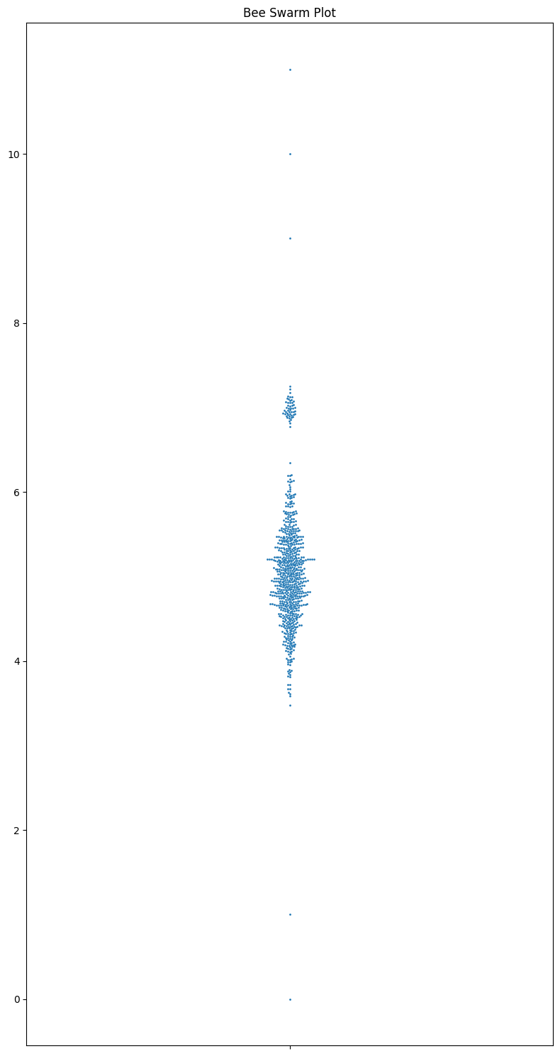
Beeswarm Plots
Now I want to go over the most underrated plot type: beeswarm plots. They convey all the data, and easy to grasp, show the sample size and the distribution, and are really nice looking. They are an excellent tool for smallish datasets. It’s a shame that they aren’t used more often.
np.random.seed(0)

main_cluster = np.random.normal(5, 0.5, 700)
outliers = np.array([0, 1, 9, 10, 11])
secondary_cluster = np.random.normal(7, 0.1, 50)
data = np.concatenate([main_cluster, outliers, secondary_cluster])

# Plotting
fig, ax = plt.subplots(1, 1, figsize=(8, 15))

# Bee Swarm Plot
sns.swarmplot(y=data, ax=ax, size=2)
ax.set_title("Bee Swarm Plot")


plt.tight_layout()
plt.show()
np.random.seed(0)

# Normal Distribution
normal_dist = np.random.normal(5, 1, 1000)

# Bimodal Distribution
bimodal_dist = np.concatenate([np.random.normal(3, 0.5, 500), np.random.normal(7, 0.5, 500)])

# Exponential Distribution
exponential_dist = np.random.exponential(scale=1, size=1000)

# Uniform Distribution
uniform_dist = np.random.uniform(0, 10, 1000)

# Skewed Distribution with Outliers
skewed_main = np.random.chisquare(3, 900)
outliers = [15, 16, 17, 18, 19]
skewed_dist = np.concatenate([skewed_main, outliers])

datasets = [normal_dist, bimodal_dist, exponential_dist, uniform_dist, skewed_dist]
titles = ['Normal Distribution', 'Bimodal Distribution', 'Exponential Distribution',
          'Uniform Distribution', 'Skewed Distribution with Outliers']

# Plotting
fig, axes = plt.subplots(5, 2, figsize=(12, 15))

for i, (data, title) in enumerate(zip(datasets, titles)):
    sns.boxplot(ax=axes[i, 0], y=data)
    axes[i, 0].set_title(f'Box Plot: {title}')

    sns.swarmplot(ax=axes[i, 1], y=data, size=2)
    axes[i, 1].set_title(f'Bee Swarm Plot: {title}')

plt.tight_layout()
plt.show()
Let’s look at all the ones that I criticized box plots for.
# Plotting
fig, axes = plt.subplots(6, 1, figsize=(8, 24))

data_list = [uniform_data, clusters, bimodal_data, bimodal_data_with_overlap, nested_distributions, nonrandom_uniform]
titles = ['Uniform Distribution', 'Clusters', 'Bimodal Distribution', 'Bomodal with Overlap', 'Nested Distributions', 'Nonrandom Uniform Distribution']

for i, data in enumerate(data_list):
    sns.swarmplot(ax=axes[i], y=data, size=3)
    axes[i].set_title(f'Beeswarm Plot: {titles[i]}')

plt.tight_layout()
plt.show()
Look at those beauties.
I will note that you can add the quartiles and medians to the beeswarm pretty easily.
data = np.random.normal(5, 2, 1000)

# Plotting the swarm plot
plt.figure(figsize=(8, 6))
sns.swarmplot(y=data, color='blue', size=2)

# Calculating and adding the IQR
Q1 = np.percentile(data, 25)
Q3 = np.percentile(data, 75)
median = np.median(data)

plt.axhline(y=Q1, color='red', linestyle='dashed', label='Q1')
plt.axhline(y=Q3, color='red', linestyle='dashed', label='Q3')
plt.axhline(y=median, color='green', linestyle='-', label='Median')  # Highlighting the median

plt.fill_between([-.5, .5], Q1, Q3, color='red', alpha=0.2)  # Shade the IQR region

plt.title("Swarm Plot with IQR and Median")
plt.legend()
plt.show()
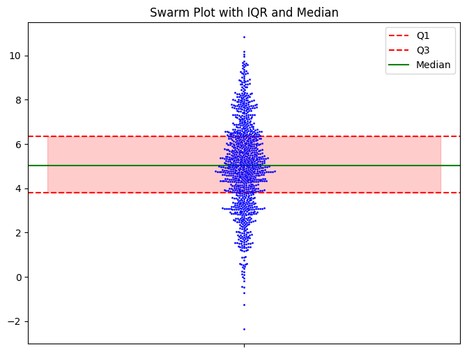
I don’t think you need it, but it’s there if you want it. Seeing the raw data, you get a sense of what the data is telling you, and the summary statistics don’t add much.
Conclusion
My point isn’t that you should NEVER use box or violin plots. Maybe there’s a time and place for them; I’m not that ideological. But now you know what to be concerned about.